I saw a study a while ago where someone had tracked where people look onscreen for various types of help - I seem to remember that, for example, they looked to the right of the question for help on a form for instance, and at the bottom of the page for 'about us' type info? Can anyone remember/ help me out? I am trying to find a shorthand way to explain best practice, to help me steer a stakeholder away from wanting generic marketing spiel about 'how this site works' info front and centre when a customer is on task.
2 Answers
I woudl look at Nielson Norman group work see this site where they have a number of eyetracking reports, and they do quite a lot of the eyetracking work. I cannot find anything that directly relates to what you are after, but you might be able to find something that works for you.
I know this is a very old post, but since this question was exacly what I was looking for.. I tried to search for that asked research, for the people who are looking for the same question.. here it is!
Help! Where Is It When You Need It? http://uxpamagazine.org/help_where_it_it/
To be sure the website won't shutdown, here's what the article is basically is saying. Of course, credits go to the original writer: Tania Lang
There are two types of 'searching for help' when filling in online webforms:
- Looking for help on specific item
- Looking for overall help on a entire form
Specific items
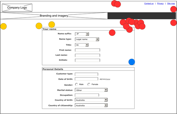
In regards to the expected location of a help button, link, or icon that a user could click for inline help or assistance with a specific question, 67 percent (12 of 18) of users expected this to be located directly to the right of the field they were seeking assistance with (indicated using red circles in Figure 1). 11 percent (2 of 18) of users indicated they would expect it inside the same form box and to the top right of that box (indicated using yellow circles in Figure 1).
Help on entire form
About trouble completing the form, the findings were conclusive: 78 percent (14 of 18) of users expected to see help associated with the whole form located in the top right quadrant of the screen (indicated with red circles in Figure 1). Three of these users clicked in the global header area which would be persistent throughout the entire website.
Only 17 percent (3 of 18) of users expected to see help associated with the whole form located in the top left of the screen below the global header (indicated by yellow circles in Figure 1). The remaining user click location is indicated by a blue circle.
Conclusion
As a result, your design could look like the design in figure 3. If users are having trouble understanding the overall purpose of the form or the web application screen, they tend to look for help in the top right corner of the screen. A help button, link, or icon relating to the whole form or screen function should be located on the top right corner of the screen but below the global header (see Figure 3). Help relating to the entire application or website, such as phone help, support numbers, or global tips, should be placed in the global header.
Based on our ongoing observations and limited research, we recommend that inline help relating to a specific question in a form appear to the immediate right of the input field and using a meaningful symbol such as the question mark icon (see Figure 3). This is where two-thirds of the users in our study indicated they would expect to find inline help. We also recommend that inline help be user activated (for example, appear upon mouseover) to reduce screen clutter while allowing easy access to help when needed by the user.


