What's a better way to handle navigation in a slider with a lot of images?
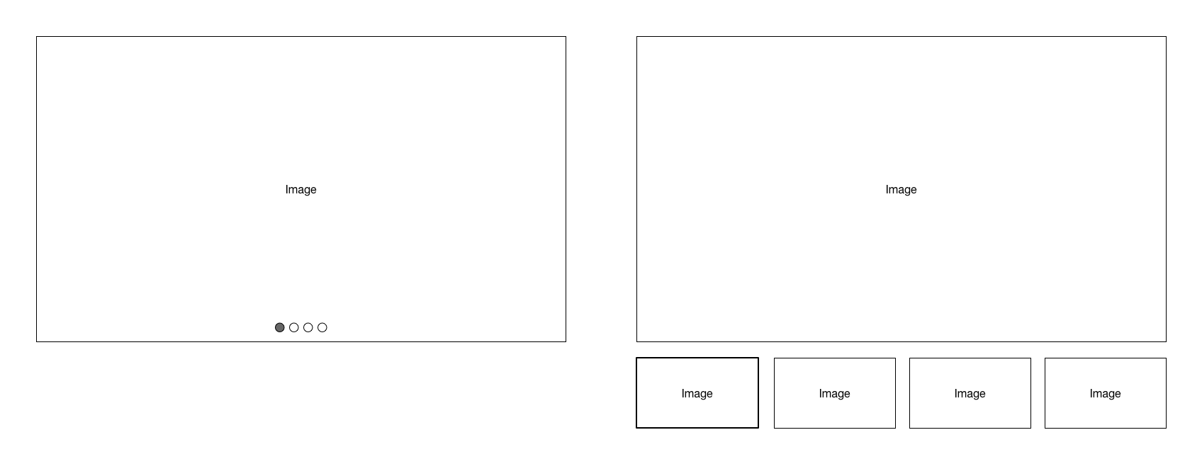
I'm currently working on the behaviour of an image slider. The image slider will look like the wireframe in the image below.
The user can choose to have either small circles (left) or thumbnails (right) as navigation and indicators of the current image.
This is fine for small lists of images (4 or less), but I'm struggling with the navigation when there are a lot of images.
Based on the above navigation patterns it would look something like this. There will be a lot of circles in a row. I'm focused on the circles. I've worked out the thumbnails already. They are easier to navigate and find because they show the image.
It's hard to navigate. For example, users have to count the number of circles if they want to see an image again later.
I've thought of a few ways to make the row of circles easier to understand.
- Replace the circles with numbers. (left image below)
- Have 'pages' of circles. (right image below)
I'm not happy with the result yet.
What's a better way to handle navigation in a slider with a lot of images?
Thanks!


