7

Would you ever ask, or expect your users to understand that they can and should scroll up from their entry point?

The idea is showing articles in reverse-chronological order.

They can also scroll up from the entry point to see details about future events in chronological order. Soonest at the bottom.

A lateral date scrubber is also fixed at the top of the viewport.

Scrub right, or scroll up takes the user to the future. Scrub left or down takes you to the past.

It's kind of a bizarre idea and I might be coming off the rails. Of course i'll user-test this, but wanted to ask the community if it's worth exploring. Any better suggestions as to how to solve it. Ideally in one screen?

enter image description here

2
  • I would not say this is a completely new concept. There are some similar ones, e.g. Fantastical. Commented Apr 6, 2017 at 21:48
  • 1
    The difference between the vertical scroll and the horizontal scrubber might be a bit difficult for some users to get their heads around. Commented Apr 7, 2017 at 9:00

3 Answers 3

1

"Anchor Linking" is OK

Linking to the middle of a web page is as old as the web itself. It's called anchor linking or section linking. It is fine to do if there are strong affordances informing the user that they can scroll up.

Wikipedia links to the the middle of pages to direct users to specific topics, so a lot of people will be familiar with this. Their affordances for this are OK but not great - many folks will notice the empty left-hand navigation and the lack of the Wikipedia header and realize they have landed on the middle of the page.

Unless you have as many page views as Wikipedia, you'll want to give a stronger signal that scrolling up is a possibility.

Avoid a "False Ceiling"

Many webpages have a problem of a "false floor" where it is not obvious to the user can/should scroll down. If the user starts in the middle of the page, you will also need to avoid a "false ceiling."

The same techniques can be used to prevent what Nielsen/Norman Group calls an illusion of completeness at either the top of bottom of your viewport.

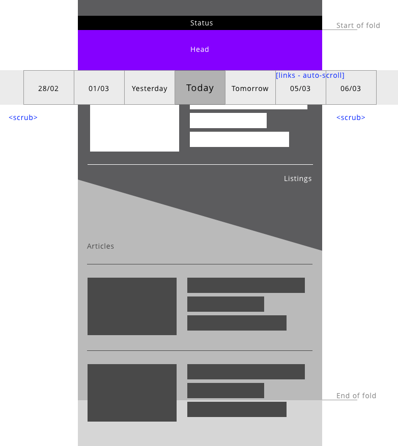
Simply put, make sure the top of the visible viewport does not look like it could be the top of your page. A quick example:

enter image description here

You can have website header above "cut off" content such as in the above example. As long as the user sees incomplete content running off the top of the content area, it's a strong indication there is content above that can be scrolled to.

0

Generally, I wouldn't expect users scrolling upwards to reach new contents on their own. Using the scrollbar would be very tricky, especially if you implement infinite scroll on both sides (on top and bottom of the page), and the only anchor to the "today" view would be in your "lateral date scrubber", since the scrolling up to the top of the page will bring you to a unknown future date.

For events sorting, I'd prefer the solution adopted by Facebook: sorting the ongoing events by their end-date, then listing all the future events in chronological order, and, at last, listing all the past events in reverse chronological order.

Finally, this kind of navigation could cause serious accessibility issues, since there is no clear path to follow in order to grasp all the informations.

0

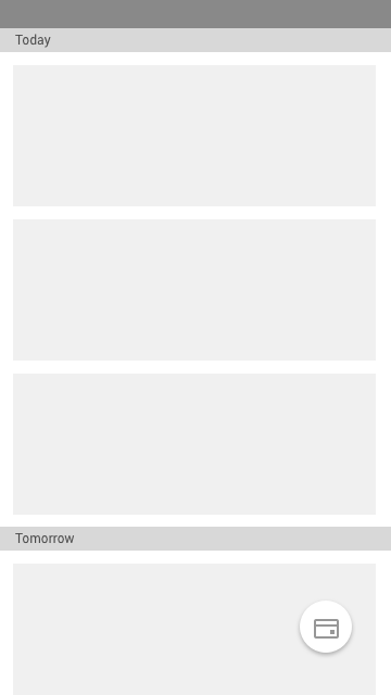
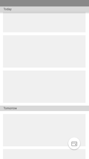
As you have yourself pointed out, a user might not scroll up on landing. But you should also realise it is something a user will learn as he uses the app. I will suggest you to not use a reverse chronological order. To my understanding, a user will be more interested in the current and future events which makes it better that the future events are in the natural direction of scrolling (downwards). Still if you believe, a user might not scroll up, you could add a microinteraction when the user lands on the screen. It could be an animation that reveals the last past event and then automatically scrolls to today. Oh and I might add, a both way scroll will not allow you to use the pull to refresh function.

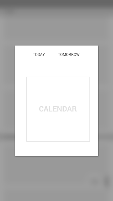
The date scrub will definitely not work when there are a lot of days to be selected from. Instead, allow users to select from a calendar with quick links to today, tomorrow etc. While scrolling, use the date as a sticky header. This will allow the user to be aware of the date he's scrolling through at all times. Hope this helps. Screens attached.

Default Landing

While Scrolling

enter image description here

Your Answer

By clicking “Post Your Answer”, you agree to our terms of service and acknowledge you have read our privacy policy.

Not the answer you're looking for? Browse other questions tagged or ask your own question.