1

I need to hide away a piece of text that explains a useful part about using the UI for an app I am making (out of space) and a tooltip will work fine. My concern is that if people see a button they will assume it takes them to a different page so I need to make sure they understand this is something they hover over.

Any ideas?

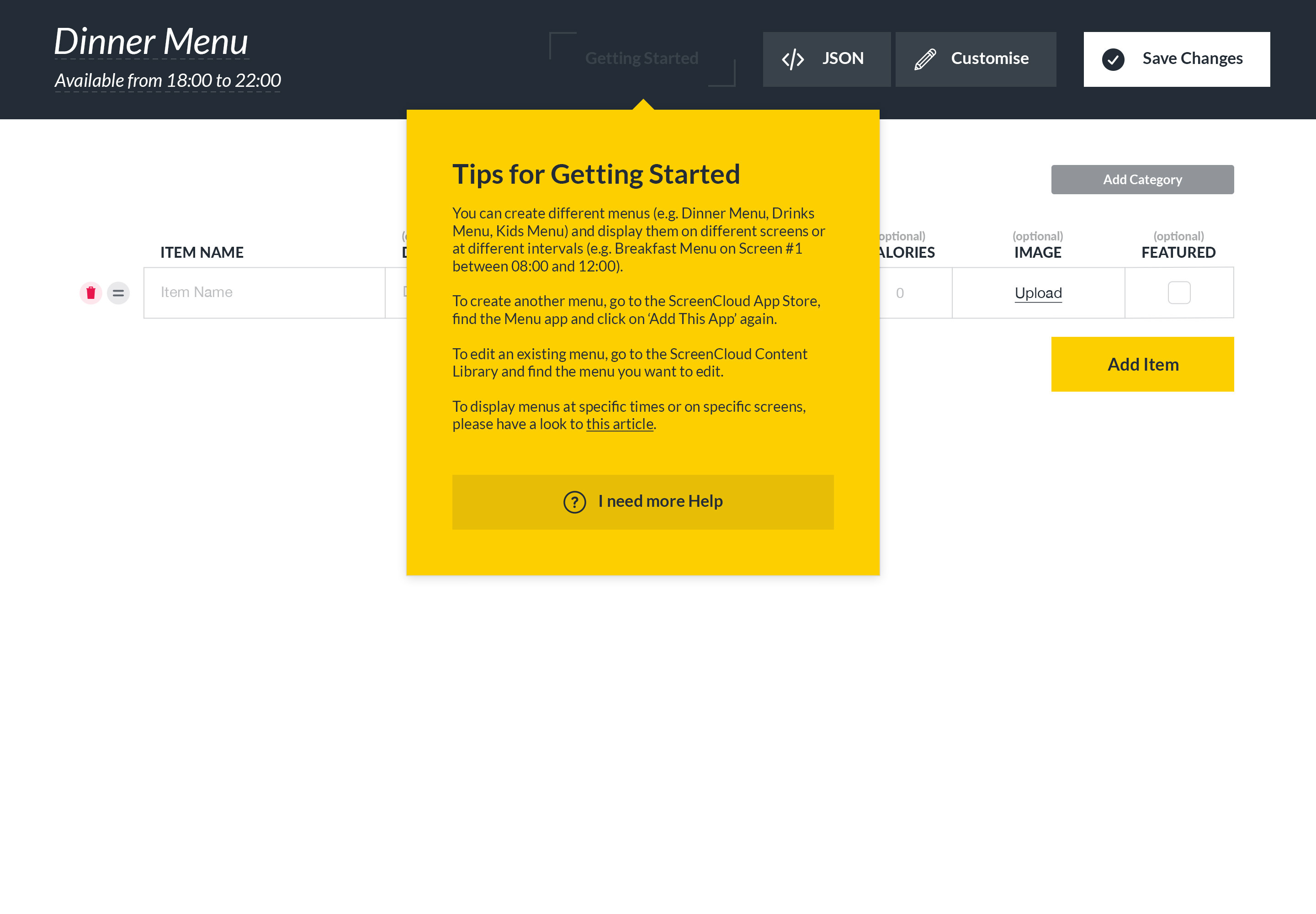
EDIT: here's the solution I went with: An unconventional, clearly different button that doesn't make you want to click on it.

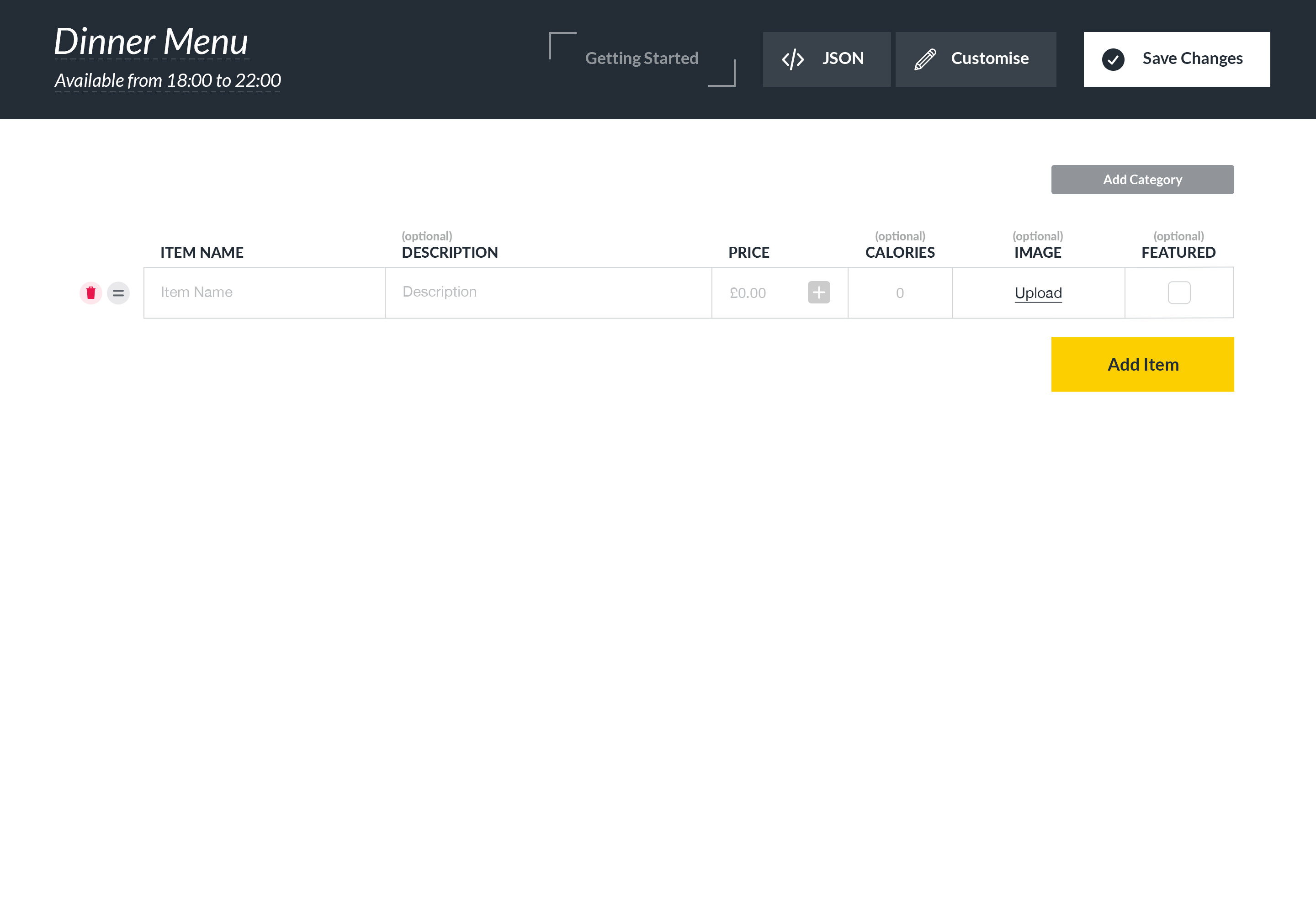
enter image description here enter image description here

3
  • 1
    "My concern is that if people see a button they will assume it takes them to a different page..." Are you saying that the button is only there as a hover target, that it's not clickable? Commented Dec 6, 2017 at 13:34
  • Yes, I've attached a demo of the solution I went with. Commented Dec 7, 2017 at 9:46
  • Hover states containing vital information are not good for users with accessibility requirements. If this information is vital then you need to make it visible without resorting to using the hover interaction. If this information is non-vital then you don't need to modify the button to show that there is a hover interaction; you can just let the user 'discover' it. Commented Dec 8, 2017 at 9:33

3 Answers 3

2

Maybe this sounds stupid, but if the piece of text explains something useful, i image it's relevant. So why hide it?

It's a good practice to make the button label as descriptive as possible. If the action is clear maybe there is no need for a tooltip at all?

On a side note: please note that touch devices will miss tooltips because on these devices rollovers are not obvious or intuitive.

1
  • Good questions, the reason I have to hide is that the text is quite lengthy and I do not have space for it in the UI. Also, this is desktop only, I don't need to worry about mobile devices. Commented Dec 7, 2017 at 9:45
1

You can simply add a '?' tooltip icon next to the button. The expected behavior of this kind of icon is that it will bring up information within the same window.

Users will know what this means as it's common practice these days to be used on forms etc.

0

It could help to add an "information" or "question" icon to let the user understand that it won't take any other actions than just provide the information.

For these purposes you might also want to consider how these buttons could differ from the regular CTA's so that the user can distinguish them in other screens/steps if there will be any.

1
  • Making it look different (i.e. not like a conventional button) is the approach I went with. Thanks for the suggestion. Commented Dec 7, 2017 at 9:45

Your Answer

By clicking “Post Your Answer”, you agree to our terms of service and acknowledge you have read our privacy policy.

Not the answer you're looking for? Browse other questions tagged or ask your own question.