Tweeted twitter.com/#!/StackUX/status/611598469510365184
added 633 characters in body
Source Link
CleverNode
  • 315
  • 1
  • 9

I'm working on a radial tree. There will be nodes on branches and leaves of each tree, with text next to it -- using this model on d3.

Now, I realize that it is very neat that they managed to place the text in the angle of the line, so the text never overlapped, but it is also very annoying for the user to read. Half way through, the text changes direction -- this actually makes it easier for the user, but on my own tree, it will be confusing, because my label has (icon)label so half way through, the icon will be at the outer edge of the circle instead of inner.

I'm just wondering if anyone knows if there is certain pattern that is better for the user. Angled text is already bad (probably), the user has to keep turning his/her head to read, and changing half way through, may be even worse (I'm not sure) -- maybe it makes sense because the head can't turn 360 degree!.
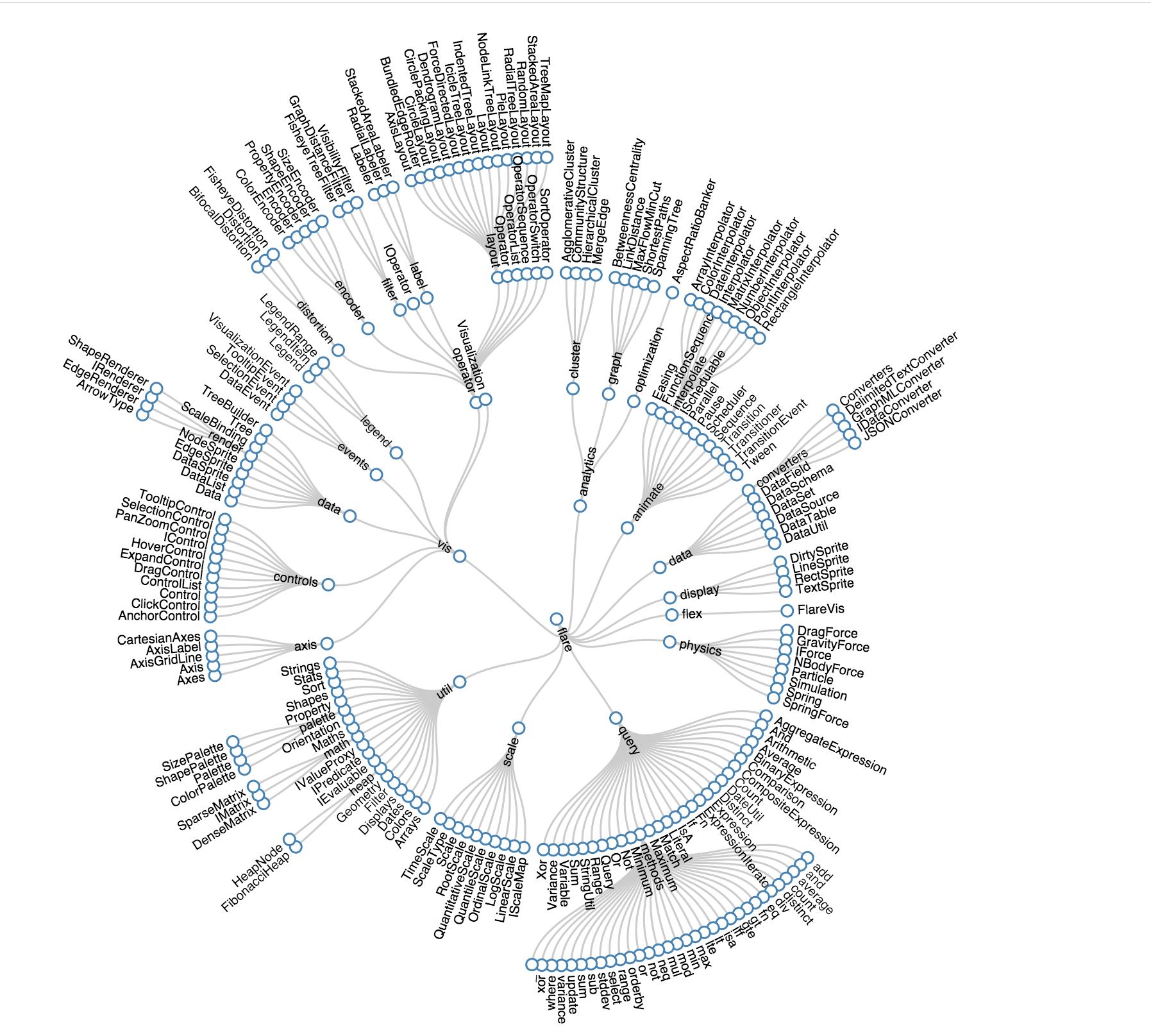
enter image description here. You can find the live example here: http://bl.ocks.org/mbostock/4063550

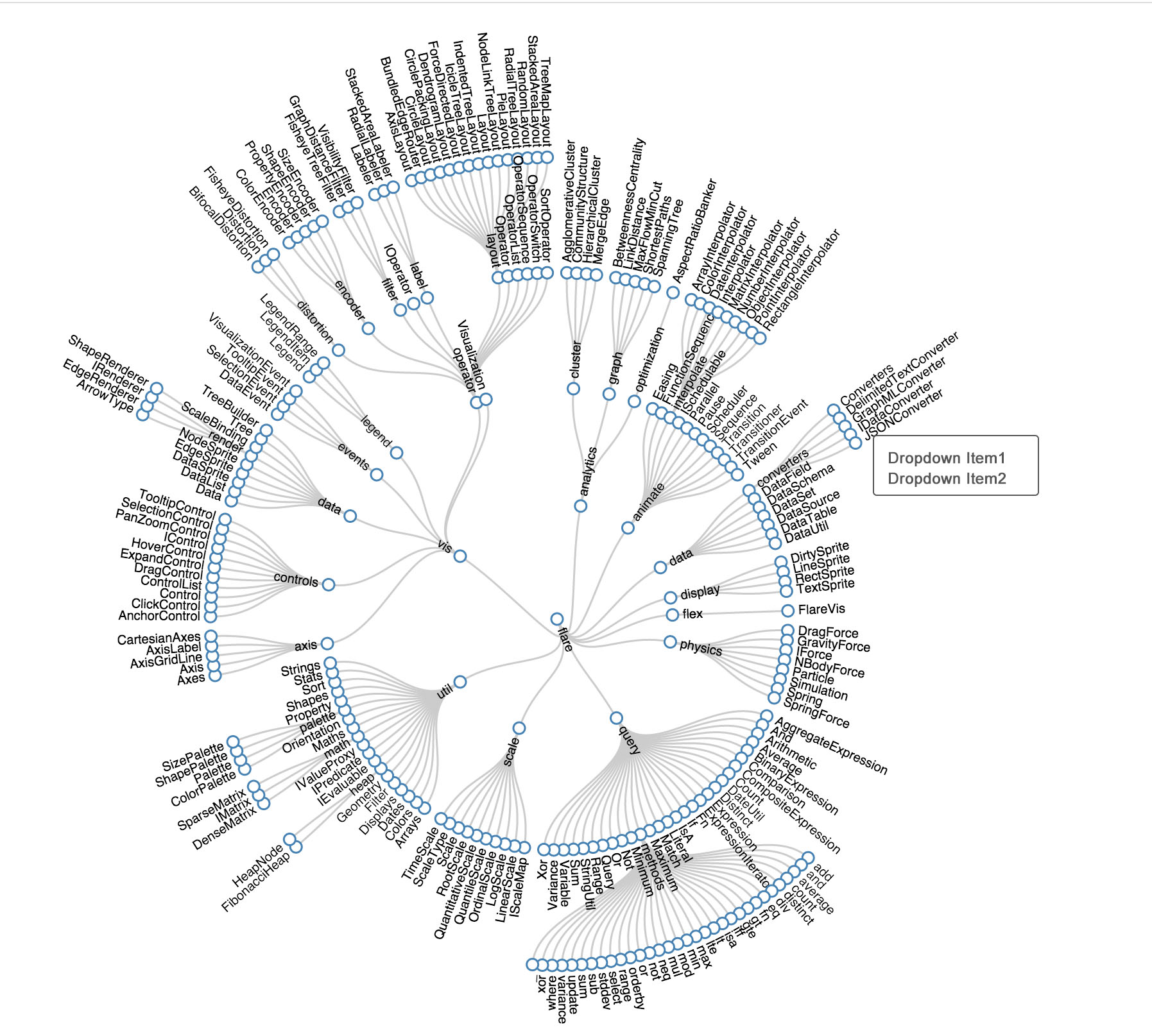
Edit: In addition to the text problem. Each text actually triggers an additional dropdown to open additional information at another box. However, I'm having trouble deciding the placement of this dropdown, simply because all the text are in strange angles, making it hard to decide whether the left side, or the right side would be better, or if they'd both be confusing. Anyone has any example of dropdown from rotated text? What do I have to be aware of and how should I make it more obvious for the user which dropdown relate to which text?
enter image description here

I'm working on a radial tree. There will be nodes on branches and leaves of each tree, with text next to it -- using this model on d3.

Now, I realize that it is very neat that they managed to place the text in the angle of the line, so the text never overlapped, but it is also very annoying for the user to read. Half way through, the text changes direction -- this actually makes it easier for the user, but on my own tree, it will be confusing, because my label has (icon)label so half way through, the icon will be at the outer edge of the circle instead of inner.

I'm just wondering if anyone knows if there is certain pattern that is better for the user. Angled text is already bad (probably), the user has to keep turning his/her head to read, and changing half way through, may be even worse (I'm not sure) -- maybe it makes sense because the head can't turn 360 degree!.

enter image description here. You can find the live example here: http://bl.ocks.org/mbostock/4063550

Edit: In addition to the text problem. Each text actually triggers an additional dropdown to open additional information at another box. However, I'm having trouble deciding the placement of this dropdown, simply because all the text are in strange angles, making it hard to decide whether the left side, or the right side would be better, or if they'd both be confusing. Anyone has any example of dropdown from rotated text? What do I have to be aware of and how should I make it more obvious for the user which dropdown relate to which text?
enter image description here

Source Link
CleverNode
  • 315
  • 1
  • 9

Text around a circle

I'm working on a radial tree. There will be nodes on branches and leaves of each tree, with text next to it -- using this model on d3.

Now, I realize that it is very neat that they managed to place the text in the angle of the line, so the text never overlapped, but it is also very annoying for the user to read. Half way through, the text changes direction -- this actually makes it easier for the user, but on my own tree, it will be confusing, because my label has (icon)label so half way through, the icon will be at the outer edge of the circle instead of inner.

I'm just wondering if anyone knows if there is certain pattern that is better for the user. Angled text is already bad (probably), the user has to keep turning his/her head to read, and changing half way through, may be even worse (I'm not sure) -- maybe it makes sense because the head can't turn 360 degree!.

enter image description here. You can find the live example here: http://bl.ocks.org/mbostock/4063550