0

This is an application for in house use
Features over flash

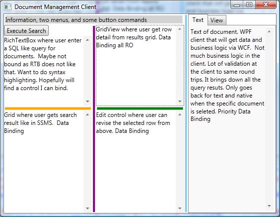
Used to have a structure UI pages for building up the search. Users told us they would rather have a WestLaw natural language syntax. A SQL like language.

select * from documents where fName = 'bill' and date > 1/1/2002

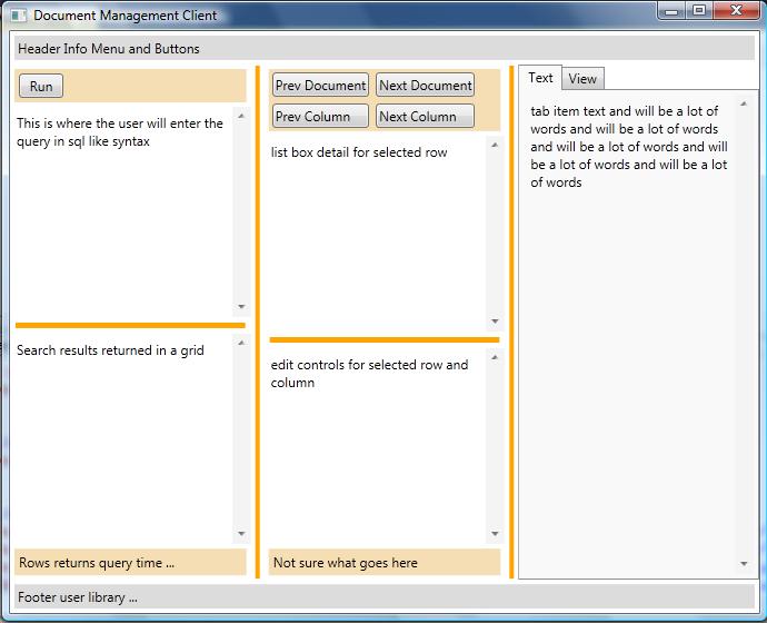
The crazy colors are sliders and those colors will change.

We had some stuff in pop up Windows but some users would hide them and get stuck. Hoping to just have one window where the get real estate via sliders and tabs.

The number of features is down as users in it full time wanted anything what would save a key stroke. But user that were not in the app a lot felt over whelmed.

This is designed after a tool from Microsoft called SQL Server Management Studio for database queries.

Can this design be improved? If so how?

client

Just spacing stuff out as suggested in the accepted answer helps

enter image description here

P.S. there is a log in page first that introduces the product.

5
  • 3
    Hey, "input on the design" is quite open ended. Can you ask a more specific question to help guide the people on here?
    – UXerUIer
    Commented Sep 9, 2016 at 19:03
  • @Majo0od Design improvements? I am not a UX guy.
    – paparazzo
    Commented Sep 9, 2016 at 21:35
  • 3
    Yes, this design can be improved.
    – Wildcard
    Commented Sep 9, 2016 at 22:27
  • 1
    I'm voting to close this question as off-topic because, as written, there is no specific usability question. It appears the author is asking for the application to be designed for them. Commented Sep 10, 2016 at 0:33
  • @EvilClosetMonkey Just asking for help. I am programmer that is not a UX person.
    – paparazzo
    Commented Sep 10, 2016 at 8:07

1 Answer 1

2

I think the biggest improvement you could make is just to space things out. The whole thing is unnecessarily tightly packed. Plus, it's not hard to do with the visual studio designer.

If you are planning to be displaying tables based on the SQL search result you want that element to be as wide as possible, most tables have many columns and therefore width. So a tiny little box doesn't help when analyzing the data.

It could also use a menu at the top, like every other windows forms application has, which could contain commands as well. Which makes the application conform more to the windows forms' style. And people love conformity.

0

Not the answer you're looking for? Browse other questions tagged or ask your own question.