6

On the site I'm working on, we have a list of buttons which make donations.

We would like to promote a specific donation button so it will convey more traffic. We tends to prefer less big donations over a lot of small ones (at least it's the analysis we made until now).

Example, emphasis on the 2nd element:
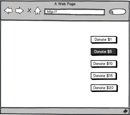
mockup

download bmml source – Wireframes created with Balsamiq Mockups

Some though we have on the subject:

  • If we promote the first link, it will make people click the first link, thus driving less "big" donations.
  • If we promote the last element, it will repel people.
  • The second may be a good option, but it's a guess.

Also, the amount and number of buttons are variables and unknown from us, so we would like a generic way to do this.

Right now the emphasis is done by a different background color, but any other emphasis be OK.

Is there a proper way to choose which element to promote?

5 Answers 5

5

Well the proper way to choose which to highlight is de-emphasize the $5 donation, so no option is contrasting the other, put the site live and wait for the first 10-20 donations. Then you will find out which of them converted the most and respectfully contrast it against the others as you depicted in your image.

However, in this approach the research phase is probably going to cost just a few donations because people won't have a donation sum that is highlighted. It depends on your audience, and their motivation to donate.

I would suggest you add playful descriptions after every donation sum, like -

$1 - Helper

$5 - Nice man

$10 - Big heart

$20 - Lion heart

These descriptions should with aligned with your domain of work and may include badges or some other recognition to the donators.

2
  • While I agree with your proposition, I wanted to know a way without any labelling (like the Stephenye's answer). In the end we will probably end up testing and promoting the most popular one (or the one just after).
    – nobe4
    Commented Jun 7, 2016 at 8:05
  • 1
    I think just contrasting the button as you have depicted and saying - most prefered choice or something like that is enough. What else you can do is to play with the wording. You can do a A/B test on the different wording - popular choice vs. best choice vs. recognition names (big heart, nice man etc.). Commented Jun 7, 2016 at 8:09
4

Here are some suggestions that could help you increase the amount of donations you receive:

-Reorder the donations from highest to lowest. The "anchoring" cognitive bias shows people are more likely to decide on an option that is closer to the first option they see. You should also emphasize a higher amount because it will draw the eye first and anchor the higher amount.

-Add a larger donation amount, like $100 to the list. That makes $20 not seem as "expensive" because it isn't that much more than $15 when compared to $100. You may even get a few $100 donations out of it.

-You could also look into taking out a few of the options that aren't selected very often. Fewer choices make it easier for people to make decisions. I would stick with at least 3 choices though to take advantage of "price" comparisons.

To sum up, I would try something like this to start (and if possible do some A/B testing on the values and number of choices to see what maximizes contributions): $100 $20 (emphasized) $10 $1

Take a look at the first two items on this list for more info: https://blog.kissmetrics.com/pricing-page-psychological-triggers/

1
  • I would take this approach and add the "playful descriptions" as suggested by @kristiyan Commented Jun 17, 2016 at 13:25
2

When several options are available for users to choose from, sometimes you can add a corner banner indicating it's a "best choice", "popular choice", or something similar. I'm not entirely sure whether this suits the situation of donations, but I think with proper wording it maybe a way to explore.

2
  • I'm not sure about the difference between the text and the color/font change for emphasis. But the question is really about which element to emphasis, let me clarify my question.
    – nobe4
    Commented Jun 6, 2016 at 15:28
  • I guess most people would want to be in the middle ground - I agree with you that the first and last may not be the best option. Perhaps highlight both the second and the third.
    – Stephenye
    Commented Jun 6, 2016 at 15:42
2

This is a classic example where A/B-Testing will help you to make the best decision. Measure conversion rates for different variants and stick with the one that attracted the most donors!

2
  • Makes sense, although I'm surprised the question does not seem to have a "general answer", and the only proper way to find the "best" button to promote is by testing...
    – nobe4
    Commented Jun 7, 2016 at 8:07
  • A general answer would need specific information, you already stated in your question that you can't tell which values will be available by now. Commented Jun 7, 2016 at 8:08
2

Highlight the button middle in the sequence.

  • If it is very first button: It will be skipped by user to check whats other options. User may not come back to first
  • If it is last button: User may not reach till the 'Last' button in sequence.

As donation may not be user's prime objective, it will be good to have middle button highlighted. It will give sense to user that he is doing something good which is neither too early decided nor too heavy on his pocket.

Just my views.

2
  • Make sense, but I think in this case (it's not on the question, but I can add it if needed), the user may want to support the project (and thus, donating became the reason he is on this page). What do you think?
    – nobe4
    Commented Jun 7, 2016 at 8:51
  • Sorry for delayed response. Still in this case as well 'I Feel' middle button will work for me for the same reasons. :) Commented Jun 12, 2016 at 14:43

Your Answer

By clicking “Post Your Answer”, you agree to our terms of service and acknowledge you have read our privacy policy.

Not the answer you're looking for? Browse other questions tagged or ask your own question.