4

Think of a smartphone style flat list with items that can belong to one of three priorities: High, medium and low. Each priority is separated with an inline header.

Now suppose we have a small viewport, where you can only see a portion of the list at a time. If you scroll to a position, where the priority headers are not visible, you might lose track of which priority "section" you're in.

Thus we have a scenario like this:
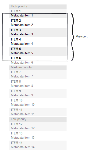
Scenario with small viewport and long scrollable list

My question is:

If repeating priority on each item is too much redundancy and sticky headers (like in the iPhone contacts list) are unfeasible, what would be a good alternative way to communicate priority regardless of scroll position?

1
  • What about indenting each section more the more you go down?
    – henryaaron
    Commented Jan 27, 2012 at 8:12

5 Answers 5

6

Using colors can be sufficient enough.

Consider red, yellow, and gray respectively, or perhaps some other variations. Red is known to be an attention grabbing color (think warnings, alerts), whereas yellow is known to be yet another slightly-less attention grabbing color when it comes to web and mobile (think notifications).

11
  • Can you explain why?
    – Rahul
    Commented Jan 25, 2012 at 15:01
  • Just modified my answer - sorry about that. While there's nothing ground-breaking about this approach, it's easy to adopt for just about any user.
    – Vin Burgh
    Commented Jan 25, 2012 at 15:03
  • Heh. You beat me to the answer. Color-coding is a great solution.
    – dnbrv
    Commented Jan 25, 2012 at 15:09
  • 5
    Be careful with reds and yellows, make sure they're at least visually distinct enough for colorblind users.
    – Zelda
    Commented Jan 25, 2012 at 15:10
  • @VinnyBurgh Removed my downvote :)
    – Rahul
    Commented Jan 25, 2012 at 15:11
3

You can use bullets for the Items made of little squares with H, M or L in them, colored or not depending on your design. The user should make the connection between the small square bullet with H inside and the 'High priority' header and associate them.

Of course, coloring them would make it even more easier. You can try to use less saturated colors with low value if you don't want to use bold ones.

As an example, kind of.., change the colors of a label in Gmail. You'll see some little colored squares with 'a' in the center.

1

What about some including some indicator on the left hand side of the content. Using colour as a starter but not relying on it. I would be wary of using a very bold colour. Also you could use a line markers which I have seen used a bit (example 2Do on the iphone). So ≣ for most important ₋ the least important.

1
  • I was considering something along the lines of what you suggest. Perhaps sparsely repeated text labels (High, Medium and Low) - rotated 90 degrees counterclockwise - could work?
    – agib
    Commented Jan 26, 2012 at 13:44
0

You can use colors (see comment above) or symbols. In addition you can insert a exclusive or non-exclusive priority filter "High", "Medium", "Low" if the number of items is to big.

0

Any type of indication of clear grouping would work. Colors, as already mentioned, font styles, background patterns, borders etc. Make sure that the use of colors works if people are color blind.

Your Answer

By clicking “Post Your Answer”, you agree to our terms of service and acknowledge you have read our privacy policy.

Not the answer you're looking for? Browse other questions tagged or ask your own question.