32

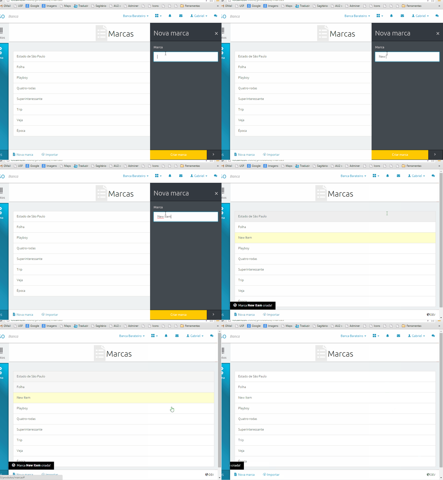
I was wondering if you had any clever idea of how to show that an element in a list is new.

In my case I'm displaying a list of documents and I want the user to see which ones are new since their last visit on that page.

I can think of 2 ways:

  • By adding a "new" label or badge (but I really want to avoid that)
  • By putting text in bold and background lighter that for other documents so it stands out. For example it's what Gmail does to show which emails are new since last time.
  • By choosing a different background colour for those items. In my case we are really limited with colours...

Can you think of any other way? Have you got examples to show?

In my case new elements will always be at the top of the list.

Many thanks

3
  • 5
    I'd like to answer here but I'll just observe that the constraint you are really grappling with is layout-specific (since you don't want the site to appear too cluttered). So without seeing a screenshot or wireframe of the layout so we can understand the specifics, it's hard to design an answer.
    – tohster
    Commented Mar 23, 2015 at 18:19
  • If it is important that the effect is persistent (as opposed to showing a fading out new badge or fading background color) you could consider just adding a subtle separator to the list - like this imgur.com/Zpg7jRP
    – CompuChip
    Commented Mar 24, 2015 at 8:38
  • 2
    I'll second @tohster. There are really only two ways to signal this to a user: you can either change the content by adding some sort of tag or change the layout by making it visually distinct. The latter can be done in a myriad of ways but is entirely dependent on the look-and-feel of the rest of the page.
    – Lilienthal
    Commented Mar 24, 2015 at 11:48

9 Answers 9

27

I suggest you to show the 'added date' as additional attribute (column) to the documents and color the date of the new entries:

enter image description here

Alternatively you can set the text of the date bold.

4
  • 10
    And provide a Sort by Date option. Commented Mar 23, 2015 at 13:39
  • 17
    And replace recent enough dates with phrases like "Today", "Yesterday", "Last Tuesday" Commented Mar 23, 2015 at 21:17
  • 1
    To some users, bolded or coloured differently could just as well mean "modified" or "changed". I don't really feel that cuts the bill, but may have been the right solution for @RaphaëlleM Commented Mar 24, 2015 at 22:52
  • 1
    ... phrases like "Today", "Yesterday", "Last Tuesday" AND a tooltip for each of them that shows the absolute full date! (OTH, TBH, I'm an engineer. I'm used to read and interpret numbers. I fervently hate these relative phrases but if one must... And I consider it advantageous when there's also the weekday prior to the date.) Commented Mar 1, 2023 at 12:51
10

As it happens with Gmail interface, the 'newness' of unread emails is differentiated by a momentary 'new' tag that hides itself after a few seconds. That's how gmail tells today's unread emails apart from yesterday's unread emails. However, this doesn't apply to your case.

The solution to my mind is a simple timestamp, visible in each row, for example '2 hours ago'. Background colour variations can help but they are not the most accessible options out there.

Since you are putting the newest messages at the top anyway, the timestamp would help differentiate how new the item is.

A simple horizontal line below the last 'new' item could also help in visually differentiating new from the old. In your case, I presume the user doesn't need to interact with the items, and the 'newness' will be gone once the page is refreshed.

4
  • 11
    Dude, your reputation is 1,337 Commented Mar 23, 2015 at 16:01
  • 13
    I would upvote your answer, but I don't want to ruin your rep. Commented Mar 23, 2015 at 16:02
  • 4
    He's going to have to start submitting some off-topic answers now.
    – Mordred
    Commented Mar 23, 2015 at 19:28
  • 3
    @AndrewHoffman not anymore, how sad is that.
    – Adnan Khan
    Commented Mar 23, 2015 at 23:23
10

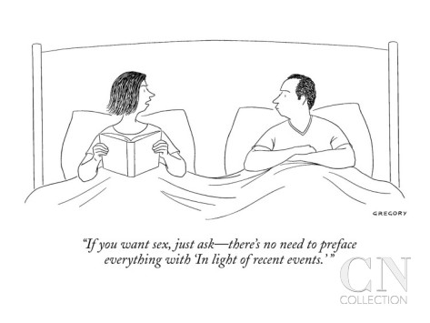
"If you want sex just say it"

A caricature of a couple in bed, with the women telling the man "If you want sex, just ask - there is no need to preface everything with 'in the light of recent events'"

Or in other words - convey information in the clearest, and most direct and concise way (rather than using nth degree semantics).

Visual features will constitute nth degree semantics.

You stated that new documents are always at the top of the list. If new documents are indeed of real interest to users, just give it to them:

mockup

download bmml source – Wireframes created with Balsamiq Mockups

3

I'm against of using "new", that does not add enough value to an updated item in a list that frequently has added items. Using timestamps like: "1h", "2d" is going be an standard, so people can recognize it, they have the same experience in their social networks app such as facebook, twitter, and gmail, you can also see this representation form in Android and iOS. So by using this feature next to a title of the list item, we can let users quickly catch that this is new and also it is newer than the other item. So a lot of valuable information just with 2 characters: "1s" (1 second ago)

2
  • Also we have done user testing in this feature and this works the best compare to other options.
    – aliesifar
    Commented Mar 23, 2015 at 16:39
  • Works really well if there is a lot of new content all the time. Commented Apr 8, 2015 at 8:53
3

I love this way: Transform the background of element to a light yellow and fade it to the default background color after some seconds.

Highlight new item animation]()![On add item, the new item in the list gives a highlight for some time

4
  • 1
    Please expand on why you recommend that so that people can understand your reasoning.
    – JohnGB
    Commented Mar 27, 2015 at 10:59
  • Sorry. For ME this is the most common way to do this. So, the element gives a highlight when created, and after some time, it will go back to the default UI. Commented Apr 3, 2015 at 23:54
  • 1
    It's not about whether it's common or not. It's about the reasoning behind the suggestion, so that other readers can understand the principles you're applying rather than just knowing "use x in y situation".
    – JohnGB
    Commented Apr 4, 2015 at 19:55
  • 1
    This is exactly what I was looking for! Thanks a lot Commented Feb 7, 2017 at 14:05
2

You could use a faded background animation (I think Wordpress uses it in the admin panel).

It would work as follows:

  1. The user lands on the page the page
  2. The new items in the the list are highlighted by a background colour (and perhaps even the label new)
  3. Over a period of 3 seconds (or less) the highlight and the new label fade to the background colour of the other items (presumably white) never to be seen again

The user can then interact with the list with all items being visually equal whilst being notified of which are new.

Since this relies heavily on short term memory success depends on how many items the list has, how many new items are added and how important it is for a user to remember which items are new.

3
  • good idea, thank you. However I'm not sure it would work for me here. I need an effect that will last in time, at least until the page is refreshed. The behaviour you're describing here works really well when the users have just added an item to the list themselves though. Commented Mar 23, 2015 at 12:56
  • 4
    -1 Please don't do this, please don't rely on the user seeing (and also noticing) something before it goes away by itself. I've been "had" by sites that did this, when I opened their pages in a separate tab and didn't look at it until later. (Simple use case: Morning Coffee plugin)
    – KlaymenDK
    Commented Mar 23, 2015 at 14:18
  • It's possible to have the fade only begin when the tab gains focus - but it's still worth reconsidering since you're unlikely to know which list items are on the page and which aren't yet scrolled down to (of course, you could check for that too...) Commented Mar 23, 2015 at 16:50
2

There may be a problem with defining new to the user.

Users typically comprehend a date/time for posting, and a freshness seal.

You can define a new that is different than that, but you can't expect your users to see it the same way, and that can be a problem for product owners if that isn't what they want new to mean.

If you over complicate that, you may end up confusing them. I've heard of it described like buying milk.

  • Has it been opened?
  • Whats the expiration date?

Except when the something doesn't expire, use the most relevant date, when you received it, or when it was shipped.

I like the color coding idea for things that arrived today, or replacing the date part with Today when the relevant date is today.

For that freshness seal, I'd just go with what people are used to. Look to Outlook, iphone mail, gmail, or inbox for inspiration for that. You want to be intuitive, and being intuitive usually corresponds with conforming to the expectations that the major players have established.

1

By adding a "new" label or badge (but I really want to avoid that)

Well, you could add an "old" label or badge and apply it to all the -other- documents.

Seriously, if you are going to display the newer documents first anyways, you can simply use a vertical divider with an "older documents" a label. Or a plain vertical divider without a label, I'm sure 99% of users will figure out what that means after only a few times using the site.

1

It depends on the application.

Here is a general list of techniques that can be used, mixed, or not applied at all to indicate the user that content is new:

  1. Apply bolded type
  2. Decrease or increase font size
  3. Adjust, increase, or decrease spacing between new content
  4. Append or prepend "new" label to new content
  5. Append or prepend message, with count of new items by list of content
  6. Format timestamps in relative, friendly way to the user's current time

The first question you should ask is whether to include "new" elements in your UI in the first place. Do your users benefit from knowing the new content that has recently been added? If so, in what context? The way users interact with new content varies for every app. Users also vary widely in their perception of modified content; some users may well interpret bolded text as "changed" or "modified content", while others may interpret such text as content which has not been saved yet; moreover, some users may become confused or flustered at changes between items on the list.

If, after usability research, you determine that including new elements does, indeed, help the user, then work out the specific user flow. Try to isolate a couple user stories. Ultimately, there is no substitute for performing user research, and any combination of the above techniques may prove to be the most beneficial to your users.

Look at the following table, which employs method 6, and ask yourself if you can immediately find the newest content:

relative timestamps

Sometimes, simply stating the modified date of a record is sufficient to convey its "newness". But ultimately, conveying the newest records will depend on the application.

Your Answer

By clicking “Post Your Answer”, you agree to our terms of service and acknowledge you have read our privacy policy.

Not the answer you're looking for? Browse other questions tagged or ask your own question.