5

I'm wondering if there's already a commonly used name for these types of interfaces.

The idea is that the content is sliced in to several columns, with very little in the way of horizontal menus etcetera. The most common application is multi-level navigation, but it can also be used to separate different kinds of content, or to have (contextual) menus.

I don't mean miller columns. Those always have a certain user journey and function (multi-level navigation), and I'm looking for a more generalized term.

I also don't mean Android's "linear layout" as that is about content elements (user icons, folders), not interface areas (user icon LIST, folder TREE).

I am also not looking for generalized terms like pane or bar, as they don't indicate verticality.


Examples:

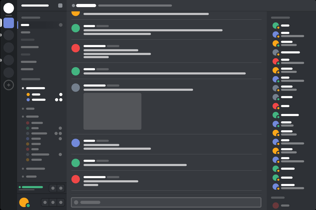
Discord: Servers | Rooms | Current room | People![enter image description here
Outlook web app: Folders | Mails | Single mailenter image description here

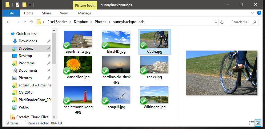
Windows explorer (arguably): Folders | Files | Detail/previewenter image description here
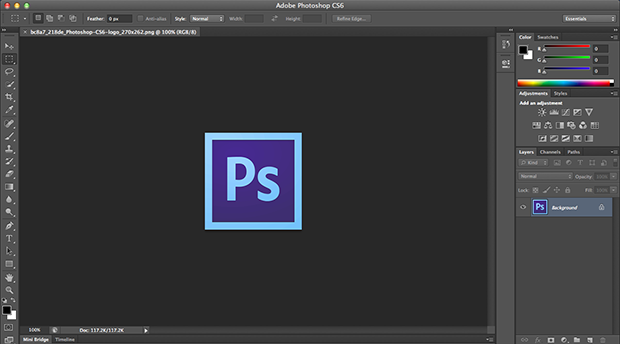
Photoshop: Toolbar | Canvas | Toolbar enter image description here

5
  • I think the examples that you have provided (other than the Photoshop example) are pretty much the same as the Miller columns. Can you explain the distinction?
    – Michael Lai
    Commented May 13, 2016 at 1:59
  • The only one that I can think of which doesn't have the direct link between each of the columns is the "iTunes column", but I think that is more as the result of the converging of multiple legacy design patterns rather than intent.
    – Michael Lai
    Commented May 13, 2016 at 2:01
  • When I worked on Outlook:Mac, we simply referred to it as "three-column view" (or, more generically, "n-column view"). When Apple Mail made that view available, they called it "widescreen view".
    – nadyne
    Commented May 13, 2016 at 18:38
  • @MichaelLai It's not that those aren't Miller columns, they are. But they're very tall, in contrast to something like upload.wikimedia.org/wikipedia/en/f/f7/… What I'm looking for partially overlaps with Miller columns, but also applies to non-navigation. You're right though, I should find better examples. Commented May 13, 2016 at 21:26
  • 2
    I would simply call those things "columns," and call the whole layout "multi-column" or something. I would probably use the words "pane" or "bar" or "panel," too. If there is a conventional/traditional word for this, I've never heard it. Like @MichaelLai said, I think these layouts are just a natural extension/combination of other design patterns: vertical scrolling rather than horizontal, "drilling in" from left to right, including secondary information in the margins, etc.
    – Nate Green
    Commented Jun 3, 2016 at 20:42

3 Answers 3

1

Most of your examples showcase a modified version of Master/Detail flow. Out of multiple emails/ photos, a single one is selected and shown on the right. Just that, another column is added to provide Navigation.

These are mostly utilised for Tablets or Phablets in Landscape orientation to adapt to the screen estate.

With respect to the Three Columnar Layout, it is rather a complex one since you are including a combination of different layouts. 3/4th of your Layout is a Master/Detail and the other one is a ListView or a NavigationDrawer with options to navigate between folders/ users/ etc.

Here's a SO answer for reference along with a Tutorial to implement it. You will need to build the Custom Layout from scratch. This is the result of making the layout with the Master/Detail and NavigationDrawer reference.

enter image description here

0

When elements are crammed together like tiles in a mosaic instead of overlapping like Windows 95, it's called a Tiling Window.

You might also see it called Non-blocking UI, or Non-overlapping UI, or Non-Modal Interface or Non-overlapping User Interface.

Tiling windows also tend to be in a tight relationship with the non-blocking philosophy which is slightly different. Non-blocking programs put an emphasis on "not blocking" the user from making actions in any of the panels in any order. Sometimes in the case of a user error, you'll be blocked from proceeding until you make a correction, but in the most true non-blocking software, only the panel which encounters a block will fail while the others can continue to operate smoothly without that panel until the user gives the computer further direction. That's maybe more than you bargained for in an answer, but I wanted you to understand that it's not just a "look." It's a very old philosophy that has influenced user interfaces since the early days. Certain languages are very good at letting lots of interactions go at once while others get stuck if anything running in the main thread crashes. Without "asynchronous" programming paradigms, it wasn't feasible or reasonable to design an asynchronous input-output user interface.

0

Apple refers to the two pane version as a split view interface and supports it with the UISplitViewController class for iOS development. It is also supported by Xamarin. Natasha Murashev has an introduction over at NSHipster.

Personally I think the two pane layout is hugely productive as a master-detail flow as referred by Swapnil Borkar. I have looked for HTML frameworks, but with limited success.

Your Answer

By clicking “Post Your Answer”, you agree to our terms of service and acknowledge you have read our privacy policy.

Not the answer you're looking for? Browse other questions tagged or ask your own question.