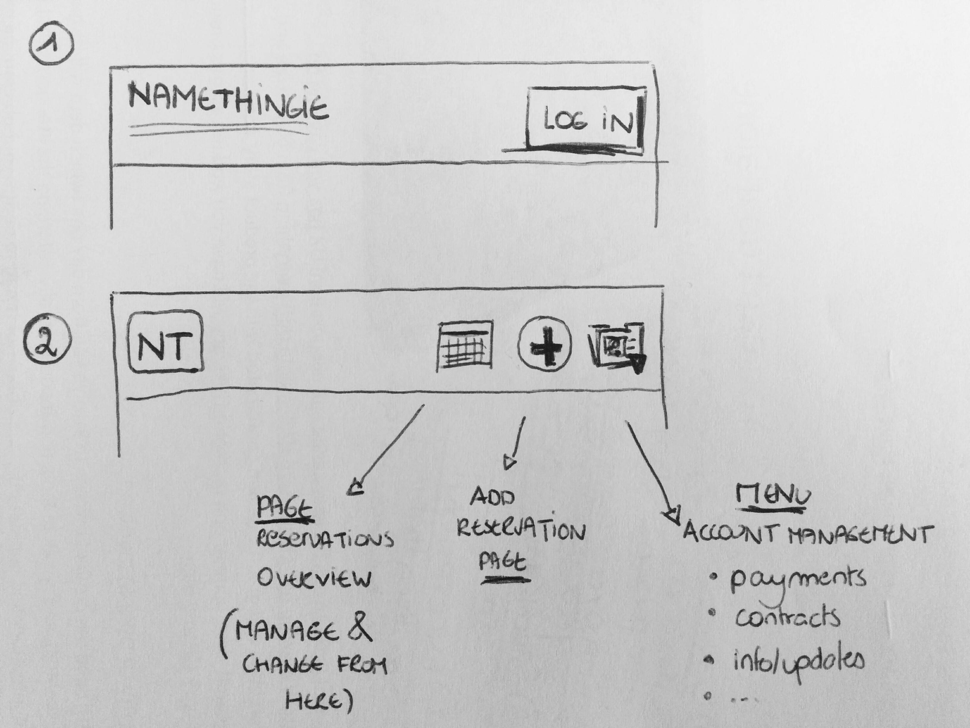
I believe there are two different situations here,
- User is not logged in ---> Very important
- User is logged in, and wants access or change information ---> Less important
When your user is not logged in yet, focus on trust, benefits & login:
- Show them they are on the right side (Logo & brand-coloured top bar)
- Give them an easy way to log in or register.
In the site content you can explain the benefits of doing this 'administration' online rather than in by phone/in person at the day care location, or tell them how to get their registration details.
Once your user is logged in, focus is on the actions:
I'm assuming they have just logged in, or are a recurring user that is familiar with the website. You can leave to logo out at this point, if you stick to the brand-coloured top bar and a recognisable derivative from the logo (eg the favicon?).
You then get more than enough room for about three dedicated action buttons (and a quick-access menu, if you insist)
They are coming most likely to check on or add reservations, so I'd definitely opt for the following to be permanent - and direct - available: a comprehensible overview of their 'upcoming' reservations and add a reservation.
Details of contracts, payments, ... seem less frequent actions and can be accessed from the menu, or can be considered to be part of the 'account'. You'd then just have the brand-icon on the left, and three access & action icons on the right:
- Bookings overview (from there you can go into detail, reschedule, ..)
- Add reservation (seems the priority action to me)
- Your profile/account (a dropdown menu with payments, contracts, ... )

The 'your profile/account' can indicate when there is new information available, or action needs to be taken (updates, payments due, ..).
-- live example --
As an example of this 'contextually aware' top bar (user logged in/out), the Mailchimp mobile site springs to mind, however you will probably not need such a push to 'sign up for free', thus can use the full logo on homepage. (logo left, log in option on the right)

