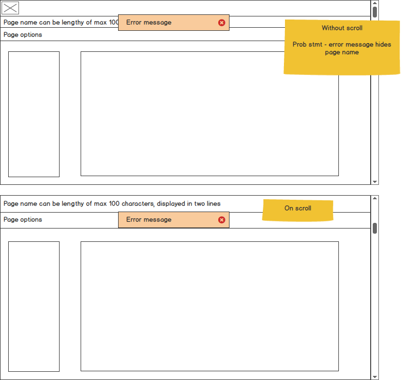
Need to place error message. (also info message, success message) on page submission. or any error occurrence on the page.
Problem statement - Right now, in the layout if we show the error message on top(image) it hides page name.
Does hiding page name is not acceptable while showing error message?
Can anybody help me out for handling this scenario? Happy to help with further info, if needed! ]1
]1
-
Is this a web page?– Varun NairCommented Mar 28, 2016 at 11:27
-
I like to have error message overlay the page, so user will always see it no matter where they scroll.– YogaPandaCommented Mar 30, 2016 at 20:54
-
yes it is a web page– Sunil kvCommented Apr 13, 2016 at 12:33
5 Answers
Locate the error next to the call-to-action which caused the error. For instance, user clicks the "Save" button, and the error should be displayed next to that button.
If this is a web application, I agree with the recommendation to place the error notification close to the call-to-action. An alternative thought is to place the error notification flush right so that it is visible (even during scrolling) but does not obscure the page name title text.
If accessibility is important then do both techniques, e.g. message block at the top to help screen readers and in-line where the error occurred for everyone else.
Success messages should be treated differently and ideally should be transient, i.e. fades out after 5 seconds so that the user does not need to manually dismiss it (a user only needs confirmation something was saved). Error messages need to persist until the error has been corrected.
It is always a good practice to place the notification message in the same consistent location. Personally I don't think its too much of an issue to hide the page name unless your error message is related to the page name. The user should be focus on reading the message and nothing else.
Sometimes its unavoidable to hide the information underneath the notification message especially if you have a long message. This becomes even more challenging when you view the notification message on smaller device where white space is limited.
Aside from what Karen has recommended (although I think having a consistent location for notification is key) to place the message next to call-to-action. You could explore using time based notification, to auto dismiss the message after a certain time has elapsed.
I believe user wouldn't kick up a big fuss over the placement of notification message. I would be more concern with guiding the user to rectify the error than anything else.
-
Agree with @adamsoh on the mention about exploring intermittent (time-based) display of the notification, just be sure it's displayed long enough so that the user has time to understand the message implications. Commented Mar 31, 2016 at 22:46
Place it at the top if it applies to the entire page, for example it applies to an entire form in that page. If it applies to a particular module within the page, position it relatively. Positioning it near the save button may not work if the page scrolls up and the save button is at the bottom - then you won't notice the error.
The close button within the error message as you already have in the mock, will be useful to disclose - providing user with control over the popup message. Can consider an error log page where the user can get to view history of messages appeared.
Narrow down the width of the error message so some part of the page title is visible. The user would definitely get hints of what page he/she is currently on.
