28

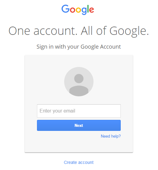
For a while now, logging onto your google account has required you to enter your username and hit next, before entering your password like this:

Google's login form.

Recently yahoo has implemented a similar system.

What are the benefits to this over a standard Username, Password, Login form?

Thanks.

2
  • 1
    @ChethanS. agreed & flagged. Even the answers are almost identical. Commented Mar 23, 2016 at 13:28
  • I have added a lot more explanation and the Yahoo case as well
    – Devin
    Commented Mar 23, 2016 at 20:31

1 Answer 1

28

Both sites are preparing new login features.

Google has made an announcement explaining the reasons behind the 2 steps login process

Today, you sign in to Google on a page that includes both the ‘email’ and ‘password’ fields on the same page. We’ll be gradually splitting those two fields into separate pages in the coming days; the sign-in process won’t change otherwise.

As we’ve said many times, we're working towards introducing new authentication solutions that complement traditional passwords. We’ve already separated the ‘username’ and ‘password’ fields onto separate pages on a successful launch in Android last year. This change to our web sign-in page is another step in that direction.

To help make sign-in easier and more personal, you may see a screen with your profile picture and full name when signing in to Google. We’ll only show this information if you are signing in from a location or device you’ve signed in from before, like your home computer.
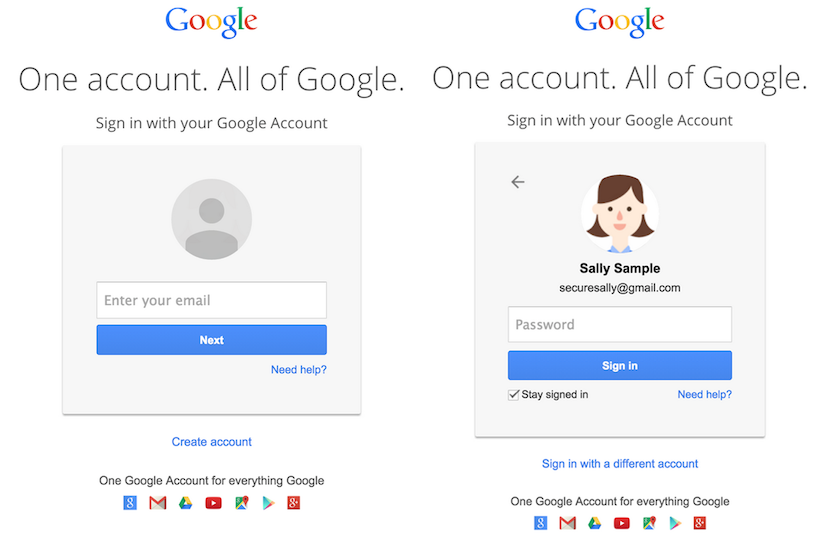
screenshot of 2 step login process

This new Google account sign-in flow will provide the following advantages:

  • Preparation for future authentication solutions that complement passwords
  • Reduced confusion among people who have multiple Google accounts
  • A better experience for SAML SSO users, such as university students or corporate users that sign in with a different identity provider than Google

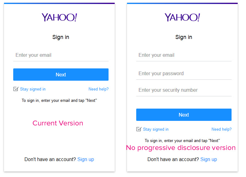
As you will see in both sites, they're basically using the Material Design guidelines (yes, even Yahoo) and serving a card that is the same both on desktop as in mobile. This helps with UI consistency across devices, but also removes cluttering of information on small screens. Also, it allows for logical "step by step" behavior, which is specially needed for people enabling Yahoo 2 steps verification (not to be confused with the 2 screens needed for login, these steps are security measures rather than UI steps)

Please note that 2 steps verification is becoming the new standard for Google, Yahoo, Apple and more to follow. So when considering this need and the fact that a huge number of users will use this feature on small devices, you end with this kind of pattern (which in fact is a progressive disclosure pattern)

Take a look at the current version and what would happen by keeping it all on the same page while using Material Design guidelines:
enter image description here

As you may see, there's a huge difference in cognitive load between both versions. And this is solved by using a "step approach" (or again, progressive disclosure)

10
  • 4
    Ah, thanks for the link. So its less a UX decision and more a functionality decision, which is also evident by the universal outrage in the comments of that thread haha.
    – Loocid
    Commented Mar 23, 2016 at 2:22
  • 11
    Well, this isn't an answer. That quote doesn't list a single tangible advantage for 2-page logins. "Preparation for future authentication solutions" doesn't explain why other websites pull this crap.
    – Navin
    Commented Mar 23, 2016 at 5:13
  • 6
    @Navin actually it does explain it quite well - passwords are no longer the only possible way to authenticate, users with single sign on (SSO) solutions will only ever have to enter a username, and not a password, so having separate screens for these makes sense. Username/password users get a second screen to enter a password, SSO users just get the first screen. As they allude to, this also makes it easier to enable alternatives to passwords (e.g. RSA tokens or Google's Authenticator app). Commented Mar 23, 2016 at 8:56
  • 5
    Some banking websites use this style of login for reverse authentication - to authenticate the website to the user (prove to the user the website is legit) they will display an image or phrase that you've chosen so that you know it's the real website. The logic being, if it's a phishing site it won't know what to display to you so you know something is wrong. On its own it's not a foolproof method but coupled with anti-proxying measures it greatly reduces phishing attacks.
    – slebetman
    Commented Mar 23, 2016 at 9:26
  • 6
    "A better experience for SAML SSO users, such as university students or corporate users that sign in with a different identity provider than Google". At my workplace, we use Office 365 in such a situation, which has a username and a password field, however, when you filled out your account name, you shouldn't use the password field, because you will be directed to a page of the company. In such a case, not having the password to begin with is definitely a better UX.
    – Jasper
    Commented Mar 23, 2016 at 10:07

Not the answer you're looking for? Browse other questions tagged or ask your own question.