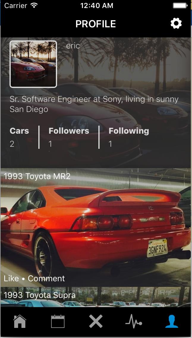
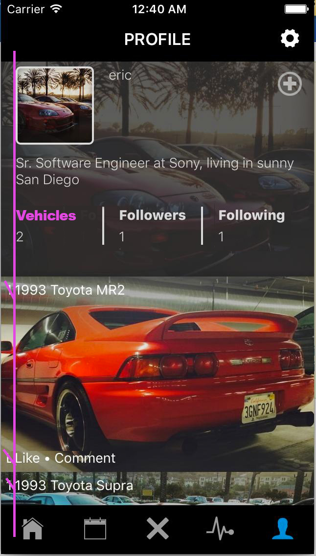
I am really trying to make it simple and elegant but I can't decide where to place this button where a user can add there car to there profile. I attached a screenshot of my mobile app, any answer will be very helpful.
3 Answers
My humble thoughts. Align the left side better and add a sort of '+' sign in the top right. Maybe make it subtle though so as to not distract the eye too much?
From your Image, I would recommend placing the Add car button with a small car icon with a + next to it below the "cars" text counter, grouping things together like this makes the user more likely to understand what it is they are doing, either that or under the Gear icon and a clear text option that says "add car" or "add my car". From the above answer I would use either this with the car icon or my suggestion.
From the above answer I would use either this with the car icon or my suggestion.t should be positioned on the black background so it is easily spottable. Also, use "+" icon
-
If you can please reference the poster or quote part of the answer just in case the placement of answers changes.– MayoCommented Jul 22, 2016 at 11:09


