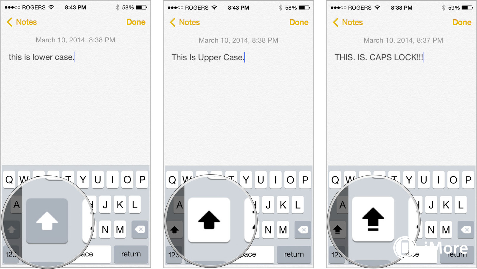
Overall, it seems that it was a design choice by Jony Ive and his design team, however it does seem to be a very hot button topic and a confusing one at that.
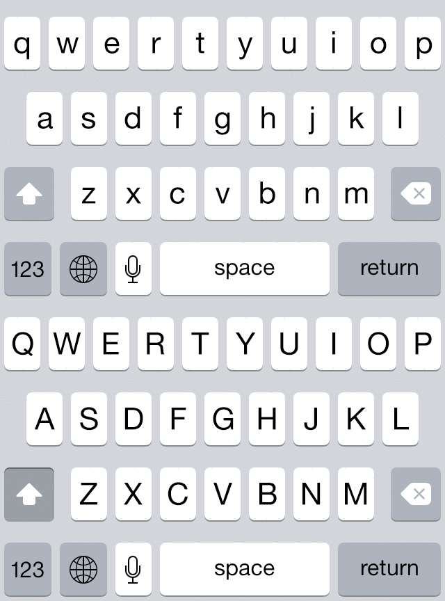
As you can see below, they do provide some kind of feedback, however it blends in with the other keys making it hard to understand what is happening. The folks over at Future Workshops did a quick usability study and found that even Android and novice iPhone users (i.e. folks who have never seen an iPhone shift key and don't have prior experiences with them) had trouble with the shift key.
 (image credit)
Overall, it seems as though the design choice was purely aesthetic and to give the keyboard a more uniform feel. Despite this choice, other more appropriate solutions have been offered, including the one by Geoff Teehan at Medium.
He offers a solution that shows the shift button as being physically pressed in as opposed to just changing color (See Below). This would provide the user with some sort of visual affordance and let them know that something is actually happening as opposed to having the user just guess what might have happened.

(image credit)

 (
(
