3

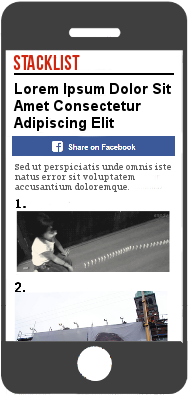
I have a blog that focuses on list articles (10 Photos of Cats You Like) that are structured like this:

> Title
> Facebook Share
> Lead Text 
> Image #1
> Image #2
> Image #3
> Image ..
enter image description here

I want to insert an ad at the beginning of the article (for smartphones only), but I don't know where.

Here are the options I thought of:

  1. Between the Title and the Facebook Share button
  2. Between the Facebook Share button and the Lead Text
  3. Between the Lead Text and the Images

Of course, having an ad-free site would be the best option in terms of user experience. But if I'd have to place an ad in the beginning, where should it be?


2
  • 1
    Sidenote : move that share button at the bottom. No one will directly share your content without first reading it, and forcing them to scroll back up to hit the share button once they read it is a waste of time.
    – user42730
    Commented Mar 28, 2015 at 13:51
  • Suggestion: just don't use ads because they suck
    – UXerUIer
    Commented May 18, 2017 at 17:36

4 Answers 4

3

First of all, ads should always be placed on peripheral vision, never at the place where a user will directly look.

Second, please if possible disable ads when a user views your blog on mobile. Your fill rates might go down on account of poor CTR.

Have a look at this award wining blog writer: http://www.matthewwoodward.co.uk/ He has ads placed in peripheral vision, and when you open this blog on mobile, the ads disappear. It feels so good reading his blog, ads occupy too much mobile real estate, no matter what their size.

2

Since this is targeting smartphones only there is really no such thing as peripheral vision.

Regardless of where you put the ad it is pretty much going to get in the way of why the user is there in the first place so I would try and empathize with the user and let them know why the ad is there while encouraging without demanding that they click it.

If any site tries to make an ad look like part of their site then I lose all trust in them and never visit again regardless of content.

So whatever you do make sure the ad is clearly marked and looks different from the rest of your page...

enter image description here

Edit: also thanks for not putting the 10 items in the list on 10 different pages with 100 ads on each page. no content is so good that I want to wade through tons of garbage to see it!

1
  • Some ad networks don't allow you to have phrases that encourage people to click ads, since this can lead to inflated click through rates with lower conversion rates for the ad's destination. Commented Aug 4, 2015 at 7:16
0

It should be placed between the lead text and the images. This insures that

  1. The user sees it when he/she goes to scroll down,
  2. It is in a general non-distracting area of the app, and
  3. It is in the centre of the app, where the user will look first.
-1

I always place the ads where the user will look the most.

I'm not the type which place the ad above the title or right after.

I like to place the ad under the main image but I use caption for image, and I place another ad on the right side of the main image.

I tried different options to place the ad in a social corner, between text or at the end of it, but it didn't worked well.

1
  • 4
    Why even bother with actual content at all? Just put ads everywhere.
    – JonW
    Commented Mar 28, 2015 at 12:39

Not the answer you're looking for? Browse other questions tagged or ask your own question.