1

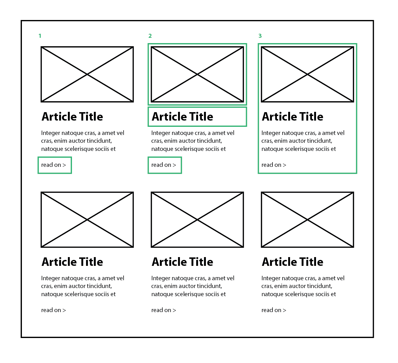
From an index page of articles - for example a blog, or in my specific case a list of services pages - what specifically should link the excerpt to the full article. Take these 3 options for example: (green boxes indicate clickable links)

enter image description here

  1. Only the 'read on' link takes you to the full article.

  2. The thumbnail image, the article title and 'read on' all independently link to the main article

  3. The entire area is clickable and takes you to the full article.

My problem with the first option is making the 'read on' text prominent enough without making it a big CTA button. Leaving the link as plain text can make the link blend in to the excerpt text and get looked over. Changing the color/size/weight etc may be enough to emphasize the link.

With the third option my thinking is that the 'read on' link is redundant, but then how do you let the user know that they can click through to the full article. Another possible concern is that most of the screen area is now clickable, maybe that is a problem, maybe not.

The second option seems a compromise between the other two extremes but I'm not sure if there is a better solution?

2 Answers 2

2

I would go with option 2:

That is what users are used to

UX is a place where re-inventing the wheel does not work very much. People are used to certain standards and they will expect the same from other website too. In most of the blogging sites out there that is what they get.

Most of the users might either click the image,title or read more button. ( The number of people who click the ream more button is comparatively less ).

Why not option 1:

As mentioned above , users will click on the title or the image , and if they are not getting the expected behaviour this can affect the usability.

Why not option 3

Option 3 is decent , but not as good as option 2. You can find a few websites that provides option 3. Consider this scenario - User is trying to read the excerpt and places the mouse over it and clicks on it accidentally. He would not want to open the article , but an accidental click can open the page. People have tendency to place mouse pointer where they read. There is a remote chance of accidental click which you can avoid.

2
  • +1 - your last point about option 3 is what I was thinking, users may try to highlight some text, or may be on touch screen and try scrolling, lots of reasons not to have giant blocks of the page be clickable links.
    – DasBeasto
    Commented Feb 11, 2016 at 13:19
  • If the OP is going for a mobile first approach, option 3 is definitely the best.
    – UXerUIer
    Commented Feb 11, 2016 at 14:17
0

I would go for either 2 or 3. Option 2 is quite a standard on websites with articles - it is usually assumed that at least the title would be clickable. The "read on" in 3 is not redundant in my opinion because it suggests not only that these two words are clickable but also that there is more story behind it - thus, even if the entire area is clickable, the readers will first want to know that they WANT to click it. The only downside of design 3 would be that more people will click the link by accident, just by scrolling the page (especially on smartphones and tablets), which could annoy them.

My recommendation would therefore be option 2, and you could add the "..." at the end of the last word that will still be visible on this page (e.g. "sociis et ...") - make sure the sentence ends half-way, it will intrigue more readers to click through.

Your Answer

By clicking “Post Your Answer”, you agree to our terms of service and acknowledge you have read our privacy policy.

Not the answer you're looking for? Browse other questions tagged or ask your own question.