29

Let's say I have a profile screen with two lists: one for Friends and another for Hobbies. This is just an example. It could as well be a Customer screen with Suppliers and Orders. I'm looking to discover the pros and cons of different patterns to solve a common problem.

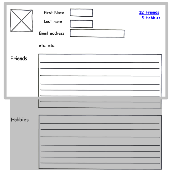
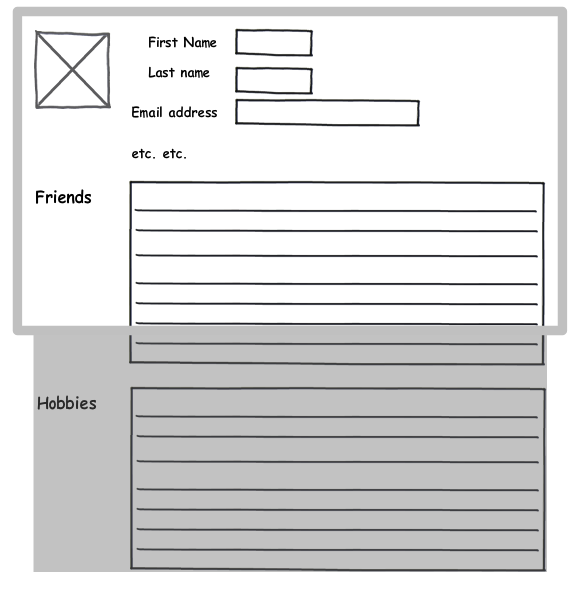
Solution A: Display everything on a scrollable page

(The lists themselves do not scroll, though they may be paged if they are excessively long)

Scrollable page

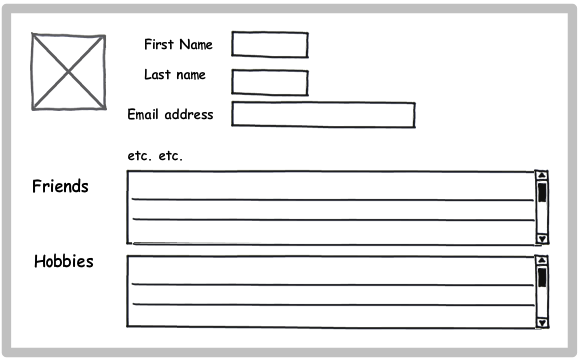
Solution B: A screen with two scrollable list boxes

(The screen does not scroll)

Screen with two list boxes

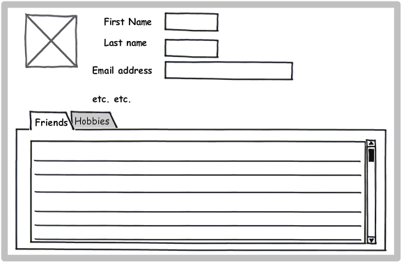
Solution C: A screen with a tab for each list

(The screen does not scroll)

Screen with tabs

Notes

Solution A is the typical approach for a web application, while B and C are common in desktop apps. I'm researching approaches for a rich client application which can use either model. What is the expected convention is less important to me; I'm interested in which pattern is superior from purely a usability standpoint.

My observations so far:

  • A emphasizes the content, while B and C emphasize the structure of the information. With A, the user may not realize that Hobbies are available until he scrolls the screen.

  • A allows the user to see more of the specific information (he can see a whole screen full of Friends). B and C allow him to see less information, but see it in context (the top portion of the Profile never gets scrolled out of view).

  • B ensures that the user will see at least some of both Friends and Hobbies without having to do anything else (scroll or click).

  • If there are only a few Friends and Hobbies, A becomes essentially equivalent to B. If there are lots of Friends and Hobbies, B requires the user to scroll two areas of the screen. C will always require user action to see Hobbies.

What are your thoughts?

4 Answers 4

7

B is best for most cases. It allows users the most flexibility and lets them keep desired data from one class (Person, Friends, Hobbies) in view while scanning through another via scrolling. B also avoids having to page if the list is long, which adds complexity and other disadvantages.

  • Solution A makes the top “principal” content (the one with First Name, Last Name, etc.) scroll out of view when the user looks at more details. As a result the users may lose track of exactly whose Friends and Hobbies they’re looking at.

  • Solution A also means that, depending on the window size, user may not even become aware that Hobbies are shown if there are a lot of Friends.

  • Solution A implies the pane title and table column headers can scroll out of view, and the user can become confused on what exactly they're looking at (Friends or Rivals? Ship Date or Receive Date?).

  • Solution A and C don’t allow the user to see Friends and Hobbies of interest at the same time, which may be problematic for some tasks. For Solution A, this happens when there are large numbers of Friends and Hobbies. To check out the Hobbies, the users lose their respective places among the Friends, and vice versa. Solution B allows users to scroll to the desired point in each list to view each.

  • Solution C forces you to pick a compromise size for Hobbies and Friends. If Persons tend to have a lot of one and few of the other, you're going to either waste space or force more scrolling. Solution B (and A) lets you choose the best default size for Hobbies and Friends independently.

  • Solution B means scrolling two areas of the screen, but that’s more an advantage than a disadvantage. It provides on average shorter scrolling distances for faster scanning. If the users decide to stop scanning Friends (or skip Friends entirely) and start scanning Hobbies, they don’t have to scroll by all the remaining Friends to just find the Hobbies, like they would with A.

  • Solution A and C become problematic if your data has a hierarchy depth greater than two (e.g., you want to show the Family Members of each Friend). For Solution C, now you have tabs inside of tabs, which can look confusing. For Solution A, now you separate each Friend with a list of Family Members, which makes it harder to compare Friends and longer to scan for a desired Friend –and even longer to skip all the Friends and go straight to the Hobbies. If any of your pages goes more than two-deep, go with Solution B for all pages to be consistent within your app.

If the Friend and Hobbies tables are relatively narrow, then one variation of Solution B is to display the two scrollable panes side-by-side. This forces the two panes to have the same height which may mean some wasted space, but it may waste less space (on the right) than stacking two skinny tables on top of each other. Solutions A and C don't effectively support this option.

For Solution B, the window should by default open with the panes (Person, Friends, Hobbies) sized optimally for the likely number of items in each for the given size of the window. When the user resizes the window, the panes should resize appropriately so the page never gets a scrollbar –only the panes need to be scrolled.

Users should always be able to easily open, close, and resize panes within a window or page to adjust for the contents. You can have a pane closed by default to provide progressive disclosure if its contents are unlikely to be on interest to most users, but generally all panes should by default be open so the user gets a sample of the information the page provides. Even the Person pane at the top should be open/closable/resizable so if users want to, they can fill the entire window with Friends with just a couple clicks (except maybe they’ll resize the Person pane to a sliver to keep the person’s name in view). This eliminates the one advantage Solution A may have over B.

BTW, for either Solution A or B, once have more than two panes, you need some sort of graphic design to indicate what belongs to what –are these Hobbies of each Friend or Hobbies of the Person at the top? Indenting of some form may be used to communicate the difference.

The web has traditionally used Solution A because until recently it was a pain to embed a scrolling region within a page. I don’t think anyone chose it for usability reasons.

I’ve more on Solution B (what I call a master-detail) versus alternatives at Taking Panes.
2
  • 1
    Excellent, thanks! (And your site is a treasure trove of info as well) Commented May 6, 2011 at 8:17
  • I like Solution B but you can make "Friends" and "Hobbies" clickable which will expend scrollable list boxes bigger or popup new box (full screen) Commented Feb 19, 2012 at 13:21
23

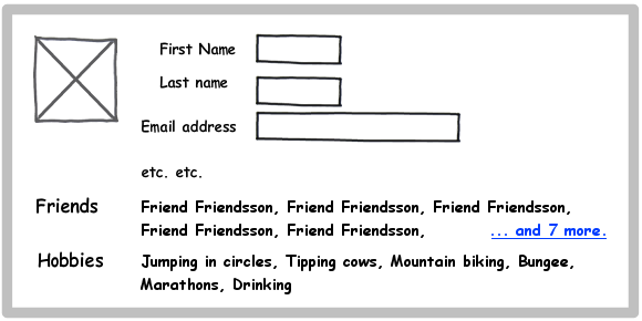
Why not show a few items from each list, and collapse the rest? Alternatively, use an accordion, but it may not always work.

enter image description here

7
  • +1 Good one. Better than strategy B, IMHO.
    – jensgram
    Commented May 5, 2011 at 7:54
  • +1 Thanks, haven't thought about the accordion. But it may lead to 2 interactions: 1. click to expand, 2. scroll to see the rest of the content Commented May 5, 2011 at 8:07
  • @Jensgram The sketch is not exactly the way I'd do it, but the gist is the same, thanks :) Commented May 5, 2011 at 9:17
  • 1
    @Vitaly Mijiritsky I wouldn't use Comic Sans for my UIs either. Badum-tscccch :)
    – jensgram
    Commented May 5, 2011 at 9:35
  • I like this solution, but I'm assuming Friends and Hobbies are tables with multiple columns of data (Orders and Customers is a better example of that). Commented May 5, 2011 at 12:12
5

Very comprehensive question!

A few thoughts:

  1. Some of your (valid) observations depend on the number of friends / hobbies. Have you calculated an average of these numbers based on current data (if any)?
  2. Consider running an A/B/C testing with different amounts of data. You may find that neither of the strategies make a difference ... or that you have missed some crucial differences between some of them.
  3. You could probably draw attention to what's below the fold in strategy A (see sketchy sketch below). You could use a catchy decoration and/or heading to draw attention to the links, e.g., "[First Name]'s social life":

enter image description here

1
  • 1
    +1 Thanks! I especially like the preview/link of information contained below Commented May 5, 2011 at 8:00
4

C looks fine at the first sight. A looks native but looks risky depending on content. B has a "trap" feeling.

You may try option A, with progressive disclosure. So, user can see all the content headers in a non-scrolling page ath the beginning, and may go on with the expanding desired content. Also it may help loading the page faster.

4
  • Thanks! What do you mean by "looks risky" concerning A? Commented May 6, 2011 at 8:18
  • I mean, you cant predict the height of "friends" box because of changing content. So it's a little it risky for design...
    – ARTniyet
    Commented May 12, 2011 at 12:48
  • Design A assumes that both lists size to the length of their contents (the lists never scroll; only the screen in its entirety scrolls) Commented May 12, 2011 at 12:50
  • I agree that B has a "trap" feeling. The two scrollable views easily occur to be too narrow. However, B might work if the lists can be expanded by dragging some handles, like e.g. the comment fields on this site.
    – agib
    Commented Oct 17, 2011 at 9:08

Your Answer

By clicking “Post Your Answer”, you agree to our terms of service and acknowledge you have read our privacy policy.

Not the answer you're looking for? Browse other questions tagged or ask your own question.