Removed unnecessary thanks
Source Link
JohnGB
  • 68.6k
  • 26
  • 185
  • 297

Let's say I have a profile screen with two lists: one for Friends and another for Hobbies. This is just an example. It could as well be a Customer screen with Suppliers and Orders. I'm looking to discover the pros and cons of different patterns to solve a common problem.

Solution A: Display everything on a scrollable page

(The lists themselves do not scroll, though they may be paged if they are excessively long)
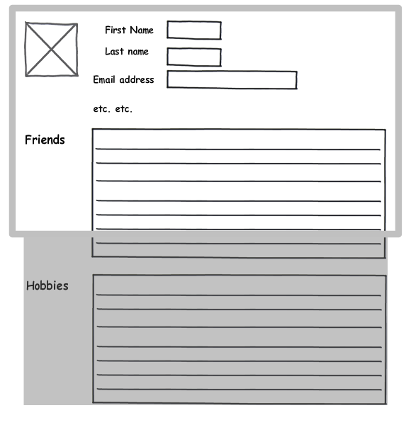
Scrollable page

Solution B: A screen with two scrollable list boxes

(The screen does not scroll)
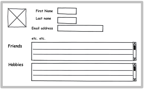
Screen with two list boxes

Solution C: A screen with a tab for each list

(The screen does not scroll)
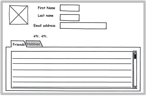
Screen with tabs

Notes

Solution A is the typical approach for a web application, while B and C are common in desktop apps. I'm researching approaches for a rich client application which can use either model. What is the expected convention is less important to me; I'm interested in which pattern is superior from purely a usability standpoint.

My observations so far:

  • A emphasizes the content, while B and C emphasize the structure of the information. With A, the user may not realize that Hobbies are available until he scrolls the screen.

  • A allows the user to see more of the specific information (he can see a whole screen full of Friends). B and C allow him to see less information, but see it in context (the top portion of the Profile never gets scrolled out of view).

  • B ensures that the user will see at least some of both Friends and Hobbies without having to do anything else (scroll or click).

  • If there are only a few Friends and Hobbies, A becomes essentially equivalent to B. If there are lots of Friends and Hobbies, B requires the user to scroll two areas of the screen. C will always require user action to see Hobbies.

What are your thoughts?

Thanks for your feedback!

Let's say I have a profile screen with two lists: one for Friends and another for Hobbies. This is just an example. It could as well be a Customer screen with Suppliers and Orders. I'm looking to discover the pros and cons of different patterns to solve a common problem.

Solution A: Display everything on a scrollable page

(The lists themselves do not scroll, though they may be paged if they are excessively long)

Scrollable page

Solution B: A screen with two scrollable list boxes

(The screen does not scroll)

Screen with two list boxes

Solution C: A screen with a tab for each list

(The screen does not scroll)

Screen with tabs

Notes

Solution A is the typical approach for a web application, while B and C are common in desktop apps. I'm researching approaches for a rich client application which can use either model. What is the expected convention is less important to me; I'm interested in which pattern is superior from purely a usability standpoint.

My observations so far:

  • A emphasizes the content, while B and C emphasize the structure of the information. With A, the user may not realize that Hobbies are available until he scrolls the screen.

  • A allows the user to see more of the specific information (he can see a whole screen full of Friends). B and C allow him to see less information, but see it in context (the top portion of the Profile never gets scrolled out of view).

  • B ensures that the user will see at least some of both Friends and Hobbies without having to do anything else (scroll or click).

  • If there are only a few Friends and Hobbies, A becomes essentially equivalent to B. If there are lots of Friends and Hobbies, B requires the user to scroll two areas of the screen. C will always require user action to see Hobbies.

What are your thoughts?

added 6 characters in body; edited tags
Source Link
Patrick McElhaney
  • 14.2k
  • 9
  • 51
  • 68

Let's say I have a profile screen with two lists: one for Friends and another for Hobbies. This is just an example. It could as well be a Customer screen with Suppliers and Orders. I'm looking to discover the pros and cons of different patterns to solve a common problem.

Solution A: Display everything on a scrollable page

(The lists themselves do not scroll, though they may be paged if they are excessively long) ![Scrollable page][1]

Scrollable page

Solution B: A screen with two scrollable list boxes

(The screen does not scroll) ![Screen with two list boxes][2]

Screen with two list boxes

Solution C: A screen with a tab for each list

(The screen does not scroll) ![Screen with tabs][3]

Screen with tabs

Notes

Solution A is the typical approach for a web application, while B and C are common in desktop apps. I'm researching approaches for a rich client application which can use either model. What is the expected convention is less important to me; I'm interested in which pattern is superior from purely a usability standpoint.

My observations so far:

  • A emphasizes the content, while B and C emphasize the structure of the information. With A, the user may not realize that Hobbies are available until he scrolls the screen.

  • A allows the user to see more of the specific information (he can see a whole screen full of Friends). B and C allow him to see less information, but see it in context (the top portion of the Profile never gets scrolled out of view).

  • B ensures that the user will see at least some of both Friends and Hobbies without having to do anything else (scroll or click).

  • If there are only a few Friends and Hobbies, A becomes essentially equivalent to B. If there are lots of Friends and Hobbies, B requires the user to scroll two areas of the screen. C will always require user action to see Hobbies.

What are your thoughts?

Thanks for your feedback!

Let's say I have a profile screen with two lists: one for Friends and another for Hobbies. This is just an example. It could as well be a Customer screen with Suppliers and Orders. I'm looking to discover the pros and cons of different patterns to solve a common problem.

Solution A: Display everything on a scrollable page

(The lists themselves do not scroll, though they may be paged if they are excessively long) ![Scrollable page][1]

Solution B: A screen with two scrollable list boxes

(The screen does not scroll) ![Screen with two list boxes][2]

Solution C: A screen with a tab for each list

(The screen does not scroll) ![Screen with tabs][3]

Notes

Solution A is the typical approach for a web application, while B and C are common in desktop apps. I'm researching approaches for a rich client application which can use either model. What is the expected convention is less important to me; I'm interested in which pattern is superior from purely a usability standpoint.

My observations so far:

  • A emphasizes the content, while B and C emphasize the structure of the information. With A, the user may not realize that Hobbies are available until he scrolls the screen.

  • A allows the user to see more of the specific information (he can see a whole screen full of Friends). B and C allow him to see less information, but see it in context (the top portion of the Profile never gets scrolled out of view).

  • B ensures that the user will see at least some of both Friends and Hobbies without having to do anything else (scroll or click).

  • If there are only a few Friends and Hobbies, A becomes essentially equivalent to B. If there are lots of Friends and Hobbies, B requires the user to scroll two areas of the screen. C will always require user action to see Hobbies.

What are your thoughts?

Thanks for your feedback!

Let's say I have a profile screen with two lists: one for Friends and another for Hobbies. This is just an example. It could as well be a Customer screen with Suppliers and Orders. I'm looking to discover the pros and cons of different patterns to solve a common problem.

Solution A: Display everything on a scrollable page

(The lists themselves do not scroll, though they may be paged if they are excessively long)

Scrollable page

Solution B: A screen with two scrollable list boxes

(The screen does not scroll)

Screen with two list boxes

Solution C: A screen with a tab for each list

(The screen does not scroll)

Screen with tabs

Notes

Solution A is the typical approach for a web application, while B and C are common in desktop apps. I'm researching approaches for a rich client application which can use either model. What is the expected convention is less important to me; I'm interested in which pattern is superior from purely a usability standpoint.

My observations so far:

  • A emphasizes the content, while B and C emphasize the structure of the information. With A, the user may not realize that Hobbies are available until he scrolls the screen.

  • A allows the user to see more of the specific information (he can see a whole screen full of Friends). B and C allow him to see less information, but see it in context (the top portion of the Profile never gets scrolled out of view).

  • B ensures that the user will see at least some of both Friends and Hobbies without having to do anything else (scroll or click).

  • If there are only a few Friends and Hobbies, A becomes essentially equivalent to B. If there are lots of Friends and Hobbies, B requires the user to scroll two areas of the screen. C will always require user action to see Hobbies.

What are your thoughts?

Thanks for your feedback!

Tweeted twitter.com/#!/StackUX/status/66056705166950400
Source Link
Tony the Pony
  • 915
  • 1
  • 11
  • 15

Multiple lists on one screen -- best approach?

Let's say I have a profile screen with two lists: one for Friends and another for Hobbies. This is just an example. It could as well be a Customer screen with Suppliers and Orders. I'm looking to discover the pros and cons of different patterns to solve a common problem.

Solution A: Display everything on a scrollable page

(The lists themselves do not scroll, though they may be paged if they are excessively long) ![Scrollable page][1]

Solution B: A screen with two scrollable list boxes

(The screen does not scroll) ![Screen with two list boxes][2]

Solution C: A screen with a tab for each list

(The screen does not scroll) ![Screen with tabs][3]

Notes

Solution A is the typical approach for a web application, while B and C are common in desktop apps. I'm researching approaches for a rich client application which can use either model. What is the expected convention is less important to me; I'm interested in which pattern is superior from purely a usability standpoint.

My observations so far:

  • A emphasizes the content, while B and C emphasize the structure of the information. With A, the user may not realize that Hobbies are available until he scrolls the screen.

  • A allows the user to see more of the specific information (he can see a whole screen full of Friends). B and C allow him to see less information, but see it in context (the top portion of the Profile never gets scrolled out of view).

  • B ensures that the user will see at least some of both Friends and Hobbies without having to do anything else (scroll or click).

  • If there are only a few Friends and Hobbies, A becomes essentially equivalent to B. If there are lots of Friends and Hobbies, B requires the user to scroll two areas of the screen. C will always require user action to see Hobbies.

What are your thoughts?

Thanks for your feedback!