1

I am working on an web-application form which represented as table rows. These table rows hold item information and can be checked or unchecked. When saved, all checked items are set to be seen by another user that can complete these items. See Example:

+-----+--------+-------------------------+-------------------+
|     | Item # | Description             | Completed         |
+-----+--------+-------------------------+-------------------+
| [ ] | Item 1 | Description of the item | -                 |
+-----+--------+-------------------------+-------------------+
| [x] | Item 2 | Description of the item | 2 weeks ago       |
+-----+--------+-------------------------+-------------------+
| [ ] | Item 3 | Description of the item | 2 weeks ago       |
+-----+--------+-------------------------+-------------------+
| [x] | Item 4 | Description of the item | 6 months ago      |
+-----+--------+-------------------------+-------------------+
| [ ] | Item 5 | Description of the item | 6 months ago      |
+-----+--------+-------------------------+-------------------+

All items have one timespan limit setting which indicates the 'freshness' of the item. Let's say it set to '1 month'.

I want to provide some visual feedback for the user of this screen so that he/she understands that items 2 and 3 are too 'fresh' to be set for another user (because another user completed those 2 weeks ago and our timespan is set to 1 month).

I've tried different icons but all of them do not represent the 'freshness' or 'unfreshness' of the item. I've also tried different suggestions from UX. At the end I decided to solve this problem by adding a piece of text in the description but now it looks too bulky.

Question is: is there some kind of visual that can represent the freshness of an item and will not confuse the user of this screen with 'read/unread' or 'new/old' items?

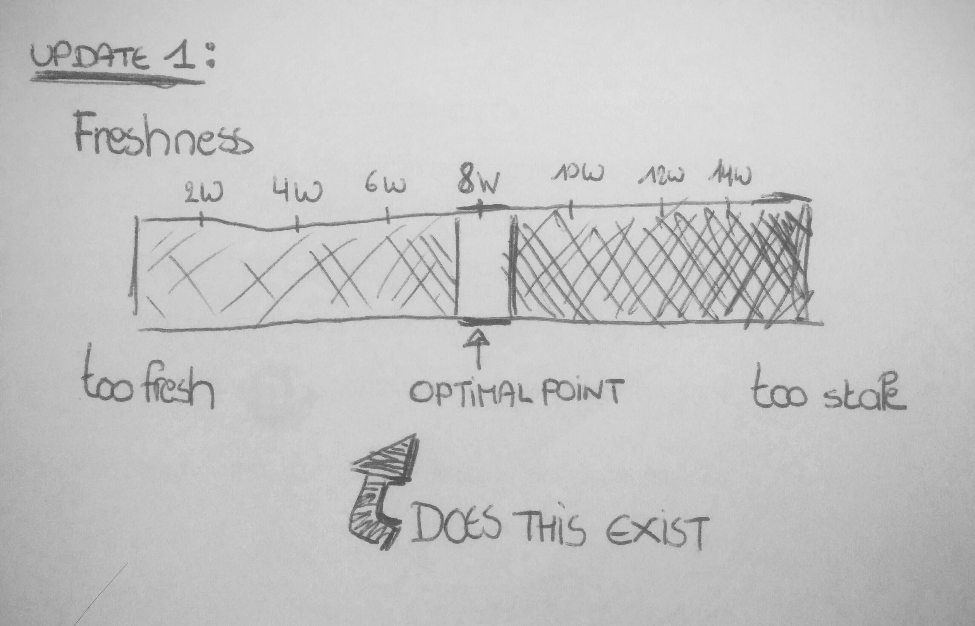
Update 1: I should've mentioned that user must still be able to select/check the Item, even if it's too 'fresh'. So hiding checkbox won't do.

4 Answers 4

2

Suggestion 1: Use the checkbox space?

If I understand correctly, when items are fresh, they can't be checked & send to other users, so you will not need a checkbox on those, or have the checkbox greyed out?

Can you not use that space then to indicate 'freshness'? A light, greyed out circle containing the item's 'freshnesh' in days (eg 24d) or weeks (eg 2w).

Drawback there though, is that there is an indication of 'unfreshness' only by the fact that there is a checkbox available. No indication of how 'unfresh' an item is. However, if you feel an item should be urgently shown to another user (as it is too unfresh) you could highlight those checkbox fields?

Definitely make the 'checkbox' column sortable by freshness then as well. (As checking an item and sending it to another user is a way to update freshness as far as I gather.)

update 1: image to illustrate my question in the comments freshnessoptimalpoint

6
  • Hi Ann, thanks for your response. I forgot to mention that user must still be able to select (check) the item even if it's 'fresh'. The indicator of 'unfreshness' is just a reminder but user must decide herself whether to select or not. I'll update my question.
    – Ivan
    Commented Oct 16, 2014 at 12:41
  • Drats, there goes my great idea. But I do have an additional question: do you want to encourage a certain 'amount' of freshness? (eg. optimally all items are re-freshed every 2 months, not too often or too little.) That would be an interesting given to work with, to not only visually indicate freshnesh, but also encourage people to achieve a certain level of freshness through the design.
    – Ann Wuyts
    Commented Oct 16, 2014 at 12:55
  • and @Ivan Does "freshness" equals the concept of "last updated"?
    – Ann Wuyts
    Commented Oct 16, 2014 at 13:11
  • An Item in this case is a questionnaire that can be prepared by, let's say, 'user A' and can be completed by 'user B'. When the 'user B' completes the questionnaire, 'user A' will see the completion date. In order to prevent 'user A' from sending the questionnaire to 'user B' again, within a certain amount of time, I would like to visually warn 'user A' that 'user B' has recently filled in the questionnaire. So actually I want to discourage 'user A' from sending again the same questionnaire.
    – Ivan
    Commented Oct 16, 2014 at 13:19
  • Also: 'freshness' is set in an admin interface per questionnaire category, so all questionnaires within a category have the same 'freshness'.
    – Ivan
    Commented Oct 16, 2014 at 13:23
1

Consider changing the concept. "Freshness" is generally seen as a positive - how can something be "too fresh"? It's not a natural concept for most users. Consider an aged product like wine or cheese "too fresh" is not really used. Rather the concepts are "not ready", "not optimal", "cellar for a while", "ready at "

If the system concepts better match between user expectations, it is normally easier to design a UI. The concept here seems to require "Can set an item for another user? => 'ready now' or the 'wait time until can do this is X'

A simple UI is to have a column "set user" and display a 'tick' or an 'hourglass' symbol. Amount of delay can either be listed in text next to the "hourglass" or on mouse over / touch of hourglass symbol.

Slightly more sophisticated is to show different hourglass symbols with the sand further down as delay is almost finished.

If culturally an hours-glass is possibly not understood, then a "clock time" symbol can do the same job.

1

If you are not already using row colours to provide information, perhaps you could use multiple shades of one colour to indicate freshness.

The less fresh (riper? I concur with Jayfang, freshness seems a little counter-intuitive here) a question is the stronger/bolder the colour is to draw the user's attention to that question. Conversely, the fresher a question is, the closer to white the row colour is to de-emphasise the question.

1

I ended up splitting the table into two different sections like the following example. I added a header with an explanation of why the items in two sections are different. The original explanation header is longer and explains briefly that questionnaires were answered recently.

+-----+--------+-------------------------+-------------------+
|     | Item # | Description             | Completed         |
+-----+--------+-------------------------+-------------------+
| [ ] | Item 1 | Description of the item | -                 |
+-----+--------+-------------------------+-------------------+
| [x] | Item 4 | Description of the item | 6 months ago      |
+-----+--------+-------------------------+-------------------+
| [ ] | Item 5 | Description of the item | 6 months ago      |
+-----+--------+-------------------------+-------------------+
|                                                            |
| Below are the recently completed questionnaires[..]        |
+-----+--------+-------------------------+-------------------+
| [ ] | Item 2 | Description of the item | 2 weeks ago       |
+-----+--------+-------------------------+-------------------+
| [ ] | Item 3 | Description of the item | 2 weeks ago       |
+-----+--------+-------------------------+-------------------+

It was very difficult to explain to our users (but also ourselves) what exactly the "clock time" icon was, or why is recent row was coloured green, grey or whatever other color.

Thanks for your contributions @Jayfang, @rach and @Ann!

Your Answer

By clicking “Post Your Answer”, you agree to our terms of service and acknowledge you have read our privacy policy.

Not the answer you're looking for? Browse other questions tagged or ask your own question.