2

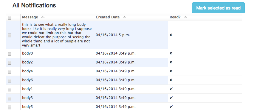
Here's the table:

enter image description here

I don't think the icons in the 'Read?' column are truly clear as to whether or not a message has been read. Am I wrong? I can change the column header, use different icons, or use some text (even just list 'read'/'unread' by each message). Thoughts? Unread messages will be listed first.

3 Answers 3

21

Most email programs (outlook, gmail, yahoo mail) simply use bold vs normal text. I think most people will recognize that as read and unread. I don't think you need any fancy design or labeling for this, just use what's conventionally used by almost everyone else.

enter image description here

enter image description here

1
  • This will cause accessibility issues though since not all users are able to differentiate between bold/ non bold text and greyed out/ non greyed out backgrounds. Commented Mar 26, 2019 at 15:43
3

Use the "open envelope" and "closed envelope" icons to indicate if notification messages have been read, or remain unread. This leverages the user's real world knowledge, and is commonly used in other applications and websites that they will be familiar with. An icon is also quicker to scan than text saying "read" or "unread" (i.e. it requires less thought to understand).

I would also suggest moving the "read?" column to the left hand side, between the selection checkbox column and the message column. People (in western cultures anyway) scan / read from left to right, top to bottom. Users will not want to read the whole line to see if a message is already read or not, rather they will scan for read / unread messages, so moving the column here will help them do this faster.

0

People been using email clients for years now and a standard has merged after years of developing and designing the email client user interface.

If you want to do something new I'm not sure it would be liked by the users. They expect the same kind of interface that they get at other places (yahoo mail). This doesn't mean you can't get creative, you can add batter fonts, color coding, open and closed envelopes.

However, try to follow the same pattern and feel like gmail, otherwise the user might think it's complicated.

Don't forget people are lazy and a creature of habit. Here is an example of a nice UI that might inspire you:.
Your Answer

By clicking “Post Your Answer”, you agree to our terms of service and acknowledge you have read our privacy policy.

Not the answer you're looking for? Browse other questions tagged or ask your own question.