4

I have a program with an interface that is much like jsfiddle, specifically the vertically draggable inner "bar" that lets you resize between the size of the left panels and the right panels. I implemented the following functionality in that bar:

enter image description here

  1. When you hover over the vertical bar, a left/right arrow appears to indicate this bar can be moved.
  2. When you click on the < button at the top of the bar, the entire left panel will be collapsed to it's minimum size.
  3. When you click on the > button at the top of the bar, the entire right panel will be collapsed to it's minimum size.

My test users indicted three problems with this approach:

  1. The width of the bar is very narrow and thus exact precision is required.
  2. The buttons at top did not evoke their functionality. Some users thought they were drag the handler(s) rather than buttons that collapse entirely. Some users even did not see them.
  3. This functionality is not usable with keyboard.

My question is how I can approve the usability and or design of this kind of UI element, without using precious space to explicitly spell it all out with full sentences. I would like to hear alternatives that tackle one or more of the above problems without losing functionality.

I've already done some research myself regarding common ways of doing a split bar in UI:

  1. Use a double lined bar.
  2. Use 3 small parallel lines close to each other (like in the jsfiddle website).
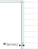
  3. Make a small extension in the middle of the bar to evoke the feeling of a button, like this:
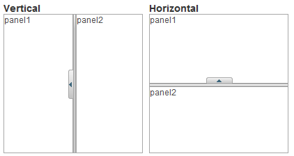
enter image description here

However, I'm not sure if this are in fact usability practices that have proven themself to be good, or just random ways of doing it. It's hard to find consistency when different ways of creating this ui element exist.

2
  • Personally, as a web developer, I hate these things. Just in case you're wondering, yes I do know how to use them. If you can get by without them then I recommend doing so. If your target audience is a trainable group of people working in your company then it would be fair game to train them but the general population will be annoyed with your site unless it offers a compelling reason for them to learn something new.
    – MonkeyZeus
    Commented Aug 25, 2014 at 18:12
  • Microsoft guideline is 5 pixels wide. Move savvy users know what a splitter is and how to use it. If the default layout is usable you have done no harm.
    – paparazzo
    Commented Aug 25, 2014 at 19:12

2 Answers 2

1

(1) First off, the draggable part. I think this is good practice but I often notice people tend to make these inbetween-bars too narrow, why not add some space, you can't do anything wrong with that.

It doesn't really matter which icon you use there. Most users are accustomed to either 2 lines (like jsfiddle) or any number of dots:

dots

(2) Now, the arrows for the collapsible part might be a bit misleading. But what about the way CodePen handles it:

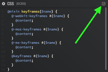
First, they used a checkbox:

checkbox

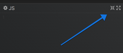
Recently, they switched over to these collapse/open icons:

collapse/open

Both are equally usable options, they just don't exactly mean the same thing when you have 3 or more collapsible boxes..

0

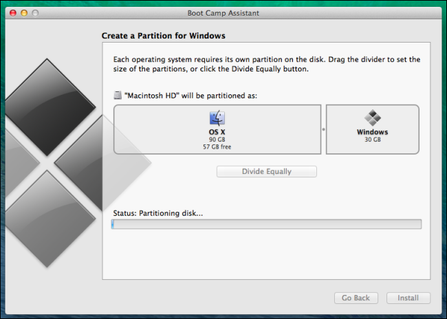
This really depends on what you're trying to do. Apple uses this similar interface for partitioning HD space for different OSes.

enter image description here

This gives a visual representation of how much each partition is going to have in terms of space.

Again, this entirely depends on what your interface is about.

4
  • some context: on the left is a "data tree", which allows for selecting a client (clients are hierarchically linked). This is important the first few seconds, but can be collapsed to save space and show more details/actions about the client after a client has been selected. Does this change anything? Commented Aug 25, 2014 at 19:09
  • Here's another question: Do you think you have to collapse the client list if it's being accessed all the time? Is there a reason behind the shifting of the sections (I'm merely curious, just so I can help you figure out an answer)
    – UXerUIer
    Commented Aug 25, 2014 at 20:03
  • A tree of data can be broad and/or deep. it varies on each user's use case. Since there is no single ui way of handling both horizontal as vertical data, I offer the user a way to customize the view to his liking. Show the entire tree, hide the tree, or show only the part that interests him. It is very much like the way windows file explorer works with the folder/file treestructure on the left taking up a varying amount of space. Commented Aug 25, 2014 at 20:23
  • Ah ok, I see what you're saying. Ok, fair enough.
    – UXerUIer
    Commented Aug 25, 2014 at 20:25

Your Answer

By clicking “Post Your Answer”, you agree to our terms of service and acknowledge you have read our privacy policy.

Not the answer you're looking for? Browse other questions tagged or ask your own question.