7

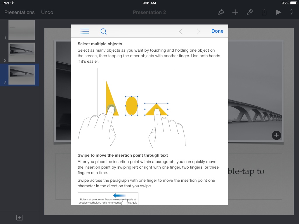
In iOS apps such as Keynote or GarageBand, the user selects multiple objects from the workspace by holding on the first item and then tapping others to toggle their selection state. What are some pros/cons of this design? What other designs are commonly used for managing selections on touch interfaces?

Keynote help describing how to select multiple objects

4 Answers 4

3

Personally, I think these apps got it right—in context, the result of this operation (e.g. "move all the items on this screen up a bit") can be accomplished by a newbie through a series of separate individual operations ("move this item up, then this item up, then this item up"). It's not an operation that needs to be performed often, and it's suitably easy to reproduce once you've been taught if you do find that you're inclined to move things around a lot.

That having been said, I don't think this solution is appropriate for all interactions, especially if one or more of those tests is no longer true (e.g. if the operation I'm trying to perform is "group selected items", I probably can't do that to each item separately).

To answer your question: it's interesting to note that Apple doesn't use a single standard for this interaction themselves.

In most apps (e.g. Photos and Mail), you generally are encouraged to enter a modal "selection" interface by tapping "Edit", then to tap on each item you wish to select individually to select them. This appears to me at least to be a very easily learnable (if cumbersome) process for users.

But Photos (on the iPad) supports an alternative form of multiple selection, where you drag two fingers over any items you wish to select. This allows you to "scrub" select a large number of items quickly.

In general, if you're designing for iOS (or really any similar platform) it's worth reading Apple's Human Interface Guidelines on the topic of Modal Contexts. Specifically consider the following:

Ideally, people can interact with iOS apps in nonlinear ways, so it’s best when you can minimize the number of modal experiences in your app. In general, consider creating a modal context only when:

  • It’s critical to get the user’s attention
  • A self-contained task must be completed—or explicitly abandoned—to avoid leaving the user’s data in an ambiguous state

This is why it's OK (even appropriate) that multiple selection in some apps uses a modal context but in others does not.

Bulk delete or move or edit operations (as in Photos or Mail) can all be performed within the modal context itself. You throw away your selection when you leave the modal context.

In the iWork apps etc., most operations occur directly on the object. You move a photo by dragging it upwards. You resize it by grabbing its handles and dragging them. In this context, multiple selection is a nice-to-have feature, not a core part of the operation.

If your app depends on multiple selection for some other reason, you should consider whether you're better off introducing a purpose-designed modal context for it that can be operated with one finger.

Any gesture that requires multiple fingers intrinsically reduces the accessibility of your app.
7
  • Thanks! Any other approaches to non-modal multi-selection? How about tapping on items to toggle their selection state?
    – Taylor
    Commented Jun 10, 2014 at 3:57
  • @Taylor That would mimic the interaction of the standard modal selection interface. If you're not doing anything with the selected objects directly, that'll work (but the concept of direct manipulation is a core tenet of touchscreen development)
    – Kit Grose
    Commented Jun 10, 2014 at 23:26
  • In my own app, I just toggle the selection (instead of requiring a two-handed gesture, like the Apple apps) and also allow direct manipulation of the items. It works quite well, but I wonder why Apple did it differently in the iWork apps, which are roughly similar to mine in terms of objects. Should I update my question with more specific information? Or ask a separate one?
    – Taylor
    Commented Jun 12, 2014 at 2:57
  • After thinking a bit, I suspect one reason to start with: Apple's modal interaction (hold) for multi-selection hides the context menu, which could otherwise obscure items if selection were non-modal. (I get around that because I use hold to invoke the context menu)
    – Taylor
    Commented Jun 12, 2014 at 3:08
  • @Taylor: If you tap two items, then drag somewhere on screen other than the items themselves, do they move around?
    – Kit Grose
    Commented Jun 12, 2014 at 5:07
2

What other designs are commonly used for managing selections on touch interfaces?

Default Android way: Long press the first item, long or short press (both work) all other items one by one

Default iOS way: Press the "Multi Select" button, select the items one by one

The Android but actually iOS way: Press overflow button, click multi select, select the items one by one

Solid Explorer way: Each item has a text part (e.g. filename) and an icon. Tap the text to open the item, press the icon to select it and start multi select. Also, long press item after multi-selecting for options, long press icon after multi-selecting do use drag and drop. http://youtu.be/CiHY4z09vRs?t=3m5s

The checkbox way(for lack of imagination i'm going for this name :) Every item at all times has a empty checkbox in front of it, so you can use multi select right away

The Windows Phone way every item has a checkbox in front of it, but it's hidden. Click the invisible checkbox and the checkboxes become visible. http://youtu.be/wWS4XKVag8I?t=3m

Also, what a lost of Android apps have is the options "invert selection" "select all" "select none". Something that I often wanted is "select all untill", so you could easily select for example all files from A to F. Never seen anyone do that though...

which one would I select? I say if it is an Android app, use the Android way, if it's an iOS app or a webapp: use iOS way. If multi select is something that you often need to do for small groups, use the Solid Explorer way. In that case: Be sure to notify the user how it works.

0

I think the obvious pro is that the application offers a richer interaction to the user, and perhaps allows them to accomplish tasks quicker than if you had to design a set of single touch interactions.

But the con is that the order and sequence of multi-touch interactions can be difficult to get right, and for a relatively unexplored interaction paradigm perhaps it is better to start with something more simple to get users familiarized with it before building up to more complex interactions.

The problem is more trying to manage the multiple states of an item/object on the screen rather than the interaction, since this is also a common problem for non-touch interfaces. But there is an additional issue of the user's hand possibly covering some of the information/content on the screen.

0

I don't know that any mobile platforms user this but you can also use long press to either select one item after another, with a short press or tap clearing the selection, or to bring up check boxes floating next to the items that can be checked or unchecked. Actually I think iOS does use the latter. I suppose you could also adapt AOSP's method of removing items from the home screen (long press and then drag toward the word 'remove' at top of screen)... Instead of remove you would have 'select' and people could drag one item after another there. I actually don't think that is the best method except for when you're deleting stuff, though, because it is not intuitive and it mimics throwing a file out so people won't want to do it if they feel as if they are deleting something.

Your Answer

By clicking “Post Your Answer”, you agree to our terms of service and acknowledge you have read our privacy policy.

Not the answer you're looking for? Browse other questions tagged or ask your own question.