0

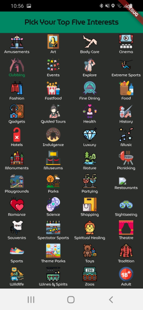
In a mobile app that I am currently developing one of the first things I do is secure a shortlist of the user's interests. This kind of input is not unusual - I recall seeing something similar in sites & apps such as Pinterest. My own experience with being made to do this has been one of impatience at being shown multiple screens. At present I have opted to squeeze everything in my, rather limited superset of choices, to one screen:

as shown below.

My question - is there a commonly accepted view on what provides a better UX here. The options I guess are:

  1. Cram everything on to one screen (as I have done here)
  2. Require selection from a vertical scrolling list
  3. Use a paged display with the superset of choices broken up into more logical categories

One of my concerns with the latter two approaches is that the user cannot see their prior selections once they have scrolled/paged. OTH with the "cram everything" approach fat fingers are liable to cause annoyance.

Or perhaps there is another entirely different way to do things?

1 Answer 1

2

I agree with you that options 2 and 3 are not the best. But I see some drawbacks in the option one that knowing them can help you find a workaround:

  • The icons are very small, it's difficult to perceive them
  • The text is too small and cannot be seen clearly
  • The icons are too close together to select
  • The already selected icon is not seen as such (Clubbing)

I think in this case some of the components or the text legibility or the clarity of the icons should be prioritized, as it is now is a middle way that doesn't reach an optimal solution.

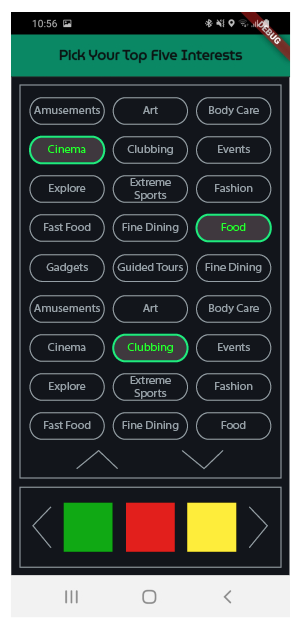
An alternative, starting from the premise of an easy visual perception, is to offer the possibility of a double selection prioritizing the text: the upper part allows the user to see/select any options in text with a vertical scroll and the lower part the larger icons with a horizontal scroll. Both are selectable, but the top field clearly shows the ones already selected:

enter image description here

Example: Di.fm

1
  • 1
    Thanks! I hugely appreciate your input. The approach you have suggested - and as implemented on Di.fm - is really good. It is true that the icons on my "cram all" screen are too small to be of any real value and only serve to make the text illegible.
    – DroidOS
    Commented May 31, 2021 at 11:55

Your Answer

By clicking “Post Your Answer”, you agree to our terms of service and acknowledge you have read our privacy policy.

Not the answer you're looking for? Browse other questions tagged or ask your own question.