0

In the list below, I have the search results of the people closeby who I can carpool with. Each person I should able to call, name and know the location.

When we hit the Confirm button it turns into a status Confirmed. If confirmed is pressed, the ride is cancelled and confirm shows up again. This can be confusing. Any ideas ?
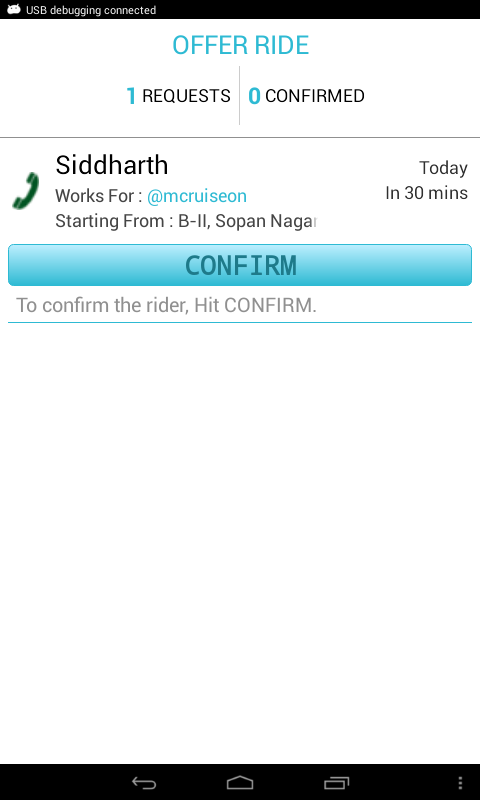
enter image description here

EDIT I changed the look and feel to save place and make it easy to understand. Notice

  1. Call button linked with name
  2. Instead of CONFIRM, I have a small + - icon instead

Still seems misaligned and confusing. Any ideas ?

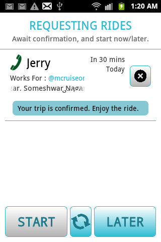
Search Results, OFFERING RIDE enter image description here

Search Results, Offering ride, CONFIRMED enter image description here
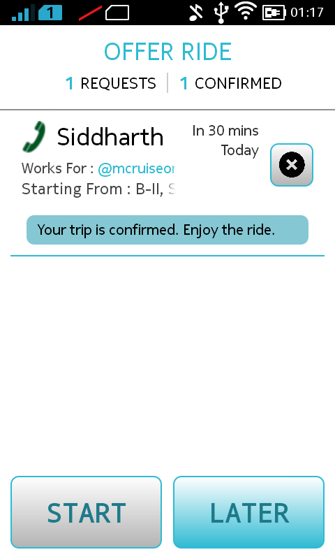
Search Results, REQUESTING RIDE enter image description here

2
  • There's 2 pictures here and I'm not sure which one you say feels "clunky". Can you elaborate what the two pictures are?
    – Perchik
    Commented May 23, 2014 at 16:20
  • I have reworded the question.
    – Siddharth
    Commented May 25, 2014 at 17:45

2 Answers 2

2

Yes it will be confusing. What you can do is after user clicks Confirm, you can show a text - "Your trip is confirmed. Enjoy the ride." And have another row which contains "Cancel trip" button.

Being more explicit in messaging gives a more personal touch to the user.

And I suggest organize layout(s) such that any clickable elements are in reach to thumb finger.

2
  • Wow!! Reputation of 1, lets change that.
    – Siddharth
    Commented May 25, 2014 at 17:32
  • I never thought about "the reach of the thumb detail" to organize my layouts. Good on that one.
    – Gus
    Commented May 25, 2014 at 20:46
1

I think "+" and "X" are not intuitive [my assumption is based on thinking myself as a user].

Did you look into Google Now cards like design to stack information in cards?

Open source Google Now cards like implementation is available at

https://github.com/nadavfima/cardsui-for-android

http://nhaarman.github.io/ListViewAnimations/

What I would do in such use case is --

  1. Changing Requests & Confirmations into actionable tabs
  2. When user clicks on Requests, a stack of requests will be displayed in google now cards like layout.
  3. Each card will contain details and one or more action items in your case, Confirm button.
  4. When user clicks on Confirm button, if everything goes well a confirmation text will be displayed. And move these details to Confirmations tab. When user clicks on Confirmations tab, a stack of confirmation cards will be displayed.

Note: I am not sure about Start, Refresh like button and later buttons would do. So couldn't comment on those. I didn't research whether Google Now cards like template can be used in iOS.

Your Answer

By clicking “Post Your Answer”, you agree to our terms of service and acknowledge you have read our privacy policy.

Not the answer you're looking for? Browse other questions tagged or ask your own question.