18

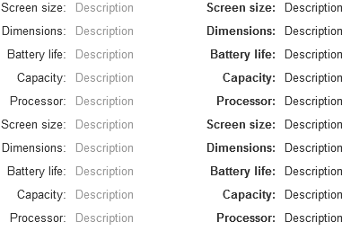
On a single detail page, which is better? Or should we not bold anything?

(bold descriptions)
Screen size: 960x480
Dimensions: 8mm x 102mm x 64mm
Battery Life: 18hrs
Capacity: 32gb
Processor: 64bit A7

or

(bold values)
Screen size: 960x480
Dimensions: 8mm x 102mm x 64mm
Battery Life: 18hrs
Capacity: 32gb
Processor: 64bit A7

5 Answers 5

16

I will agree with Anindya on the aspect that keeping the prominence on the descriptions will make it useful since a user is more likely to know what is the "Capacity" instead of what is "32gb".

When it comes to selecting the mode of prominence I would prefer using a subtle color to highlight as compared to using a "Bold" face. Something like

This is how I would suggest

As you see when the information increases on the page using a lot of bold text, I feel, will make the page a little loud. If there is some specific aspect on the page that you want the user to notice you may use a bold face, drawing attention to it.

Just an added suggestion you may try using a right aligned text for descriptions and left aligned for values, it keeps it neat and makes skimming through it also easy.

9

In your situation, I vote the same as other answers, highlight — through bold, colour or size — the labels over the data to allow for scanning behaviour, perhaps as people are comparing specs from different products. I would also align in columns the labels and the data to help with the scanning. And once that's done you can remove the colons as the distinction is clear.

However, I think highlighting labels or values depends on the context of the data.

If in a set of data, it's not evident or could be ambiguous what the data represents, then I would highlight the labels so people can scan to what they want and then interpret the data. For example:

What the data represents is not immediately clear

Start date  16 Jan 2019
End date    16 Jan 2020

However, if the data can speak for itself in its format and the context people are seeing it, or they will see it regularly and get familiar with the structure and the labels, then highlighting the data is more immediately useful to people and more direct in its value.

What the data represents is clear

For example, in the product details page for a clothing item it may be more appropriate to bold the data:

Item     Cardigan
Colour   Forest green
Size     Large
Price    $24.99

Or, in an email or confirmation page just after you've signed up to an event:

At           Benny's Bistro
Start time   7pm sharp
Guests       You and one guest
Dress code   Smart casual

Here's an example of an Uber email after a ride which highlights the data over the labels to good effect.

Uber confirmation email with trip details

More broadly, in some cases, you are better off excluding the label completely eg:

Not

Email: [email protected]
Phone: 510-123-1234
Site:  www.examplesite.com

Instead, just use

[email protected]
510-123-1234
www.examplesite.com
1

Aligning the labels combined with whitespace and bolding them. Always think in terms of scannable content. People will generally want to scan the label, not the value. It makes digesting the information easier. It's a simple information hierarchy issue.

1
  • 1
    This is not always the case. Where a user is familiar with the screen structure, in a line of business application that the use every day for example, they're more interested in scanning the data, not the labels and they (subconsiously) already know which data item is in which position. Of course, IMHO, YMMV, etc. Commented Jan 25, 2018 at 11:58
0

It depends on your font size, colors, and font face as well.

If this table is going to be stylized beyond just black and white text then consider doing the descriptions in a smaller font and in italics and having plain value text, or a smaller font and lighter font color.

If you absolutely must pick between one of the two above, then I'd say go with bolding the descriptions since people will likely be looking for those in order to look up the values, and not vice-versa

0

Bold-face the label, rather than the value.

When reading online, people tend to scan. Particularly so when looking for a specific detail. If the amount of bold is too large on your page, nothing sticks out. And when scanning for a specific detail, people looking for it will locate it more easily if it's in bold.

With respect to that last point, consider your example from the viewpoint of someone who is looking for a device with a specific battery life, and scan down each list. You'd read the left-hand side from the top down until you locate "Capacity" or some synonym. And then you'd proceed to read the right-hand side value. Note how the list with bold descriptions is easier to scan in that light than the list with bold values — in the latter case, the bold values are a distraction that get in the way of actually reading and finding the line labeled "Capacity".

Alternatively, don't bold-face anything, and align labels and values so that they're split neatly in a table. Consider:

verylonglabel: value1
label2: value2
label345: value2

vs:

verylonglabel: value1
label2:        value2
label345:      value2

vs:

verylonglabel: value1
       label2: value2
     label345: value2

Or do some combination of both. The key is to make the labels easy to locate when potential shoppers scan the page.

Your Answer

By clicking “Post Your Answer”, you agree to our terms of service and acknowledge you have read our privacy policy.

Not the answer you're looking for? Browse other questions tagged or ask your own question.