0

I'm working on a mobile app and I would like to add upload buttons.

By default I would like to display two buttons: - Upload from Dropbox - Upload from Google Drive

Regarding the flow: Once the user clicked on "Upload from xxx" and added a file, both buttons disappear and the name of the file appears. NB: Only one file can be uploaded.

Is there a best practice for displaying this file to the user and allow to delete it?

  • I mean, is it better to show the filename inside a button, and when the user touch it, it ask him if want to delete the file?
  • Or should I display just the file name inside a div with a delete icon?
  • Or should I leave the upload button even when the file is uploaded?

2 Answers 2

2

To answer your questions one by one :

I mean, is it better to show the filename inside a button, and when the user touch it, it ask him if want to delete the file? - The challenge involved with this is that the filename can be pretty large and the button is often an affordance to inform users to select it or in this case to open it. To get an option to delete it on clicking on it is confusing and if the user just wants to open the file he would need to do another click

Or should I display just the file name inside a div with a delete icon? - This sounds like the best option as it informs the user that a file has already been uploaded and he can click on it to open it while using the delete icon to delete it as needed.

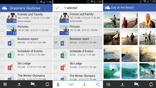
However if you do see the option that the user might want to delete several files at one shot then the approach done by skydrive might work well since it shows different files and when one or more files is selected,it gives an option to delete them as shown below

enter image description here

Or should I leave the upload button even when the file is uploaded? - Depends on the functionality, if you feel that the user might want to add more files leaving that option is always useful as it informs the user that he can upload more files or delete the ones he has uploaded like how google does it
enter image description here

1
  • Thanks for the answer, just to add some context the user will be able to upload only one file. That's why I was talking about removing the buttons. (I will edit my question)
    – Matteo
    Commented Jun 28, 2013 at 16:48
0

Mervin's image of SkyDrive's UI contains the answer.
The usual way is to furnish each file with a selection checkbox, and somewhere else show the available actions, in this case the trash can.
When the number of files is not very low, and there is a chance that you will want to apply other actions to a set of files, then the checkbox is the usual suspect.

Your Answer

By clicking “Post Your Answer”, you agree to our terms of service and acknowledge you have read our privacy policy.

Not the answer you're looking for? Browse other questions tagged or ask your own question.