47

I am developing an accounting app where I display several orders. Every order has a price. I have a box where I would like to display the price as shown below:
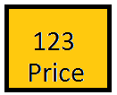
enter image description here

This works pretty well for fairly small numbers but as soon I start having big numbers the box is not suited anymore:
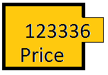
enter image description here

A solution I came up with is to only display thousands as shown below:
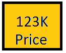
enter image description here

  • Some of my users do not like the letter K that indicates thousands.
  • Some of them want to the exact price and all the digits at once.

Making the box resize to fit all the price digits is not an option as this will make some of the boxes bigger than the others and the symmetry will be lost.

Are there any other ways of handling this kind of issue?

12
  • 9
    Utilizing the K abbreviation is probably what I would go for, and then have a details view where the exact price is displayed. Disregarding that, why don't you justify the text from the center? If you let the text in the label be center aligned the 123336 figure in the image would fit. Of course that is a temporary solution since 7-8 figure prices would still pose a problem. Commented Jun 3, 2013 at 9:21
  • 31
    Why are you measuring price in Kelvin?
    – dav_i
    Commented Jun 3, 2013 at 10:04
  • 8
    @GETah I was more making a quip on incorrect SI usage! My view on this is that you should use "k" - people are used to it in the context of 1km = 1000m etc.
    – dav_i
    Commented Jun 3, 2013 at 10:09
  • 16
    Accounting apps should display exact amount.. i would prefer to increase size of the box..
    – Awesh
    Commented Jun 3, 2013 at 11:51
  • 11
    If you do use "k", please not that upper case is inappropriate for this. A lower case k is much more appropriate.
    – Caleb
    Commented Jun 3, 2013 at 14:46

10 Answers 10

66

Best solution will be to increase the size of the box. If you can do it without changing the layout, it is good.

For reducing the font size, I would suggest use a single size rather than going descending. It is easier to read.

And, if you want to do 'k' representations, make sure the user has some way of accessing the actual number, via a tooltip or some other cue.

mockup

download bmml source – Wireframes created with Balsamiq Mockups

5
  • 8
    Tooltip won't work for a touch-based interface. Commented Jun 3, 2013 at 17:20
  • Unless the box has click/tap behavior you could show the tooltip on tap. Not sure if that would be discoverable but its a thought. Commented Jun 3, 2013 at 17:53
  • Well, for touch based interface, you could use a button that expands when clicked. Just be sure to sinalize to the user, if you don't use a button styled. Commented Jun 3, 2013 at 19:40
  • 4
    Putting the actual price in a tooltip also means that users can't select it for copying. I imagine copy/pasting a price would be a common task. Commented Jun 4, 2013 at 19:39
  • ah, number 3, copying stack exchange !
    – Toni Leigh
    Commented Oct 4, 2013 at 20:58
38

Your layout should support your content. First content, then appropriate layout. You can not easily break the physical constraints (like small screen), but maybe even your biggest number could be placed as separate line at smallest screen.

Also I would recommend to keep in mind three stages concerning software:

  1. Useful (Functionality)
  2. Usable (Usability)
  3. Aesthetics

The order is important, so don't let the Aesthetics beat Functionality and Usability.

1
  • third / fourth stage, understandable for the next developer - code usability !
    – Toni Leigh
    Commented Oct 17, 2013 at 22:54
33

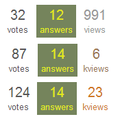
Something which is done here in stackexchange is using colors in combination with k's to display weight (and I'm guessing m's as well).

Look at how different colors represent different weight, in combination with the k's, you're receiving something which is unmistakably usable & understandable

colors to display weight

Reading further: Have you considered adding a tooltip/popover representing the exact number?

enter image description here

6
  • 9
    I didn't notice the "kviews" in this example. I think the layout works well, but the "k" should be part of the number value (which it is), not the label.
    – Kip
    Commented Jun 3, 2013 at 16:25
  • 3
    The "k" is where it is because it following the metric convention. You write "10 kg" not "10k g". Commented Jun 3, 2013 at 19:24
  • 2
    I understand the logic of "kviews" but I think most users would more intuitively understand "10k views" than "10 kviews" Commented Jun 3, 2013 at 20:11
  • 13
    @Stanley -- As a scientist, I'd just like to point out that both "10 kg" and "10k g" are correct in SI (metric) notation. One says "ten kilograms", the other "ten thousand grams." 10 kg = 10k g. Commented Jun 3, 2013 at 20:17
  • 1
    I never notice the kviews. I realize a question is "big" from the color difference and the relatively high number of votes and answers; that's what makes it stick out for me. The kviews only acts as a confirmation when I look more closely and consciously after I already realized it's a popular question.
    – Supr
    Commented Jun 4, 2013 at 8:35
11

Make the box big enough to contain any likely price.

If your app has prices that might go up to six figures, make the price box big enough to take a six figure price. Do this even if you have to change the layout, even if real estate is limited and you have to sacrifice something else to make room for it. Don't use "K" or any other abbreviation to try to keep the price area small - as you correctly say, not everyone will understand it.

The reason I am saying this that for most people doing shopping price is a very important piece of information - more important than anything else except the basic "what is this" information. Moreover people really dislike being misled on price. If it doesn't look like you are being upfront about price, people will think you are trying to trick them - even if you aren't. The comparison with Stack Overflow reputation and the use of K isn't valid, as reputation isn't as important as price, and your audience is less likely to understand the abbreviation.

8

Is the size of the box a limitation as was asked? The only reason I ask this is due to the fact that you can probably change the size of the box to the width of the largest price you have and set it as a fixed width for the box. Then center the price inside the box and you'll know that no other prices can exceed the width because you've buffered it using the highest possible price (you can perhaps add a few more digits to the maximum size you want displayed).

Also if you are going to use prices with a decimal number, I would just size the box once at the largest possible size and then you don't have to worry about the size of the box changing but you can start centering the prices inside them thus leaving you with a uniform look on the site.

2
  • Good solution but I'd suggest one minor change. Since it's an accounting app, consider right-justifying the numbers rather than centering them so the magnitude of the numbers becomes more apparent. This works best if you use a monospace typeface and with fixed precision numbers. If the precision varies within the list, line up the decimals instead.
    – Wheelie
    Commented Jun 6, 2013 at 5:20
  • That works and you're right. Generally most accounting applications don't have their data centered anyways. Plus, it's easier to read numbers that way as well. Commented Jun 8, 2013 at 8:50
6

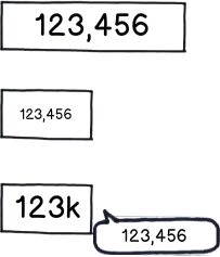
You could compromise on a mouse over for all digits (if that's an option), or you could make the trailing digits smaller / slimmer (if you have the resolution).

I tried with Calibri + Arial narrow, this doesn't buy you much:

enter image description here

(FWIW when using 'k' I'd use a small one, it distinguishes better from the digits and is SI-Correct. no such luck with 'M for million', though.)


Generally, consider reducing the total informaiton on screen. If you already have to squeeze in the data your problem is not the individual elements.

You could go for Currency symbol + value,

$123.786

can be more compact than

123k
Price


[edit] as requested: The idea is to emphasize the most important information ("123" (k)) but still perserve the detail. I've seen the "one step" version (2nd and 3rd example) a few times, but usually for esthetics / style rather than for coping with information density. Using successively smaller digits was a spontaneous idea to extend this.

As the example shows, the "one step" doesn't buy much in terms of pixels, the second looks at least unusual, if not confusing.

0
2

Scientific notation would have you display this as: 1.23e5, it's more 'correct' when it comes to units: 1.23e5 m is right, whereas 123k m isn't (it should be 123 km).

However if your users aren't comfortable with the 'k' postfix then I doubt they'd like this much, I merely mention it for completeness.

Other possibilities might be to have something like: 123thou or 123,000

2
  • 1
    -1 scientific notation is not more correct in any sense when it comes to displaying a price.
    – user31143
    Commented Jun 5, 2013 at 8:42
  • @dan1111: I think a slightly unfair down vote: I specifically said 'it's more 'correct' when it comes to units'. I appreciate that the content of the question means this may not be applicable, but for the title of the question then I think this is useful information; it's possible that someone will visit this question with a similar issue in the future, and for which this information may be appropriate.
    – steeveeet
    Commented Jun 8, 2013 at 18:28
1

It's hard to say without knowing more, but here are some possible options:

  1. Make all boxes resize so they are all as large as the one containing the biggest number
  2. Reduce the padding to the left/right of larger numbers so they fit in the box
  3. Make the number text smaller
  4. Keep the 123K, and have the option of showing the full amount by some sort of toggle (click or hover or whatever)
0

Take a cue from the social media widgets out there. Like/Follower/+1 etc buttons all need to show large numbers in a tiny little space.

3
  • 1
    Perhaps you would be able to include some examples in your answer, and explain why the way they do it is beneficial. Commented Jun 5, 2013 at 8:32
  • Well what is that cue? How do the widgets do this, and why is it suitable for this situation? You've not really answered the question here, more you've said -"Social Media widgets do something, go and see how they work". Also, would that be appropriate for displaying prices? A count of how many people like a page isn't the same as displaying a monetary cost of a product.
    – JonW
    Commented Jun 5, 2013 at 8:34
  • @JonW There isn't a person on here, yourself included, who hasn't seen a facebook or G+ like button and doesn't know exactly what they do to large numbers. If you've read any large web news/magazine website, you know exactly what I'm talking about. I respect the OP enough to not have to spell that out further for him. Commented Jun 5, 2013 at 8:59
-2

Auto re-size the numbers as the price grows; set one default size for the normal/expected price (2-3 digits let's say) and re-size it as needed.

1
  • It's a confusing, big numbers are small, small ones are big. This is clear example of cognitive dissonance. Commented Jun 24, 2013 at 4:06

Not the answer you're looking for? Browse other questions tagged or ask your own question.