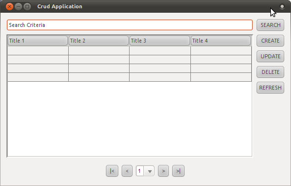
I always use this design for CRUD Desktop Form:

Is it a good design for a CRUD Form? Do you have any suggestions for a better crud desktop form?
The mockup you provided is a very rudimentary interface, and it really depends on what you are trying to do. I find that users can make better sense of the entries when you use a repeating formatted block rather than grids with separate titles. As an alternative take a look at Ebay's product listings (once you get into the category). You can also review Amazon or even http://slashdot.org.
Using a drop down to provide your sorting options, and a repeating formatted block provides a good summary and lets you pack more information than the grid layout does. It also prevents too much visual clutter with all the grid cell lines.
The choice of a search box over the list is a good idea. In your final design, don't get rid of that.
An approach I take is to keep global controls (the controls that affect what you see in the list) outside the list. Your Search and Create buttons would be examples of that. I keep record specific controls with the record itself--something the formatted block allows me to do. Each record would have it's own Read, Update, Delete buttons.
Lastly, you may want to consider alternate words in the user interface for the CRUD buttons. While those words make sense to programmers, they don't always make sense in the context of what the user is used to. The following are common synonyms that I use (note: I use the same verbs across all forms, but choose the set of verbs based on my target audience):
CRUD makes a handy acronym to cover standard features for editable lists of records, but are not always the best for the user.
Like Berin pointed out, the mockup looks like the archetypal CRUD window. However, as a CRUD UI comes directly from the ideology of just presenting the database contents in an editable form to a user, it's hardly ever the most informative or usable solution. Users' ultimate goal never is to 'work with data'.
As the mockup lacks real (or any, for that matter) data it's impossible to say what would be the best visualization for it. If you still come to the conclusion that plain table format is the way to go, here are some ideas to get rid of the unnecessary buttons:
update buttonsearch buttoncreate buttonremove button or icon on each rowSurely, these are just suggestions. You have to do some user testing (with real users and real data) to see e.g. whether the users get confused if the search button is missing or the changes get automatically saved.