2

Following a discussion here on my work, I like to call in the ideas of UX experts :-)

Thet starting point is a web page on which users can make a configuration of complex products. On the screen, there will be some buttons for search categories. Clicking on one button will open a window that will dynamically build the search options from a database. There are three levels: - by default only the most used options will be on the popup - more advanced users can ask more options & values - and expert users can ask all possible options & values

So we come down to 2 versions, which one is the best, and what improvements can be made.

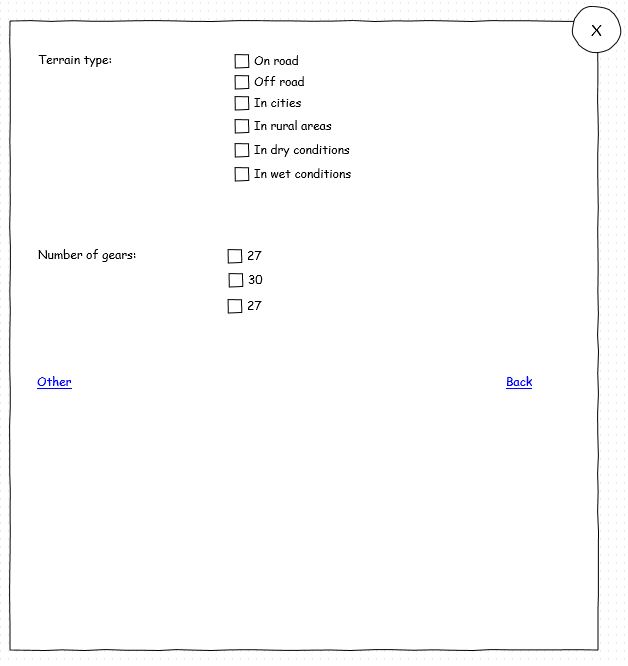
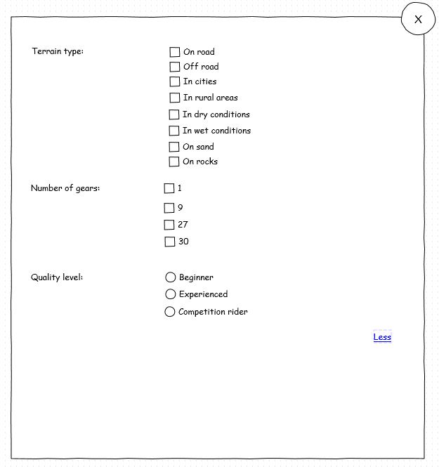
Proposition 1: expand by clicking links

Basic search: enter image description here
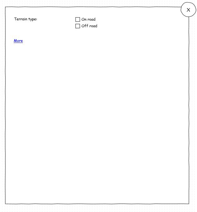
Advanced search: enter image description here

Expert search: enter image description here

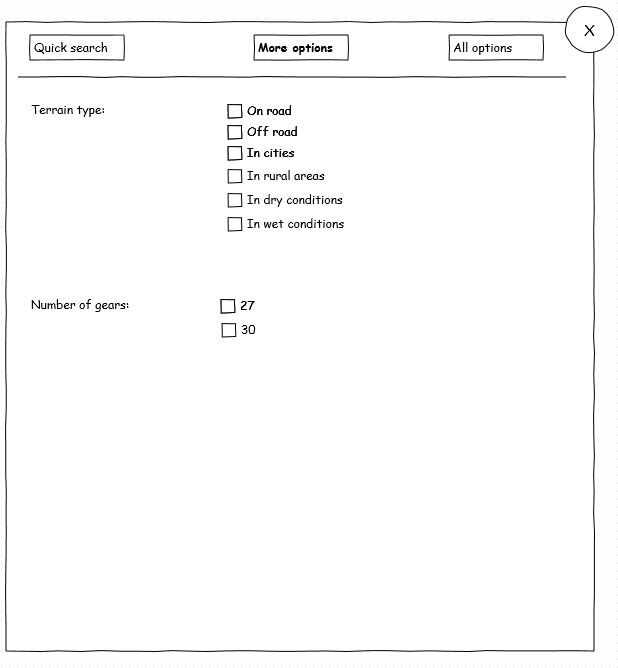
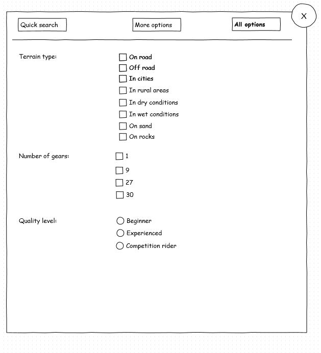
Proposition 2: search catagories on top op window

Basic search: enter image description here
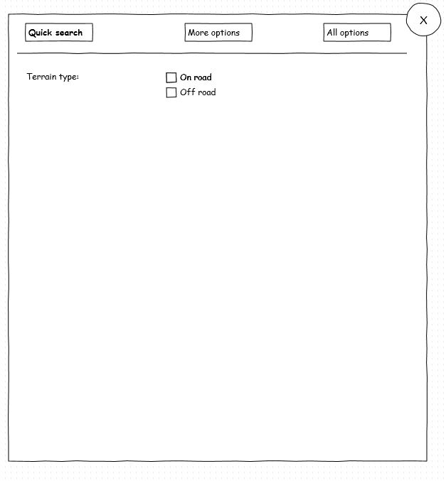
Advanced search: enter image description here

Expert search: enter image description here

8
  • Drag unsuspecting people in front of a screen and watch which one gives the best result.
    – Jeroen
    Commented Nov 12, 2012 at 16:14
  • are you going to allow multiple selection?
    – Igor-G
    Commented Nov 12, 2012 at 16:24
  • Slightly OT and a bit picky: In the first wireframe I'd use "less" instead of "back" as the opposite of "more", because "back" might make the user fear to be taken out of here to a previous context. In the second example I'd use "quick search" instead of "fast search". Hopefully all searchs will be fast while only some will be quick as in quick and dirty, i.e., easily started. Also, now you have 11 reputation!
    – Juan Lanus
    Commented Nov 12, 2012 at 18:17
  • @Igor-G In the admin website, the product manager can define all the functions and options. He may choose between: text, number, boolean, checkboxes or radiobuttons. Also, he can define on which search level the function should appear: null, 1, 2 or 3. Commented Nov 13, 2012 at 7:58
  • @JuanLanus Thank you for this input. I have modified the labels. And also thank you for the upvotes, I have added the images inline. Commented Nov 13, 2012 at 8:32

1 Answer 1

1

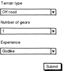
Why don't you want to use drop down menus? The user might be confused or not notice "expert"/"novice" settings.

mockup

download bmml source – Wireframes created with Balsamiq Mockups

4
  • I can give the product manager an extra option to make it a dropdownlist. But anyway, the point is: what is the best design for the users, clicking on links on the bottom of the page or on buttons on top of the page to extend search possibilities. Commented Nov 13, 2012 at 8:34
  • The less confusing it is the better. The way I see it, also based on lukew web form design , long forms scare users and the easier they look the bigger chance that the user would fill it out.
    – Igor-G
    Commented Nov 13, 2012 at 9:44
  • if the question is only about the links, I would suggest you putting them at the top, then the user would see the options before starting to fill-out the form, but there is a down side to this solution the users might skip the options. Personally I don't like the idea of your form. So I would suggest you use the drop down menus for this.
    – Igor-G
    Commented Nov 13, 2012 at 9:47
  • adding buttons at the bottom isn't a good idea because the 1st thing user will try to get out of his way is the form so the user might not realise that there are extra options are available. I believe the user will be hesitant of pressing the buttons after filling out the form, they might be afraid of the form loosing all the data, so they would have to fill out the form again (happened to me few times, never used that website again).
    – Igor-G
    Commented Nov 13, 2012 at 12:23

Your Answer

By clicking “Post Your Answer”, you agree to our terms of service and acknowledge you have read our privacy policy.

Not the answer you're looking for? Browse other questions tagged or ask your own question.