4

jQuery has a default amount of padding within their buttons, as seen here: jQuery UI - Button Demo.

I think it looks nice, but my boss keeps telling me to kill the padding. Specifically, he said to make the buttons 2/3 the size of what it is now, by removing the inner padding. That would essentially kill all the padding entirely.

How do I convince him that this is a bad idea? From what I've learned at art school, this creates a problem called tangents, which gives the user a feeling of discomfort and congestion. Am I wrong? Is this really a subjective topic? Should I just do what I'm told and don't ask questions? How do you deal with these issues at work?

I found the following to be inspirational, taken from 8 Usability Mistakes Made By Web Designers, Written by Rob Bowen on Sep 06 2011:

One less crucial usability error that you see a lot of around the web, is the lack of sufficient padding and margins in various areas of the design. Whether it be between stacked elements, text blocks, a combination or whatever, there are numerous areas throughout the design where we can fall susceptible to this common error. Visual comfort is a big part of keeping the reader’s on your site and consuming whatever content you are presenting them with, so it is not something to take lightly.

If any of your design feels cramped, or too constricted then your understanding of the box model could use a little bit of work. If it is employed correctly, then your spacing is guaranteed to not interfere in any way with your content. Once your content becomes compromised in this way, the design and the content have both been done a complete disservice. The more cramped the design feels, the less planned and completely professional it comes off. And that is never an impression that we want made through our work. So we need to be sure that we keep these little things in mind too as we build.

2
  • 2
    Take a look at the questions tagged white space - there are plenty of studies cited explaining the necessity of all kinds of padding & distance.
    – dnbrv
    Commented Mar 17, 2012 at 18:11
  • What is your boss paying you for? To do whatever s/he says regardless of the merits, or to use your knowledge and skills to supply the best product to your customers? If you're just a tool of theirs to blindly deliver their vision then that's not much job satisfaction for you. Sometimes it's good to remind them why they hired you in the first place.
    – JonW
    Commented Mar 17, 2012 at 22:22

2 Answers 2

4

What's his reasoning for wanting to make the buttons smaller?

Depending on what you're building, and who the audience is, making buttons bigger isn't always better. Here's an article about the diminishing usability benefit of making buttons bigger. http://sixrevisions.com/usabilityaccessibility/improving-usability-with-fitts-law/

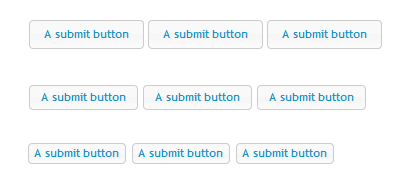
Below, I made a little mockup. The buttons in first row are the default jquery button size, but I'd argue that that they don't provide much usability improvement over the buttons in the second row.

The third row doesn't look so bad either, as long as you add couple additional pixels between the buttons. Reality is, even the thinnest buttons are thicker than most hyperlinks, and people don't have problem clicking on hyperlinks.

Sorry, I'm not helping you make your case here, but if you acknowledge his reasoning for wanting to make them smaller, you two might be able to meet half way? :)

enter image description here

1
  • Oh—I don't want you to help make my case. I'm glad you broke it down for me. Your answer is going to help me sleep at night w/o feeling like I've done something against UX.He wants them smaller so there's more room to stuff other content into the page, which is another issue entirely. Thanks for the great answer! I'll add some more padding between the buttons like you've shown. You're right. That looks more acceptable. I don't think he'll bite on the middle row, unfortunately :(
    – jedmao
    Commented Mar 18, 2012 at 21:19
1

The easy argument:

Our customers are going to increasingly be accessing our web site on mobile touch devices which have a variety of published 'target areas' requiring a minimum sized button. Easier touch targets = less frustrated users = $$$!

The same is true for the desktop/mouse as well, but tossing out 'mobile' and 'touch' are trendy business words that may help your cause.

1
  • I'm totally with you and I tried that argument before, but he said it doesn't matter because we're rolling out targeted mobile apps. I know what you're thinking, so you don't have to say it. Even if you have targeted mobile apps, that doesn't mean you should ignore the cases when they access the site through the mobile device w/o the app. Aargh!
    – jedmao
    Commented Mar 17, 2012 at 19:10

Your Answer

By clicking “Post Your Answer”, you agree to our terms of service and acknowledge you have read our privacy policy.

Not the answer you're looking for? Browse other questions tagged or ask your own question.