13

Our white-background webpages use the blue hyperlinks as shown in the image below.

Occasionally we have dash-bordered yellow information sections on a white webpage as shown. In that case someone said the blue hyperlink text was harder to see on their iPad, because there was not enough contrast between that blue and yellow.

If white correlates with the blue shown, is there a color formula to calculate what a darker blue should be for that yellow background?

enter image description here

3
  • 1
    Does this answer your question? Recommended color range for background color Commented Oct 11, 2022 at 6:52
  • @locationunknown Thanks. Helpful but I was looking for a calculation that could give an exact hyperlink blue color based on the relative correlation of the blue to white. E.g., If white= that blue, that yellow =? Commented Oct 11, 2022 at 6:58
  • Manipulating that equation will give you the exact hyperlink blue because you know the background color and the correlation needed. Commented Oct 11, 2022 at 7:00

4 Answers 4

19

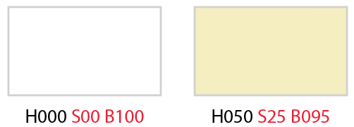
Comparing the saturation and brightness of white to yellow:

white to yellow

There is a difference of +25 in saturation and -5 in brightness

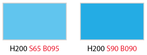
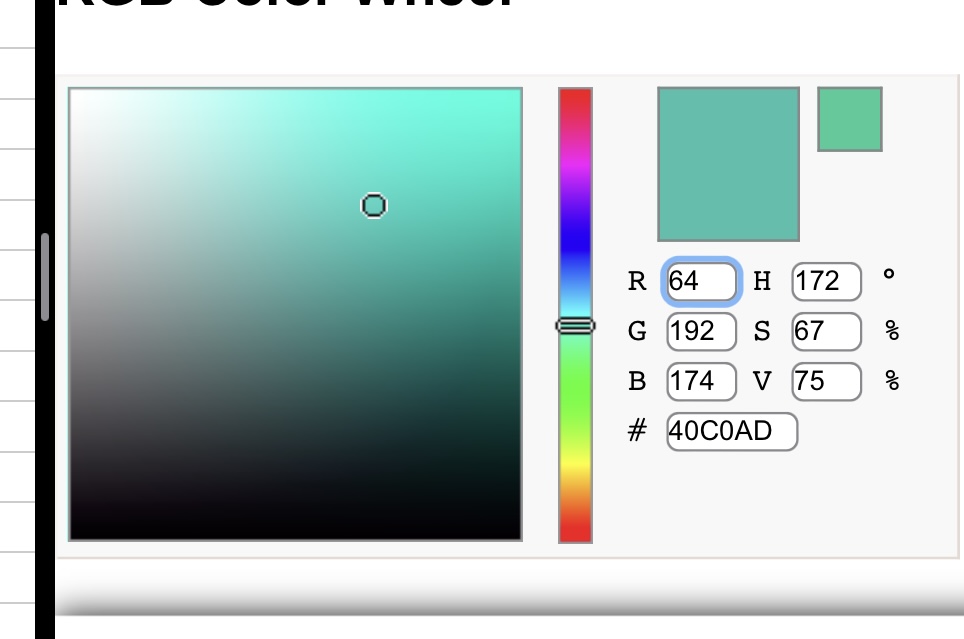
If blue has S=65 and B=100, the resulting blue would be:

  • S 65 + 25 = 90
  • B 95 - 5 = 90

Blue+blue

Result:

enter image description here

16

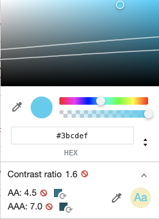
Use Google inspector, they suggest another color that passes AA and AAA

AA : #217387

AAA : #185564

enter image description here

What is AA and AAA ?

These are compliance levels to make digital content more accessible provided by WCAG.

  • WCAG 2.0 level AA requires a contrast ratio of at least 4.5:1 for normal text and 3:1 for large text. WCAG 2.1 requires a contrast ratio of at least 3:1 for graphics and user interface components (such as form input borders)
  • WCAG Level AAA requires a contrast ratio of at least 7:1 for normal text and 4.5:1 for large text. Large text is defined as 14 point (typically 18.66px) and bold or larger, or 18 point (typically 24px) or larger.
4
  • Great answer—I can check it with the saturation, brightness answer too. Thanks. Commented Oct 11, 2022 at 8:11
  • 2
    @user1946932 thanks, be careful with the Danielillo answer the contrast ratio is too low 2.31, and does not pass AA... I don't recommend it, especially with a link...
    – SylvainBTL
    Commented Oct 11, 2022 at 8:37
  • 11
    This answer would be improved by explaining what AA and AAA mean.
    – jpa
    Commented Oct 11, 2022 at 17:41
  • 1
    @jpa yeah, I add an explanation to my answer.
    – SylvainBTL
    Commented Oct 12, 2022 at 9:46
3

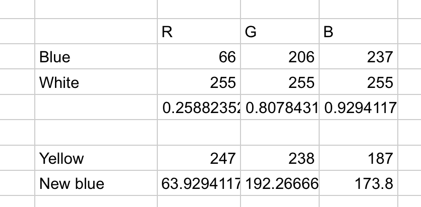
I tried the following:

  1. Getting the % R G B difference from white to the blue

  2. Applying the % to the yellow.

Result:

enter image description here

enter image description here

enter image description here

2

The easiest way to achieve what you want is to apply mix-blend-mode: multiply to your link in CSS, which will preserve the current colour when used over white but will darken it proportional to the background.

Having said that, though, you should be aware that there's no rule here that will ensure the link maintains sufficient contrast with both the text and the background. If for some reason you set the background to something like solid red, the link text will become almost black, such that it doesn't have any visible distinction with the surrounding text, and if you set the background to a dark colour, the link will effectively disappear into the background (just as the black text will).

You should consider adding underlines to your links to avoid the first issue (it's a WCAG requirement not to differentiate the behaviour of items by colour alone), and you should consider simply blending the colour yourself to a satisfying value if this is the only alternative background colour you have to deal with.

Your Answer

By clicking “Post Your Answer”, you agree to our terms of service and acknowledge you have read our privacy policy.

Not the answer you're looking for? Browse other questions tagged or ask your own question.