0

I'm currently trying to create a singular data visualization of a dot plot with datasets that have similar y-axis scales, but different x axis scales. The x-axis scales range from daily (Jan 1, Jan 2), monthly (Jan, Feb), quarterly, and yearly. What would be an effective way to design a graph when multiple different types of graphs (>= 3) are overlayed over each other?

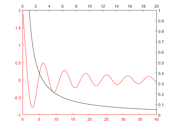
Currently, there is the option to add an axis on the top, like the below graph. However, I'm not sure if this would account well visually with a third graph with a different scale.

enter image description here

Thanks!

4
  • 1
    This forum works best when you provide some visuals of your efforts so far, with a little more context if possible. This makes the question (and its answers) more valuable to others with a similar issue.
    – Mike M
    Commented Feb 3, 2022 at 15:21
  • 1
    Is there a particular reason you want to blend them into one visualization? Is that common in the domain of the problem you're solving for?
    – Mike M
    Commented Feb 3, 2022 at 15:39
  • 1
    Yes - its financial data so people can see different sets of data overlayed over each. User studies have shown this to be a valuable tool that competitors lack. Commented Feb 3, 2022 at 15:42
  • How 4 datasets are correlated? Suppose today is 2022-02-03. What will it show: Feb 3 (or latest 24 hours?), February (or from Jan 3 to Feb 3?), etc.? Also, is it possible to change year independently of quarter, display May 2021 and Jan 31 simultaneously?
    – Serg
    Commented Feb 3, 2022 at 16:55

1 Answer 1

1

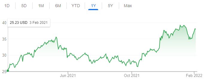
You mention in the comments that user studies have shown this to be an important tool, but I'm not sure that it necessarily means that the x-scales need to be different and on top of each other. It is after all the same axis (days), just in different resolutions. It sounds to me that the right way to display this is to show all three lines, use a monthly or weekly basic scale for the X axis, and to let users zoom in and out to get to a daily/quarterly/yearly resolution, e.g. like Google does. And then if you get to the daily scale but one of the datasets only offers yearly data points, it will "stretch" between the two closest points.
enter image description here

Usually when users request data to be shown together it means that they're looking for correlations or other trends in the data across datasets. In this case it doesn't seem to make sense - a rising trend on a specific Sunday-Monday-Tuesday will seem to correlate with a rising trend on a specific January-February-March. I don't think that data on different orders of magnitude of the same dimension should be displayed together on the same axis like this, especially if it means that the same data point can appear in several places on the chart (separate locations for a specific date on the daily, quarterly and yearly scales). To me this seems not only unclear but actively misleading the users.

I would try to investigate the need further.

Your Answer

By clicking “Post Your Answer”, you agree to our terms of service and acknowledge you have read our privacy policy.

Not the answer you're looking for? Browse other questions tagged or ask your own question.