1

I am tasked with creating an interactive visualization of tasks, where the visualization needs to show: - task importance - task progress - task state (active, completed) - task relationship (tasks can have other "tasks" they depend on or tasks that depend on them) - task group (tasks can belong to certain groups)

for each task. This seems rather complex for one diagram, but I've been asked to try to include as much information in this diagram as possible so a user does not need to interact with the page to get an overview of the information associated with each task.

Have you worked on something similar to this before? Is there a particular type of diagram that you can recommend that can support all of these features without becoming extremely complex to interpret?

Any help is appreciated, thanks.

3
  • What is the goal of the visualization? Is it a report, or are users moving or completing any of these tasks? If you have a mock, or more context of the both the business goal, and the user goal (they might be in conflict!), that would help us. There are operational visualizations, like kanban boards and gantt charts, which show critical paths for the project. And there are task visualizations which are apps that show project states (lists w/ rich info).
    – Mike M
    Commented Jul 12, 2017 at 0:03
  • The usefulness/usability of this visualization will depend on how complex the taskflow/tasks are. Rather than just providing suggestions, perhaps you can do a sketch to give an idea of what your design might look like and that way you can get better feedback. This is rather an open question at the moment.
    – Michael Lai
    Commented Jul 12, 2017 at 1:47
  • The goal is both for users to view this diagram and for them to be able to interact. For view, users should be able to tell the importance level of a task, how far along it is (% complete), if it is active (there will be active/inactive tasks at each stage of a process), and what group of tasks a task belongs to (say tasks that all deal with closing up shop at night). On interaction, users can view task relationships to other tasks (parent-children relationships) and users should be able to change the importance of a task. Commented Jul 12, 2017 at 17:41

1 Answer 1

0

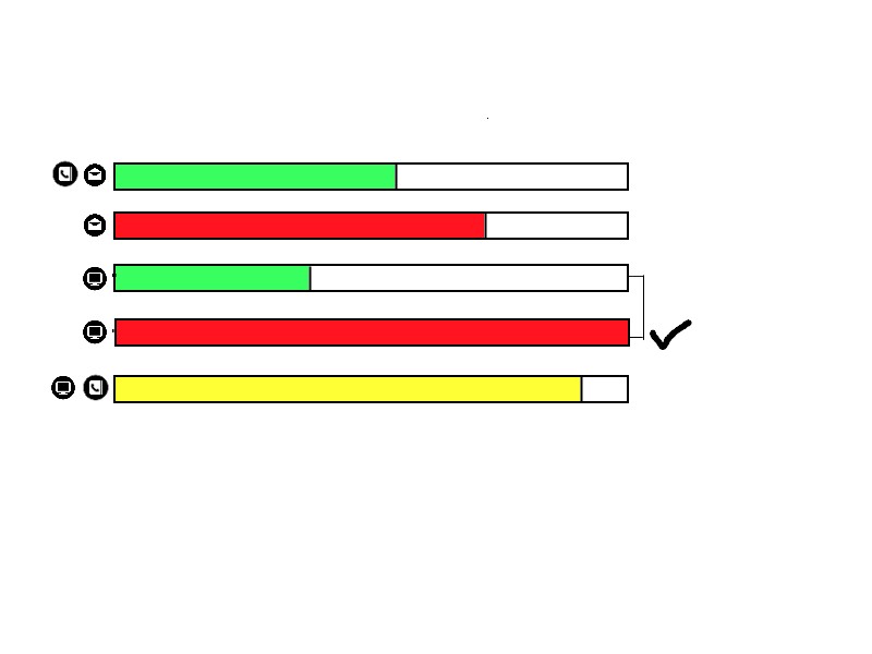
When you have to display too much information in one graph you may apply Layering and separation.

For example you may use :

  • bar length for progress
  • Color for priority
  • A check mark for completion
  • Lines for relationships
  • Icons for groups

So you may have something like this :

enter image description here

0

Your Answer

By clicking “Post Your Answer”, you agree to our terms of service and acknowledge you have read our privacy policy.

Not the answer you're looking for? Browse other questions tagged or ask your own question.