18

I'm designing a dashboard which has a graph showing the humidity notification trends across multiple locations over a selected timeline.

The challenge I'm facing is that there's 70-100 locations that need to be shown in the same graph. Showing so many locations at the same time would make the graph unreadable.

One solution I'm exploring is to have some groups so that only some show (e.g. top 5 with highest notifications; refer to the image) at a time, and have a way for the user to navigate to the next 10 and so on. What would be a meaningful way to navigate between these groups?

I'm also curious how you would tackle such a problem.

line graph showing locations 1-5 as different colored lines

4 Answers 4

27

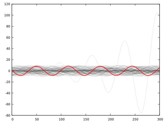
For a quick look, rendering all the lines with low opacity allows seeing the most common values and any outliers quickly:

Example of transparent rendering

Then you can provide a way to select groups or specific measurements to highlight against that background. Ideally user can select from image and see the identifier, or by identifier and see the line in the image.

3
  • Cool trick!! Loved it. Commented Feb 2, 2022 at 19:26
  • I use precisely this trick in my software that displays time-series plots for data from multiple sensor channels. All channels are available for display at once on the graph, and the legend includes entries for each channel. However, that results in a very noisy graph in the common case where you have something like 32 distinct sensor channels. Therefore, the interactive legend allows you to make all channels but the one you're interested in draw in low-opacity mode, just as you show here. This definitely makes it easier to see the channel of interest, while not losing context/outliers.
    – Cody Gray
    Commented Feb 2, 2022 at 19:57
  • 3
    Couple of years back used to work for a data aggregation and visualization company and this was one of the solutions I designed there as well. Instead of opacity we just went with a two color scheme. Some thoughts: I ended up spending quite a bit of time on the mouse hover behavior, as one common desire is to find out which line is the one which deviates from the trend. Getting this to behave well when you have a lot of closely bunched lines is pretty difficult, but in my exp worth it. Also important, the ability to hide outliers (to prevent the axis getting to dominated by a single line). Commented Feb 3, 2022 at 15:50
10

What's the use case here, what are you users looking for?

I would try to focus on the insights that need to be derived from this graph, and see if there's a way to isolate them. E.g. just the outliers, or abnormal behavior, or commonalities, or specific concerning trends, or any other specific criterion. This can be defined dynamically by the user. It's possible that this chart should be the 2nd level drilldown from an earlier screen displaying just the relevant insights, which would let you filter out the irrelevant data. Or a 3rd level :). 70-100 series of raw data is much too much to handle.

If you're going for grouping, I would also aim for a dynamic grouping criterion, where a user can define what they'd like to group by, starting with geographical regions. And possibly displaying them in a dropdown somewhere around the chart.

2
  • Thanks for the ideas. Actually this is a 2nd level drill down chart. but it still needs to show default data until the filters have been applied. i'm looking at sorting the locations by highest notifications 1st. So the most urgent ones will be showing in the 1st group. but i''m unsure what would the the logic to separate them by. If nothing else i'm thinking groups of 10. your thoughts?
    – Blue Ocean
    Commented Feb 2, 2022 at 14:13
  • 4
    but it still needs to show default data until the filters have been applied the key here is "default data"; with such high volumes of data, "default" doesn't mean "unfiltered", it means "with default filters applied". As this answer mentions, this depends on what information will be derived from this data, which should be defined by your clients/users/product owners
    – Josh Part
    Commented Feb 2, 2022 at 18:08
9

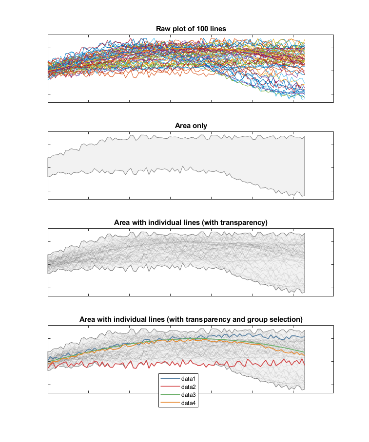
One nice approach can be to use a shaded area which covers the entire range of your data, with all of the lines overlaid. This can give an impression of trends without showing too much clutter.

Adding the original lines on top of this gives a better sense of density within the whole area. Giving these lines transparency is a further improvement already noted by other answers to give a sense of density.

Then selections made for your specific groups could simply "colour in" the selected lines, so they go from the background to the foreground.

This progression is shown below:

plots

Of course the last plot here can also look effective without the background area, but some faint lines at the extremes of your data can get lost.

3

A good tip: when a user wants to see that many data points/sources, he/she is not curious about what is the value in each of them, but where there are jumps, deviations, what are the trends. In data visualization, we usually solve this design problem with introducing fewer colors or different use of colors. Collate the data so that it can show the user the information they want to see. In a case like this, trends are more important than separate sources. Which source has the highest or lowest rate. Where are problems, what source differs most from the average, what is the average...etc.

Your Answer

By clicking “Post Your Answer”, you agree to our terms of service and acknowledge you have read our privacy policy.

Not the answer you're looking for? Browse other questions tagged or ask your own question.