11

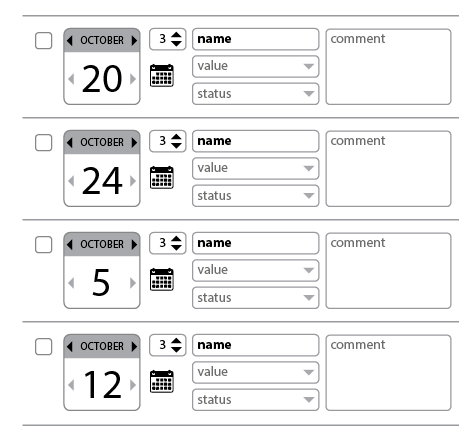
I am seeing that when showing results based in 2 lines, the perception from end-users is not good or as intuitive that in a single line result (even having a slightly different background color)

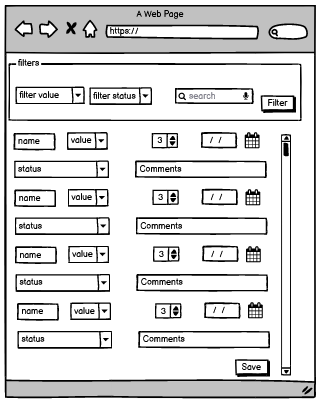
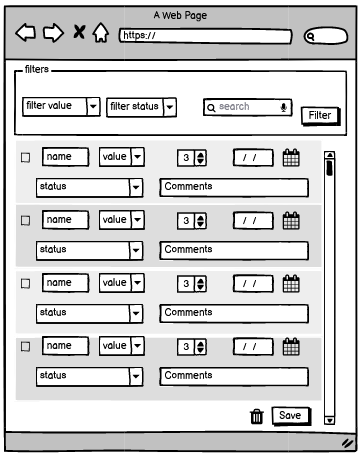
Is there best practices to present a list of multi-line result? Any suggestion to apply to the 2nd mockup?

mockup  current

mockup proposal

4 Answers 4

17

Best practices for multi-line list items aside, the underlying concern here is visual grouping - users should be able to tell that a collection of elements are grouped.

And for visual grouping you have Gestalt Principles:
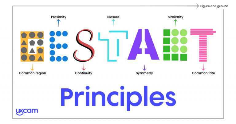
Gestalt principles diagram

Single Line List Items

With single line list items, visual grouping is largely based on continuity - the vertical alignment creates a perceptual horizontal group.

Multiline List Items

Once items occupy more than one line, the continuity principle breaks, so you need to employ something else. You options are:

  • Proximity - Have larger gaps between items than between lines.
  • Common boundary - Introduce border around (or between) each item, or a background (either toggle background or same one with gaps between blocks).

Which one you choose is more of a question of both graphic design (aesthetics) and context (how the rest of the interface looks like).

To give one example, in the next design a border between items creates clear visual distinction (source):

A multi line list

3
  • 2
    What is meant by "common fate" in the graphic you used? And under which of these principles, if any, does @Danielillo's suggestion to pick a "referent element" and make it a landmark to separate each item fall under?
    – theberzi
    Commented Oct 21, 2021 at 12:43
  • 3
    uxcam.com/blog/gestalt-principles/#Law_of_Common_Fate. I guess a "referent element" means an element that makes it clear what's around it belongs to the same group (like the video thumbnail on the left). In this case, the law of similarity will apply here - because items have the same visual layout with distinctive visual element, they are seen as a group.
    – Izhaki
    Commented Oct 21, 2021 at 12:52
  • 1
    In other words it moves the "burden" of expressing similarity from an individual element within the item, to each item itself, by making the referent prominent enough to represent the item as a whole. Clever!
    – theberzi
    Commented Oct 21, 2021 at 13:53
14

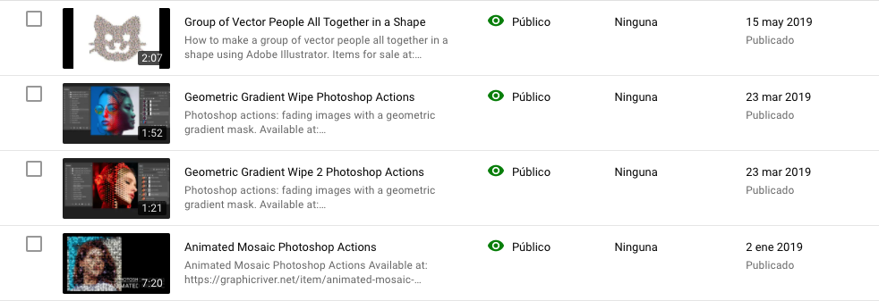
There are several examples of results with more than two lines, such as Youtube Studio, where a referent graphic element creates the separation without practically any visual perception problem and without using any added visual artifacts.

enter image description here

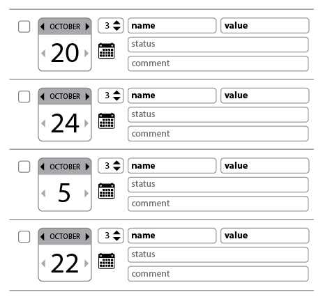
In the case of the question, I would try to find this referent element. I have no information about the content, but for example the date block may be an idea, all depends on the visual priority of each item.

enter image description here

On the other hand, not all the elements must be graphically the same, establishing visual contrasts such as the use of bold letters, fields with different graphic weight or managing well the blank spaces, helps to create well-defined compact visual areas.

enter image description here

7

You could use different implementations of Gestalt principle to solve this:

  • Law of Common Region by visually grouping items in one result (pretty much what you did on your second mockup);
  • Law of Proximity by arranging grouped items to be closer to each other than to another group (essentially, by leaving more space between results);

User testing is the best way to know which solution is better in your implementation.

Also, please see this question and answers for whether to use alternating coloring of the results or not.

2

I'd be happy with the second mock-up, and unhappy with the first.

It could be made even clearer by implementing a mouse-into action which emphasized the panel a bit more when the mouse was within it. (Discoverability: if unsure, just point without clicking, and it becomes more obvious).

Comment: is it a list view, or a list of forms? The mock-up suggests the latter. For a pure read-only view, simple tables have a lot going for them. Familiarity with the layout, for one. (DataTables, for another :-) When I've had difficulty with textual tables becoming too long, I've always preferred to make the entities split onto multiple lines within a table cell, with the start of each entity remaining on a single horizontal. With input elements and less textual elements in general, this isn't really applicable.

1
  • You are right , it is a edit list view with input elements. Commented Oct 22, 2021 at 7:38

Your Answer

By clicking “Post Your Answer”, you agree to our terms of service and acknowledge you have read our privacy policy.

Not the answer you're looking for? Browse other questions tagged or ask your own question.