2

I'm having trouble finding any best practices for a report designer when you have some data elements which repeat multiple times within a single report. Every report design best practice seems to assume that every element repeats a single time or that they all repeat together.

For example, say the report is about managers and their employees with everyone's salary. On each row, you have a manager, their salary, and then a repeating list of each employee with their salary.

The standard format doesn't really work so well.

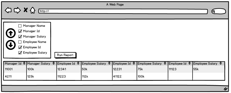
enter image description here

The reason why is that manager information cannot be sorted alongside employee information. Here are two sample reports.

enter image description here

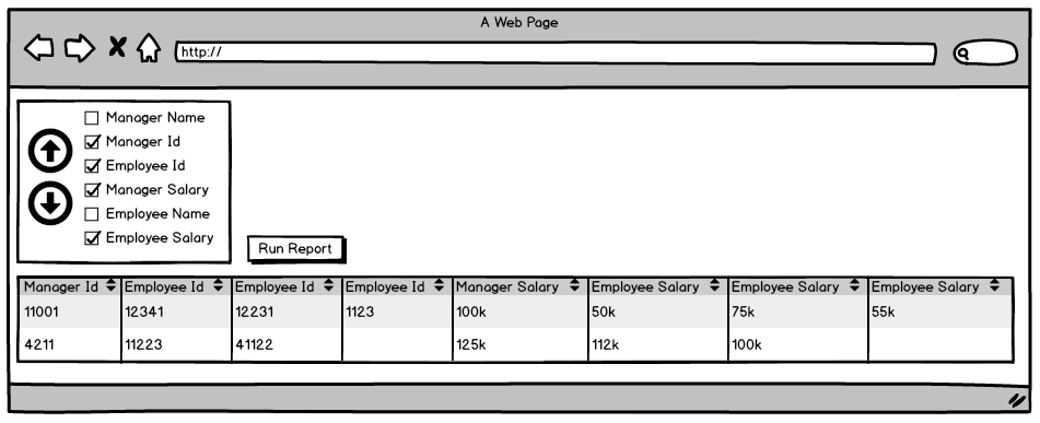
In this report, everything seems to work well. But when I sort Employee Id to right under Manger Id...

enter image description here

The behavior changes. In this case, Employee Id and Employee Salary now repeat independently instead of repeating as a group, because Manager Salary is now in the way.

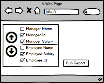
So the best option seems to be to lock down the sorting. You can sort Manager information and you can sort Employee information, but the two cannot be sorted with each other.

enter image description here

Here, the line stops the sorting (but I doubt a line is the best way to present these are not being able to be independently sort it).

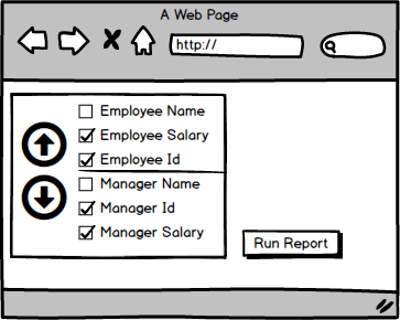
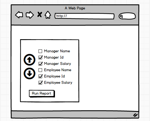
enter image description here

But what if I want all the Employee data (with Id and Salary repeating as a group) before all the manager data. How would you present an option to the user to switch Employee data with Manager data? What if you had more types of repeating data other than Manager and Employee (say we added in assets where Managers and Employees could each have multiple assets along with the value of the asset)?

As far as I can tell (and talking with a few UX folks where I work), this is a really abnormal report and there are no best practices or accepted designs for handling this. I fear coming up with a custom way to handle this will confuse the end users.

P.S. The users are the ones insisting we have a single row per manager format and we don't have the political power to resist.

2 Answers 2

1

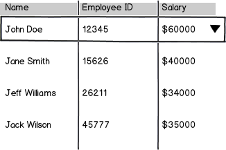
Excuse this terrible mockup...

mockup

download bmml source – Wireframes created with Balsamiq Mockups

You might be able to solve this by having the manager row be the primary thing "listed" in the report, and having their employees nested underneath. One way you could show that is to have the managers' name(s) be a header (maybe collapsible, as shown above) and then show employees below that. A more typical tree-like listing might be another way you could do it, sort of like the Finder view where folders expand in-line to show their contents and each row has several columns of details.

I work for a company that makes enterprise software, and reports are a big part of our products. We have several reports with many-to-one relationships like this, so we often solve this problem by doing what I've suggested above, or by including the upper-level information in the header of the report (if only one manager's employees are listed, for instance).

1

The design pattern you are looking for is a called a Tree Table.
Tree Tables are common in file browsers such as Finder and email clients.

Jenifer Tidwell describes a Tree Table at length in Designing Interfaces:

What: Put hierarchical data in columns, like a table, but use an indented outline structure in the first column to illustrate the tree structure.

Use when: The UI displays multivariate information, so a table works well to show the data (or allow them to be sorted, as in a Sortable Table). But the items are primarily organized as a hierarchy, so you also want a tree to display them most of the time. Your user are relatively sophisticated with respect to GUI usage; this is not an easy pattern for naive computer users to understand (and the same can be said about most hierarchical views, including Cascading Lists.

Why: Combining the two data-viewing approaches into one view gives you the best of both worlds, at the cost of some visual and programming complexity. You can show the hierarchy of items, plus a matrix of additional data or item attributes, in one unified structure.

How: The examples show what you need to do: put the tree (really an outline) in the first column, and the item attributes in the subsequent columns. The rows -- one item per row -- are usually selectable. Naturally, you can combine this pattern with Sortable Table to produce a more browsable, interactive structure. Sorting on the columns disrupts tree ordering, so you'll need to provide an extra button or some other affordance to re-sort the table into the order the tree requires. This technique seems to have found a home in email clients and news readers, where threads of discussion form treelike structures.

More at: http://www.designinginterfaces.com/firstedition/index.php?page=Tree-Table

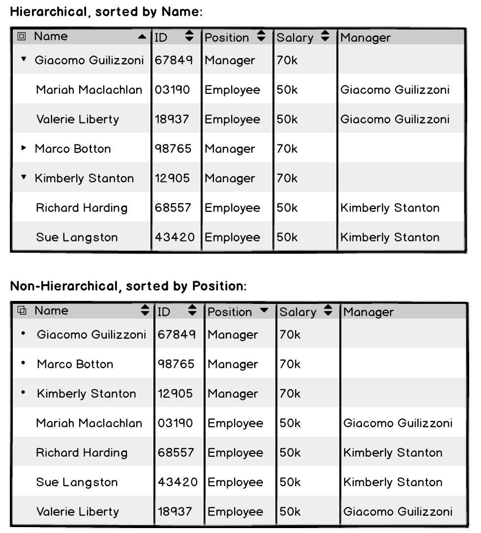
In your specific example you could try something like this:

enter image description here

Notes:

  1. This wireframe features a toggle in the upper left hand corner that allows the user to switch between hierarchical and non-hierarchical formats.
  2. By disaggregating "Manager" and "Employee" from repeated category headings and by creating a "Position" category, the user will be able to sort by position.
  3. If you are creating this to compare managers and employees, I suggest adding assets and asset values as additional column categories instead of nesting them under their owners.

Your Answer

By clicking “Post Your Answer”, you agree to our terms of service and acknowledge you have read our privacy policy.

Not the answer you're looking for? Browse other questions tagged or ask your own question.