21

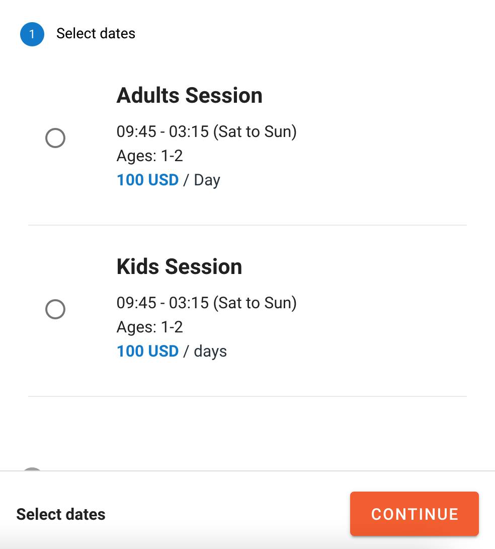
We have a booking platform where users choose different types of activities to do in their area; each activity has many sessions or options, which are listed in radio button groups as shown in this image:

two options with radio buttons, and a continue button on the bottom

The issue is that customers don't know that they have to click on the radio button or anywhere in the box to the right of it to make a selection.

What would be the best way to solve this issue?

4
  • 2
    Is there a specific reason there needs to be two clicks: select the date, then continue? Why not select the date directly by clicking on it (possibly with a "Select" or "Choose" button)?
    – jcaron
    Commented Jul 9, 2021 at 10:27
  • @jcaron After you click on the session or chose button as in the answer a calendar will show up for them to select dates .. then they click done button and then click continue. Do you think we should go to next step directly after selecting dates and clicking done ? Commented Jul 9, 2021 at 10:39
  • 1
    I think they should pick the session (with a single click), which will then bring them directly to the next screen (date selection).
    – jcaron
    Commented Jul 9, 2021 at 10:41
  • 3
    At first glance I thought there where three radio buttons of which the first (1) is already selected. At least make the first text not look like a radiobutton.
    – Jeff
    Commented Jul 9, 2021 at 11:15

3 Answers 3

42

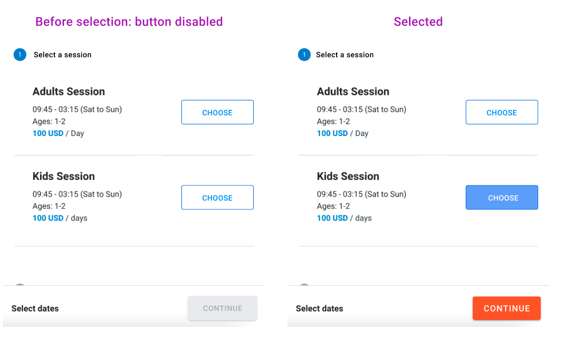
Try being explicit with a set of buttons, and tie the [continue] button to the action.

Since users have to choose one of a set of available sessions, try disabling the CONTINUE button, so it's apparent they can't move forward.

Pair that with a set of buttons aligned above the next step, and experiment with a label that's clear (you can test which text is the most straightforward).

You can also try renaming the step so that it emphasizes a singular choice. I removed the word 'dates' because it might imply selecting more than one.

enter image description here

When the selection is made, CONTINUE is enabled, showing them a path to move forward.

8
  • 2
    Mike's suggestion is good. It's basically a 'make buttons look like buttons' issue. And it's possible that as traditional radio buttons are used less nowadays, users don't recognise them as buttons.
    – PhillipW
    Commented Jul 9, 2021 at 8:53
  • 1
    That looks so much understandable for me , we will update and test it.. Thanks for your amazing answer :) Commented Jul 9, 2021 at 10:26
  • 1
    Precisely this. I would also change the 'Dates" text at the bottom. There is no DATE whatsoever on this screen. "Select Dates" makes no sense at all for this screen.
    – Tonny
    Commented Jul 9, 2021 at 12:32
  • 2
    This kind of design is much clearer is the text on the button changes when it is selected. Commented Jul 9, 2021 at 19:46
  • 3
    Note that if there are only two choices, buttons like this (where the only difference is an inversion of colors) make it hard to tell which button is selected one and which isn't.
    – jamesdlin
    Commented Jul 10, 2021 at 20:48
26

I would personally go one step further:

enter image description here

Let the user select the session, and that then brings directly to the next screen. There's probably no need to select first and then confirm in that scenario.

The text of the button could be "Select", "Choose", "Continue", "Book"...

It could possibly be more explicit about the next step "Select and go to date selection" but that takes a lot of space, so it probably depends on whether this is on mobile or desktop (or both).

1
  • If you do this, it would be good to provide an obvious way to go back on the next step. There will be mis-clicks and changed minds, and this doesn't afford an "are you sure?" moment. Commented Jul 12, 2021 at 2:01
2

The expectation of a user from traditional radio buttons is that one option is initially selected, so either pre-selecting the most popular/likely option, or if an accidental transaction is to be avoided, a cancel option, should make this much more intuitive.

Your Answer

By clicking “Post Your Answer”, you agree to our terms of service and acknowledge you have read our privacy policy.

Not the answer you're looking for? Browse other questions tagged or ask your own question.