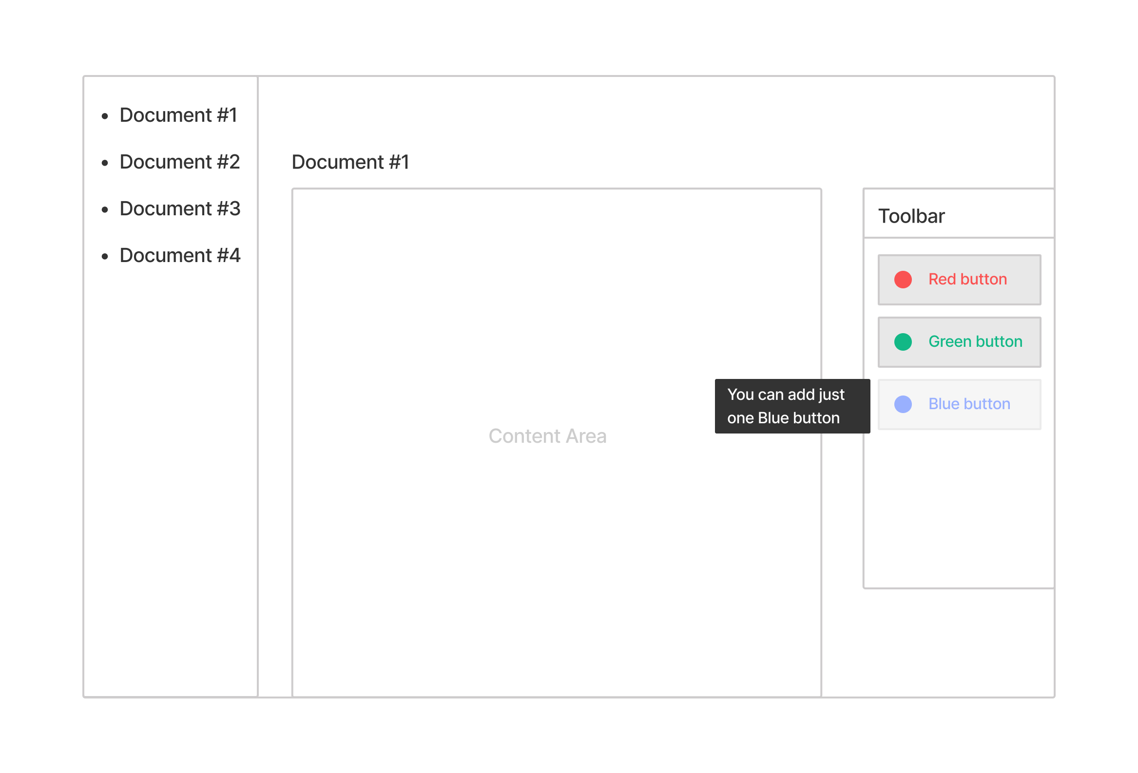
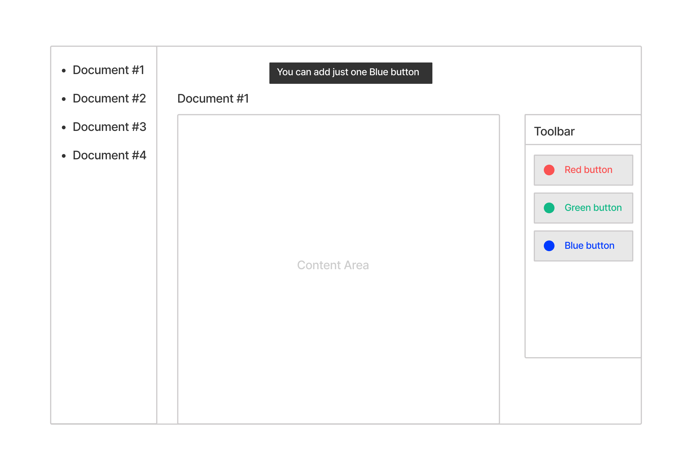
I think the technique in your Picture A, disabling the button and showing a tooltip when you can place no more, looks fine. It is very similar to how the video game Super Mario Maker 2 handles this same problem.
Super Mario Maker 2’s UI for parts with limits
Super Mario Maker 2 is a game that lets you build custom levels by adding parts to your level from the library or from the toolbar. The toolbar is automatically populated with items you have recently placed. You can either select a part first, then tap the level to place it, or drag a part from the toolbar to the level.
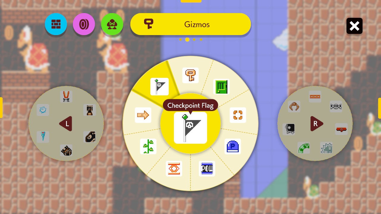
Most parts can be added without limit, but some have a limit. For example, only one Checkpoint Flag may be placed. Here’s what it looks like when you select the Checkpoint Flag from the library of parts:

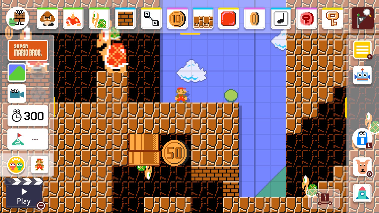
After confirming your selection, the Checkpoint Flag is selected in the toolbar (at the top right), ready to be placed:

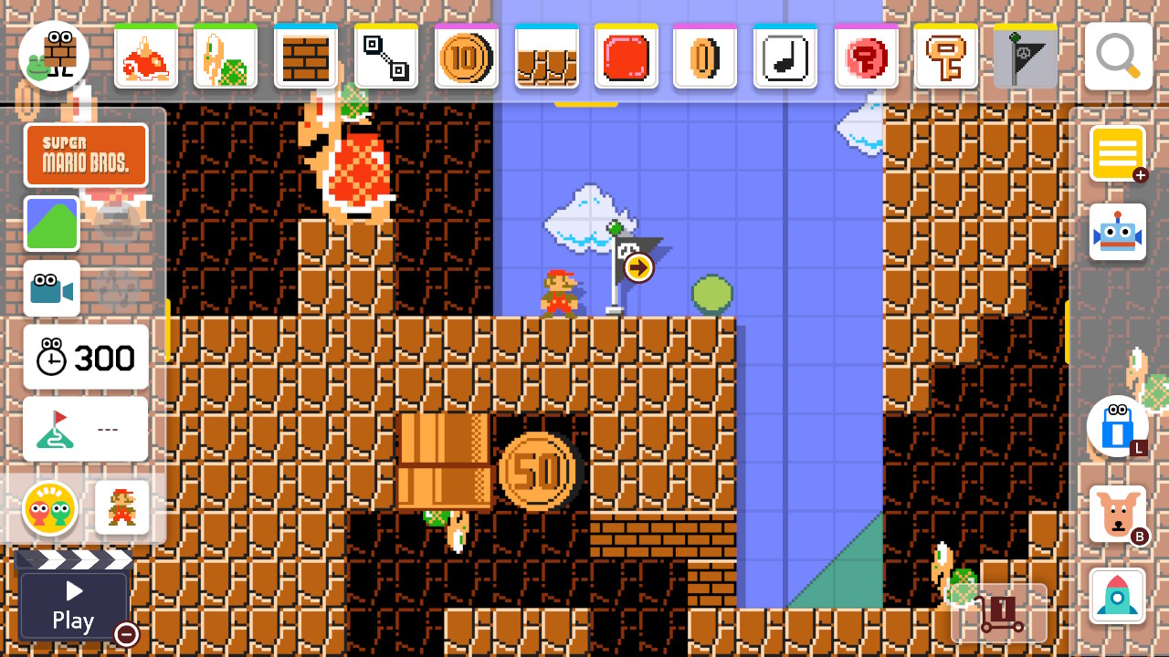
After tapping the level to place the Checkpoint Flag, that part gets added to the right side of the toolbar, as it is the most recently used item. Also, since you have placed the maximum number of that part allowed, the square for that part turns gray to show it can’t be placed again:

Tapping on the screen to place another Checkpoint Flag or trying to drag a copy of that part from the toolbar does nothing but play a wood clunk sound effect.
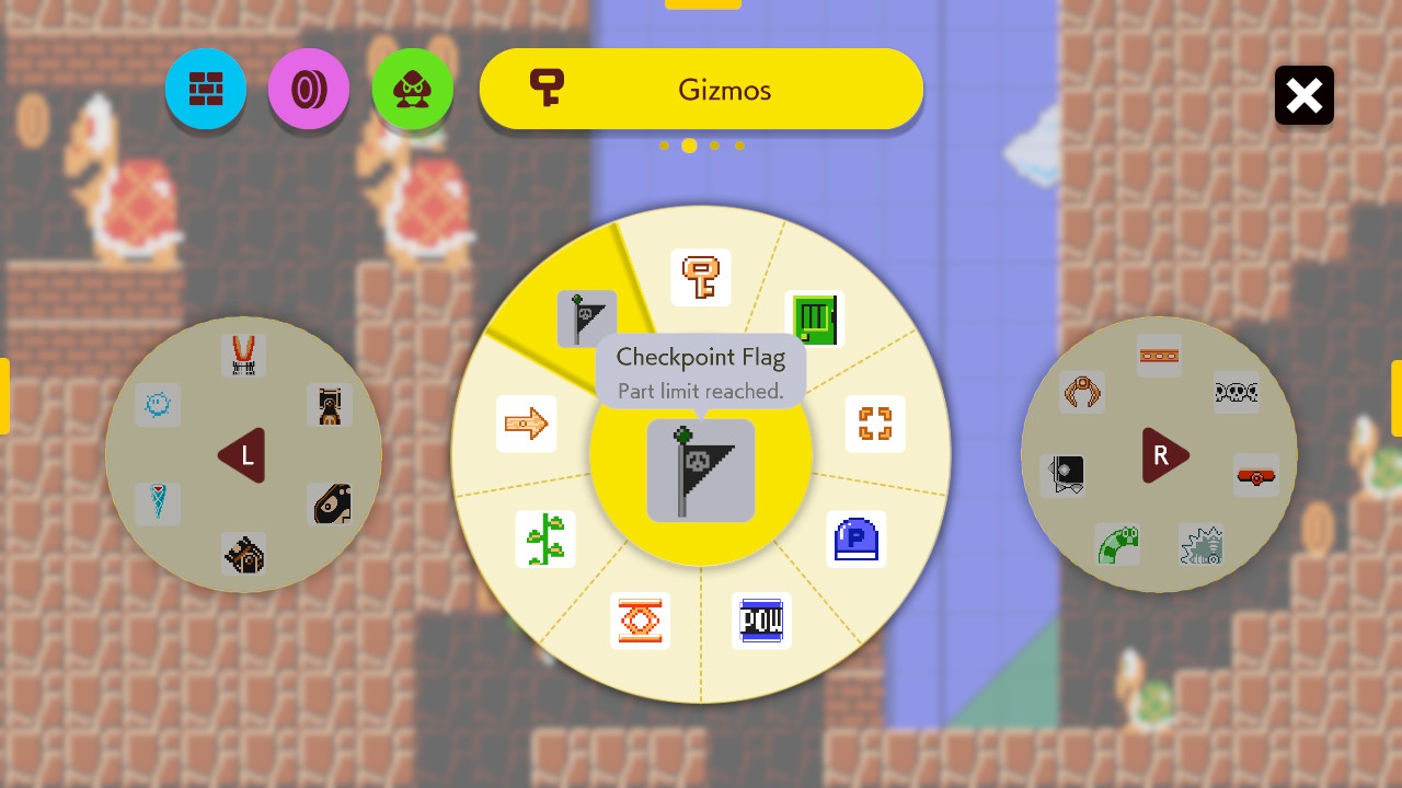
If you open the library again, the Checkpoint Flag is grayed out there too. If you select it, the tooltip now includes “Part limit reached” in addition to the part name:

I found Super Mario Maker 2’s UI pretty clear when I built levels in it. However, the game assumes input with either an analog controller or a 6-inch touch screen. A UI for a desktop computer that requires a mouse may require some changes.
Still, for your specific design, I don’t see any flaws in your Picture A. It seems a fine way to communicate why you can’t place any more of a part and which part it is you have run out of.

