6

A form I am optimising for mobile has specific references to terms and conditions in numerous times (not just at the end usual checkbox, for example "We need this detail to sometimes contact you, read our terms and conditions to find out more), which on the desktop version open the content in a new window.

What is the best way to show the user these terms and conditions but make it easy to get back to the registration process? should they open up in a new "window" but have clear method to get back to the form?

Remeber this is for mobile.

2 Answers 2

6

The simplest option is to just navigate to the terms and conditions page, but give nothing on that page other than a back button to take the person back to the page where they clicked the link.

That way they aren't going to get lost, and you don't have to mess around with other popups etc.

1
  • This is what I was thinking, just good to get an opinion! thanks
    – Wander
    Commented Nov 6, 2011 at 22:44
2

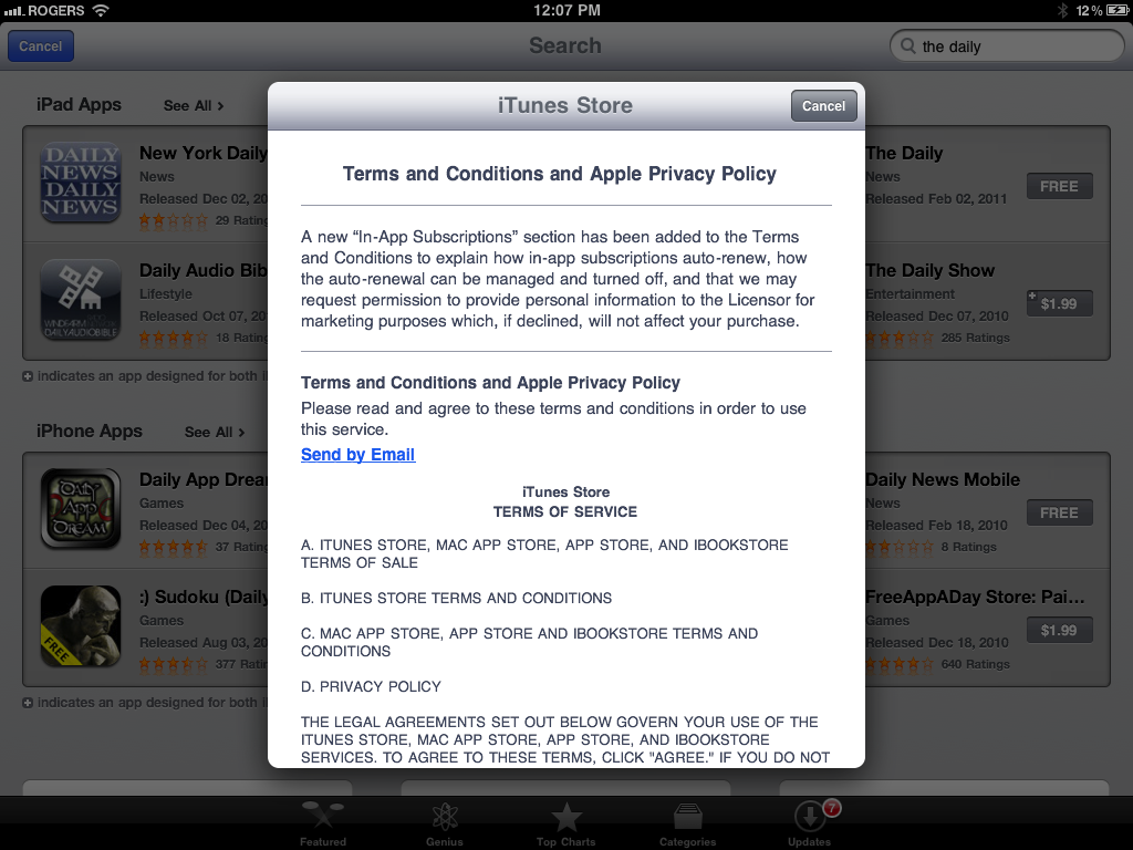
If you're looking to do a little more, one nice touch apple does with terms is offering the option to email them to you. This process forces the user to explicitly accept them. A lot of times a checkbox will suffice with a link to the terms. This somehow seems more explicit and less "We're just doing this because we have to".

http://cdn.tipb.com/images/stories/2011/02/photo.png

I think the assumption with emailing is that you're already logged in which may not be one you'd like to make.

Your Answer

By clicking “Post Your Answer”, you agree to our terms of service and acknowledge you have read our privacy policy.

Not the answer you're looking for? Browse other questions tagged or ask your own question.