8

I'm designing an e-commerce site with red buttons. It has a yellow/white background and it looks quite good that way.

Now, my boss finds the same, he likes it, but he is doubtful, because red could mean "stop". So, he suggests to make those buttons green, because that would mean "go".

These are just some of many arguments. All colors may have different meanings. Red can be energetic, alive, and draw attention to it very powerfully. Our buttons convey "buy" or "enjoy", so this is not to be taken lightly.

I tell him that I've seen a lot of sites with red buttons, and also quite big call-to-action buttons in red too. "http://mx.letsbonus.com/mexico-df-norte" would be an example of such a (e-commerce) site.

We both would like the site with red buttons. But he is afraid that that could be a "make or break" decision. The e-commerce site must work, and depending on the color of the buttons there may be a difference in how people react and that could improve of worsen sales. So, what's best? c

4
  • 2
    What are the brand colours?
    – Erics
    Commented Sep 30, 2011 at 0:26
  • Red, white and gray. Red is the most important color of the logo.
    – Lalo
    Commented Oct 3, 2011 at 15:29
  • Just because a brand has a colour doesn't mean you have to use it on controls. Commented Jan 26, 2017 at 18:59
  • Checkout Macy's website they too are incorporating red color for CTA's. Red color invokes urgency. If you want your customer's to take an urgent action on the product (i.e buy) then red color works out. Try out A/B testing within the office team.
    – NB4
    Commented Jan 27, 2017 at 9:56

8 Answers 8

12

Unless you are using colour in an application where it could be mistaken as a signal (for example traffic signs), it is actually a very good colour to use to draw attention to something.

This has been confirmed by testing.

That said, it is still useful to do A/B testing on your specific audience and see what works best for you.

Some examples of testing results:

How We Improved Our Conversion Rate by 72%

Green vs red buttons at Dmix

2) Changing our signup button from Green to Red

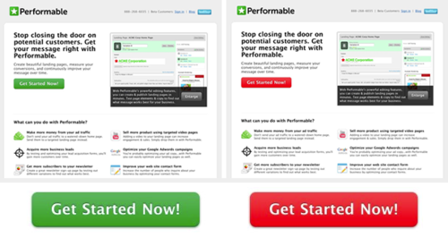
Earlier this week I came across an article by Performable that explained how changing their call-to-action from green to red increased conversion by 21%.

I had to try it out so that day I set up an A/B test on our homepage call-to-action.

So far we’ve had 600 participants and our conversion rate has increased 34%.

The Button Color A/B Test: Red Beats Green

Green vs red button at HubSpot

The result? The red button outperformed the green button by 21%.

21% more people clicked on the red button than on the green button. Everything else on the pages was the same, so it was only the button color that made this difference. This was a much larger difference that I expected.

0
8

Test both and see which one converts better.

1
  • 3
    Split testing is the right answer, here. But in my opinion red can work fine for anything if it's a sensible part of your design (see Target's Website...).
    – Evan
    Commented Sep 30, 2011 at 1:59
2

I think red is fine, providing that:

  • you avoid using red for error messages / rejection notices in other areas
  • you use red colouring for 'positive' actions and calls-to-action elsewhere

I haven't been able to find much serious literature on the psychology of colour (perhaps another poster can provide some), but my understanding is that research does indeed hint humans respond quite potently to the colour red, and that reds are indeed very noticeable.

0
1

I am using a red "PLACE ORDER NOW" button on my checkout page, and blue buttons on the rest of the site. Only 2% of customers who reach the checkout page do not place orders.

2
  • Wow! Quite convincing!
    – Lalo
    Commented Oct 3, 2011 at 15:22
  • 1
    It's not really, without knowing how many people would have placed orders if the button weren't red.
    – calum_b
    Commented Jan 26, 2017 at 15:59
1

I think a good “rule of thumb” is:

Copy what amazon does, until you have enough customers and resources to do your own A/B testing.

However be careful, just getting more conversions in the short term my not be what you want. (e.g. Having a website that converts a few more people on the first view, but “turn off” a lot of people that may have come back to buy later.)

1
  • Your argument is complex. We've, of course, analyzed Amazone's case, but it is not that easy, in my opinion. Firstly, Amazon doesn't have the same colors; secondly, we're just starting, and they are huge. That makes a different navigation necessary. So, the scenarios are sometimes difficult to balance. But, in general,yes, one should at least start by checking what Amazon is doing, I agree.
    – Lalo
    Commented Oct 3, 2011 at 15:28
1

It can depend on the shade of red, and how it looks on the site. A very bright, glaring red can be a turnoff, because it does have some negative connotations, and it can be considered aggressive.

However, if you use a darker red, against a pale yellow background, they should look very good. And a darker red has fewer implications of "stop" (or advertisement, which is the other suggestion of a bright red button).

There is no reason for not using a particular colour scheme. But adjusting the tone of the colours to avoid problems or clashes is always worthwhile. Stick with red, but look at the shade being used.

1
  • Thank you. I was actually going to post the two different colors on the site here, but I'm not allowed yet. But yes, our red isn't really flashy, rather a darker red that has a gradient towards a brighter red, but they are balanced quite nicely.
    – Lalo
    Commented Oct 3, 2011 at 15:16
0

I've always found out that only reading and asking others is not going to help. The best thing is to read about the split testing, see what works for others, then try it yourself. And don't try only 2 variants, because you definitely aren't going to find the best one out of two. Do it continuously until you fail to improve anymore.

By doing split tests I manage to get results up to 300% better than before, but it takes time and work to test absolutely everything.

1
  • Hi Alex. Welcome to the UX Stack Exchange! Perhaps you can add a concrete example to explain how you've found this testing method effective? Commented May 5, 2013 at 18:51
0

Is there anywhere else on your site where you use red to signify, "stop", "quit", "exit", etc.... If so then make sure your button is different than those in some way, maybe a softer red, but in theory, there's no problem with using red buttons on an eCommerce site that i can foresee, if you take a look at many themes for Magento, a popular open source e-commerce platform there are places where you can see red buttons throughout the checkout page, and other places. Also typically from what I've seen they're usually softer red colors.

Your Answer

By clicking “Post Your Answer”, you agree to our terms of service and acknowledge you have read our privacy policy.

Not the answer you're looking for? Browse other questions tagged or ask your own question.