36

A "happy state" is a bit like an empty state but occurs when the user successfully completes a task or likewise.

Is there a coined term for this kind of screen?

Example (this source names it a "congrats page" but that doesn't sound right as it doesn't speak for other kinds of "happy states"): enter image description here
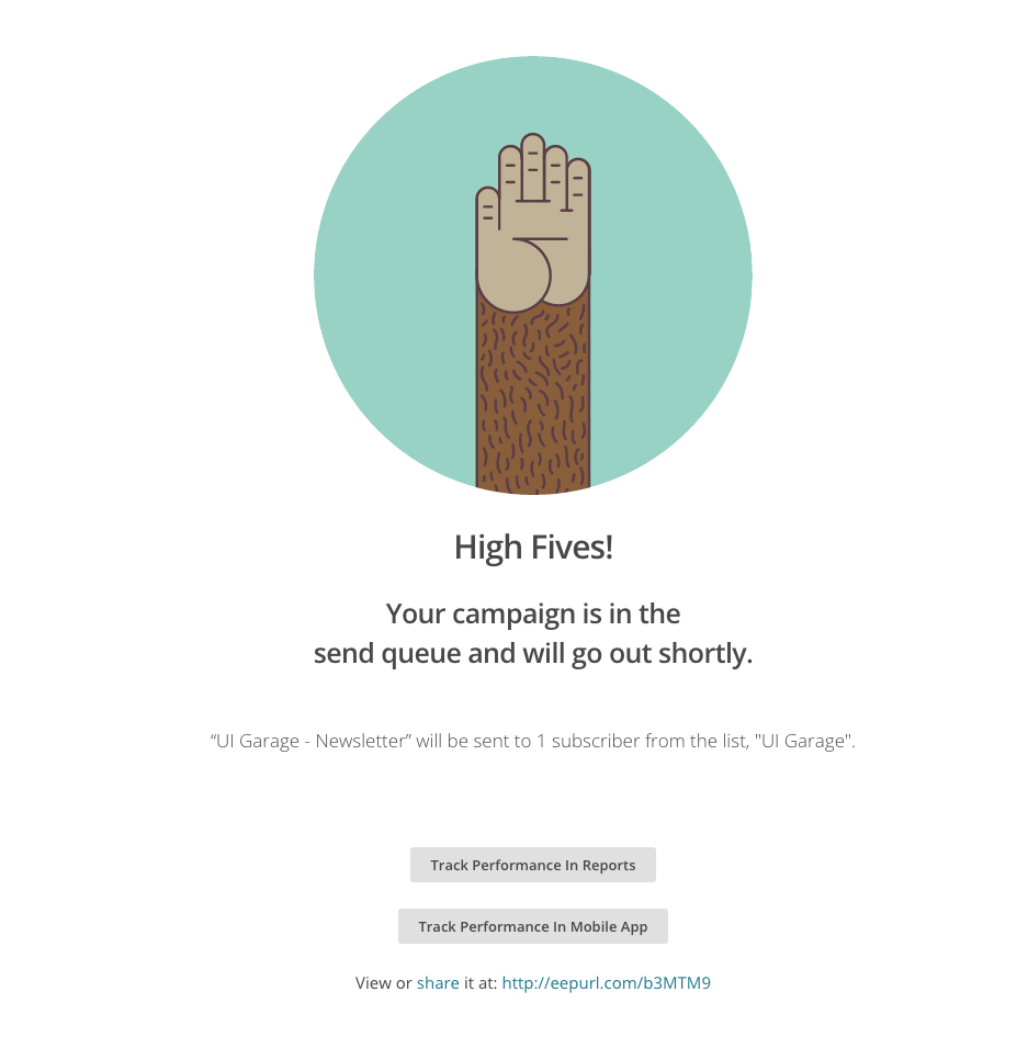
Edit due to comments: I'm asking about the way to describe these particular type of screens. Not the potential mental state of the user!

7
  • 3
    Can you possibly tighten this question up a bit? Are you asking about a way to describe a screen? or the potential mental state of a user looking at this screen. It's a little confusing to talk about screens being in a "happy state", and if it's the user's mental state you're talking about, then using emotions as a reference is likely to be inaccurate, because it's quite possible for one user to reach the end of process and be pleased, but another to reach the end of the same process and feel completely indifferent about it.
    – dennislees
    Commented Sep 20, 2018 at 13:30
  • 1
    makes me think about "fist bump" ad for Stack Overflow teams. This hand tells me "STOP, you can't go any further", not the intended high five invitation.
    – Pac0
    Commented Sep 23, 2018 at 9:17
  • @Pac0 it would probably be better with another hand going in for the high five but it was just an example. Commented Sep 24, 2018 at 8:34
  • 1
    In console game terms, this would be the end sequence? Possibly this morphed into endgame ?
    – Caius Jard
    Commented Sep 24, 2018 at 12:23
  • @CaiusJard this question doesn't really have to do with console games (maybe my fault for not making it clear) and I'd imagine that being a separate question in itself. Commented Sep 26, 2018 at 6:16

5 Answers 5

68

Should be "Success page". Derived can be "Success animation", "Success screen". Its also more accurate as not every success needs to be happy.

7
  • 88
    +1, not every success is happy. "You have successfully removed Bob from your friends list." Yay!
    – Johndt
    Commented Sep 20, 2018 at 18:16
  • 93
    @JohnT I mean, Bob had it coming.
    – anon
    Commented Sep 20, 2018 at 18:20
  • 2
    A "happy" state seems to me to be the inverse of the empty state. That is, the empty state is a starting point, such as a shopping cart or favourites list, whereas the happy state is getting to the bottom of the stack, such as clearing all the customer support tickets or getting to an empty mail inbox. "Success" describes a single action, like paying for a shopping cart or sending a campaign (as in the question). Commented Sep 20, 2018 at 19:45
  • 1
    @JohnT shouldn't that be a -1 then, since OP specifically asked for happy state? This answer will encompass scenarios that aren't necessarily happy, like you said. Unless OP asked the wrong question (which seems to be the case).
    – ESR
    Commented Sep 21, 2018 at 1:37
  • 3
    @ESR, no, "happy state" and "happy path" are common terms in development for things working as intended. There's a happy path/state for paying parking tickets, though the users are rarely happy when they're there.
    – Tim Grant
    Commented Sep 21, 2018 at 15:29
8

Visibility of system status is one of the 10 heuristics defined by Jakob Nielsen, even though Mailchimp does a good job when it comes to the wording, the screen you uploaded is not primarly meant to make the user "happy", the primary use is to tell the user that his action was successful.

You can read more about that here:

10 Heuristics defined by Jakob Nielsen

So if i would have to name this kind of screen i would name it "feedback screen".

Many companies with a different language defined by their brand guidelines would not use the "high fives" as the headline and instead would write something like "Success" etc.

1
  • 1
    +1 for the suggestion in the last sentence. Possibly also just move the "Your campaign is in the send queue…" to the top - it's the important message - and keep the picture followed by "High Fives!" if that matches the brand.
    – Bergi
    Commented Sep 20, 2018 at 18:37
5

The traditional term to describe the ideal mental state achieved upon successful completion of a step or process is delight.

"e.g. the user reads that their submission was successfully received and was delighted"

This is used to describe the optimal mental state of a user. Not just that they are feeling positive, or satisfied, but that there is some element of pleasure involved.

There's a lot out there on the topic. Here's a selection from a search for 'UX delight':

https://www.nngroup.com/articles/theory-user-delight/

https://uxplanet.org/delightful-experience-be7098a44666

https://uxmastery.com/formula-delight/

2
  • 4
    I don't think this actually addresses the OP's request. He was asking about an app state, a page to show, not the user's mental state. As far as I understand it.
    – Big_Chair
    Commented Sep 20, 2018 at 13:21
  • 1
    Good point. I'll ask for qualification.
    – dennislees
    Commented Sep 20, 2018 at 13:27
5

I think if this was a transactional type of task (i.e. making a purchase of something) then a confirmation page would be your 'happy state' because after the purchase/checkour page you will get the confirmation page/message.

However, for a non-transactional type of task there really isn't a page that shows completion of task (since you never undertook one), so I don't think there would be anything like this.

If we are talking about it from the designer's perspective, rather than using a subjective term of whether the user is happy or not, it is preferable to use a term like 'ideal state' or path for the user flow that you are guiding the user towards. From the user's perspective, they might not necessarily be 'happy' to have completed the task either (e.g. it might be to pay a fine), so it is better to use a more neutral term for this.

3

In Anki, a popular open source study app, it is officially called the congratulations screen:

Anki is designed to optimize the learning process, so that you study the minimum amount necessary to remember the majority of your cards. Once the congratulations screen is reached, further study becomes a case of diminishing returns: the amount of extra time spent going over the same cards again is generally not worth the moderate increase in retention you’ll see.

https://apps.ankiweb.net/docs/am-manual.html#filtered-decks

This screen basically tells you "You have no more reviews to perform today".

Your Answer

By clicking “Post Your Answer”, you agree to our terms of service and acknowledge you have read our privacy policy.

Not the answer you're looking for? Browse other questions tagged or ask your own question.