3

In order to create a list, usually I think like a developer and tried to cram everything as much as possible in a single screen so that user can see everything (or as much as possible) all at once.

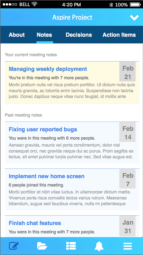
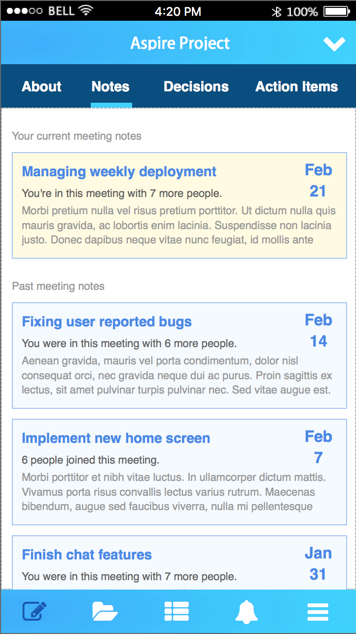
Then after I tried to do a mock up for it, and let it cooldown for a couple of days, I revisited my mock up, and realized that my design looks too crammed. So I tried to redesign the screen with lots more white spaces and tried to hide further actions within a tap (a tap reveal more icons and buttons underneath). But still, I feel that the design feel crammed. I feel like the design is all text and no images, and feel flat with no focal points. But how can I improve a design that's supposedly a bland list of text? Can I get some simple hints on how to make the design does not look crammed?

enter image description here

2 Answers 2

4

Maybe this is my personal opinion, but most of the time when I doing very dry content / wall of text content, I'll consider some of this point in my design:

  1. Give them a white space for them to breath (you excellently did it).
  2. Try my best to limit the usage of border line, just put a bit like border on left only, border on top only (refer image below). too much use of it will make your site crowded and hard to focus.
  3. Put color background at certain item to give them shape, instead of plain box (for example is like the 'Date' grey background as in image below)

Pardon me if my color is abit funny:

enter image description here

1
  • 2
    Yeah, the border line was the main problem I see on my design, but I don't know how to make it better. I see that the way you make it seems a great alternative! Thank you for giving effort with the modified screenshot to show your point! Commented Apr 30, 2018 at 8:34
1

Some things that I have done in the past with projects similar to this:

  1. Look at putting the date on one line, and making the text smaller. Given its in the same place every time, its consistent, so you could probably get away with making it a little smaller, maybe even change the colour.
  2. Look at card-based user interfaces this uses separation of elements combined well with white space. There are some great examples here:
  3. Look at line-height in the text, opening that up a little bit may just add something to it to make it look cleaner.
  4. Perhaps open up the padding a little to make dividing space between elements bigger creating more space for the elements to breathe.
  5. Iconography. I dont know about all the categories of the part where the '6 people joined this meeting' line of text is, but can this be summed up in an icon and number only? I would recommend this is there are only 1-2 categories that go in this space, anymore and it will likely be confusing.
3
  • Yeah, I'm considering make the date smaller. The color is an indication that it's tappable though, so for now I can't change that. This is actually card-based user interface, but I probably execute it poorly. Thank you for the references. Line height probably things where I can tweak of. I rarely think about line heights. And also the padding. Thanks for the input!! Commented Apr 30, 2018 at 8:39
  • I didnt actually realise the date was tappable, think as a user id be more inclined to tap on the title but thats just me, might be something to user test. I realise its card based but I wanted to point out how its others are designed. Line-heights and padding will massively help, the references I highlighted show how effective they can be. No worries at all :)
    – SURO
    Commented Apr 30, 2018 at 8:58
  • I do agree that it needs more user test. The whole cell is actually tappable. So there will be different action for tapping on the title and the box. If there are multiple additional commands associated, it will be revealed when user tap on the box, by expand the box, revealing additional commands (such as edit or delete), navigations (such as open the owner of the note) and contents. if not, then tapping on the title and the box actually opens the same screen. I want to give the user as much control or navigation as possible, but I don't want to showering the user with those at first glance. Commented May 2, 2018 at 4:43

Your Answer

By clicking “Post Your Answer”, you agree to our terms of service and acknowledge you have read our privacy policy.

Not the answer you're looking for? Browse other questions tagged or ask your own question.