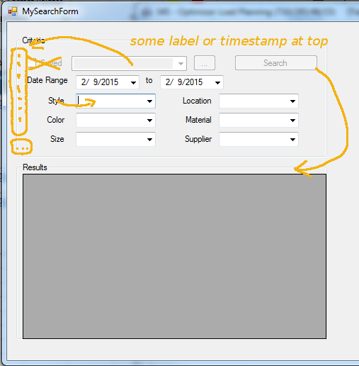
I'm looking for a way to allow the user to perform a search quickly & easily, most of the time using saved searches with relative dates. Frequently the user will want to perform ad-hoc searches using a few common search criteria (don't worry about the labels - these are examples only). Suffice it to say that a date range, combo boxes and text boxes are all possible input controls for the ad-hoc criteria.
It looks similar to this:

The screen defaults the Saved checkbox = true and the user can select from a list of previously saved searches. The ellipsis allows the user to manage the saved searches. The search button is enabled when a saved search is selected.
When the user deselects the Saved check box the ad hoc filters are enabled, and the Search button is enabled when enough of the criteria are entered.
This works well and allows for a minimum of keystrokes to get your job done, and works well once you've used it a few times, but isn't a great user experience for the new user.
How can we more visually separate the Saved vs Ad Hoc search workflow without giving up screen real-estate? We tried a few radio button layouts, but we decided this design worked better for experienced users, showing as many row results as possible.

