25

I have a web app I'm building for my business which essentially tracks an employee's progress doing a pick in a warehouse.

The interface has a progress bar that's colored in, and it's full, and as the user picks the progress bar depletes, from 100% down to 0% -- once it reaches 0% the info no longer appears on screen.

However it might be more intuitive for the progress go from 0% picked to 100% picked -- but I feel like a pick being deleted after reaching 0 is more intuitive than being deleted after reaching 100.

I feel like either way I design it, it will be quickly understood by the people who use it, but if one is slightly more intuitive than another I'd want to take that into consideration.

5
  • 13
    Why do you think it's not logical to remove something when it has been completed (100%)? If I remove files I'm presented with a progressbar going from 0 to 100 (on most machines). When it reaches 100 I know it completed the task I gave it.
    – Rolf ツ
    Commented Apr 11, 2018 at 12:05
  • 17
    If it needs to go from 100% to 0%, don't call it a Progress Bar, but a Congress Bar. (And yes, I know that the opposite of progress isn't congress, but that's how the joke goes...) Commented Apr 11, 2018 at 14:22
  • 3
    @JoshuaTaylor Pedantically, that would probably be a Regress bar. :) Commented Apr 11, 2018 at 18:37
  • 4
    Perhaps you feel it natural to "deplete" the progress bar because it mirrors the warehouse employees are picking from. But progress bars overwhelmingly model progress of tasks. So 100% would be reached when you finish the task, ie picked everything.
    – Pablo H
    Commented Apr 11, 2018 at 20:49
  • 1
    You're not currently tracking progress, you're tracking the amount remaining of the task. This can make sense if the size of the task can change while it's being done. See "burndown charts", Agile Estimating and Planning, Mike Cohn.
    – CJ Dennis
    Commented Apr 12, 2018 at 1:23

3 Answers 3

59

TLDR: Never, unless you are not making any progress (losing progress)

A progress-bar in UX has one simple feature, show progress to a user. Progress is a forward motion/movement. This is I especially true from a psychological point of view.

From the Cambridge dictionary:

Progress - movement to an improved or more developed state, or to a forward position. https://dictionary.cambridge.org/dictionary/english/progress

In the context of a progress-bar this would mean that the bar needs to have a forward motion, or in other words a left to right filling motion.

Reading direction: the direction in which a progress bar fills, should in my eyes logically depend on the natural reading direction for a specific language. For RTL languages the bar should fill from the right to the left. However most RTL interfaces I've seen do strange enough not reverse the progress-bar. I'm not sure why this is the case, do people simply forget the progress-bar? Or is my theory based on nonsense?

Don't make progress go backwards

Quite some progress-bars have a forward filling motion even though stuff is being removed. Take for example the file removal dialog in Windows:
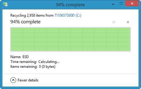
File removal in Windows

The progress bar here could have been reversed, but that would communicate a completely different message to the user: "The disk getting emptier". But in a forward filling motion it would communicate the correct message: "The progress of removing the files".

An easier example is emptying a bucket of water. You can show the progress in two ways:

  • How much water did we already drain from the bucket? (from 0 to 100)
  • How much water is left in the bucket? (from 100 to 0)

From a psychological perspective the forward motion from 0 to 100 is preferable.

If you look at progress-bars on different crowdfunding websites (take Kickstarter for example) they always seem to fill up from 0 to some number (and from the left to right) but can easily be reverted:

500$ of 2500$ funded
[=====                     ]

These websites could however have used a different type:

2000$ of 2500$ needed
[===================       ]

The first type fills from the left to the right, the second model empties from the right to the left. The first progress bar is used for a reason, it shows the progress in a forward motion. The backward progress is counter-intuitive.

When can you have backwards progress?

Almost never, unless you are for some reason losing progress. A good example of a backwards going bar is the health-bar in a game (as mentioned in the comments). A health bar always depletes as you lose life. Notice however that a health bar is for a good reason not called a "progress bar". A health bar does not necessary communicate "progress" to the user, instead it communicates a certain "status" to the user. If the bar drops it's perceived as something negative (especially if the bar cannot go up again).

Conclusion

Progress is forward motion, backwards movements is counter-intuitive and from a psychological point of view probably not the best choice. Forward motion is positive, backward motion is negative. Because of this I suggest you use a filling type progress-bar.


Note: I can't currently find a good source to back this answer up with. But I do have an interesting paper that researched different types of forward going progress (linear progress vs accelerating progress etc.) : Rethinking the Progress Bar

19
  • 37
    "unless you are not making any progress (losing progress)" - I've seen progress bar on installer go backward, when it hit an error at ~80% and started doing rollback. I think that's exactly one of the rare exceptions you meant, but it still felt awkward.
    – Mołot
    Commented Apr 11, 2018 at 13:25
  • 13
    +1 and you sometimes see bars that start at 100% and deplete, but every case I can think of is some sort of warning that you are losing or running out of something, where something bad happens when it reaches zero (e.g. health bars in video games, visualisations of time remaining to complete a task or before you're logged out, or some depleting allowance like disk space, bandwidth, fuel etc) - i.e. the opposite of progress. Commented Apr 11, 2018 at 13:37
  • 10
    Another example would be battery-charge bars. When recharging the battery they go from (less than 100%) to 100% - you want that charge-bar to reach 100%. When you use the device the charge-bar drops (hopefully slowly) from 100% (or whatever its current charge was) to 0% - you want it to stay as high as possible, and don't want it to hit 0% obviously.
    – CharonX
    Commented Apr 11, 2018 at 14:14
  • 5
    @TKoL this is anecdotal, but I've never had a problem with a progress bar going from 0-100% alongside text like "90 items remaining" that goes down. Commented Apr 11, 2018 at 15:46
  • 8
    To elaborate on the health bar thing, and the battery level thing noted in the comments, these are not progress - they are status. They are expected to go up and down over time as your character takes damage and heals, or your phone is being used or charging. They don't indicate progress towards a specific goal, just the current state of something that fluctuates over time.
    – Zeus
    Commented Apr 11, 2018 at 18:59
10

You might want to go out to the warehouse and show the people there what the app currently looks like and what other ideas you have.

That way, your end user can give you insight as to what they would find the easiest to use. Something that looks great in a mock-up/design process might not be as well received by the 'real world' users.

For example, I helped in the development of an in-store ordering app to help shop workers place online orders for customers. The design was sound when trying it out in the office but when we trialed in the store, the users said it would be awkward due to the fact they move around the shop a lot, don't have to time to read the long text or understand the graphics etc.

In a nutshell user research will help you out here.

0

Rolf covered the main question pretty well, so I won't add to that, but I have some suggestion regarding things being deleted after reaching 100%.

I actually believe it's pretty natural and fine for things to disappear once they are done. However, if you don't feel like it, there are some ways you could help it:

  • Keep the completed items visible for some time, e.g. 5 minutes. It may have additional value if the last step happens to be marked by mistake and has to be reverted.
  • Make a switch for showing completed items. That way:

    • By turning the switch on, it will be possible to keep all the completed items visible,
    • It should be very clear the finished items don't vanish, but are simply hidden.

Your Answer

By clicking “Post Your Answer”, you agree to our terms of service and acknowledge you have read our privacy policy.

Not the answer you're looking for? Browse other questions tagged or ask your own question.