14

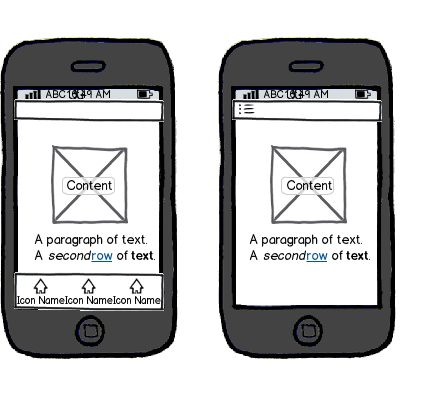
Currently I'm designing an android app that has 4 main menus without extra sub-menus (just simple menus like Home, My Loans, History, Settings). This app is a financial product to help users acquire loans. I thought that having a side menu like Gmail will be a more pleasing layout than having a fixed bottom menu like Instagram where each menu needs an icon and label.

Any advice for the menu placement?
mockup

download bmml source – Wireframes created with Balsamiq Mockups

5
  • You need to provide more context for your situation. What kind of app? Desktop, mobile, both? Who are the users? What are they used to for similar apps? How deep is the menu structure? Have you made some efforts on your own towards this? Post any mockups so we understand what you're trying to do.
    – Mike M
    Commented Sep 29, 2017 at 3:35
  • @MikeM thank you, I've updated the above description. Commented Sep 29, 2017 at 3:54
  • We use both: the side navigation contains all top-level (and some second-level) items while the bottom navigation contains the most prominent (most used) top-level items. Bottom/Top navigation just does not offer enough space for everything and is quite limited.
    – Rolf ツ
    Commented Sep 29, 2017 at 11:12
  • @RobH.Yamin added an answer explaining the use of both.
    – Rolf ツ
    Commented Sep 29, 2017 at 12:01
  • Are u designing an iOS, Android, ... App. Commented Sep 29, 2017 at 13:57

5 Answers 5

17

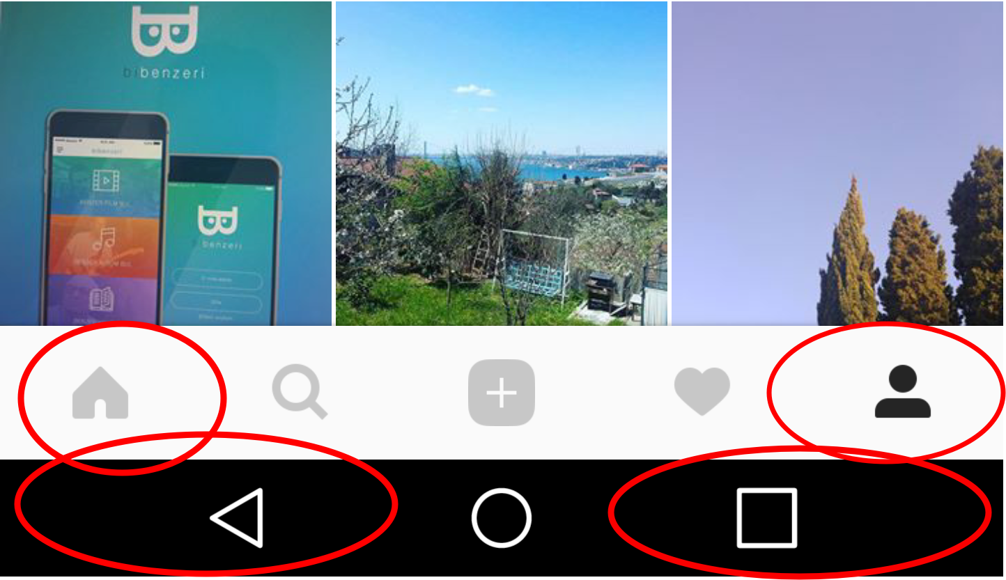
Bottom navigation works well on Apple devices but not recommended for Android because of the system buttons.

Dear Google, it is nice but I insist that the bottom navigation does not work well on Android devices because of the system buttons. When I ask about 15 Instagram users on Android devices, they declared that they often click on system buttons accidentally when operating with bottom menu.

https://medium.com/house-of-apps/bottom-navigation-issue-on-ios-android-and-ux-8851ffe7260

It is a failure in terms of user experience when user accidentally exits the application. As a product team, do we want the user to leave the application?

enter image description here


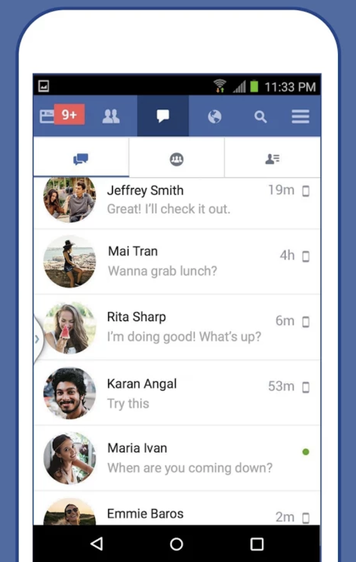
Facebook used bottom navigation bar on Android for a while, but they did not get positive results in the tests and turn to tabbed structure.

enter image description here


I would suggest you use the side menu, or do a little user testing with Floating Bottom Hamburger Menu to help people access the menus with their thumb. Similar to Google's plus icon -

enter image description here

5
  • Any concrete evidence for any of this? i.e. 15 users is a minute set in the world of Instagram et al.
    – Johan
    Commented Sep 29, 2017 at 8:04
  • @Johan Facebook did not get positive results on bottom navigation can be a concrete proof?
    – Diego
    Commented Sep 29, 2017 at 8:17
  • 1
    There could be many factors as to why they changed it. Besides, they didn't purely use hamburgers either, they used top tabs. Regardless of that, Facebook own Instagram, why did they not apply the same science to it?
    – Johan
    Commented Sep 29, 2017 at 8:23
  • 2
    @Johan Interesting point. Thank you! I think this will help you. When designing for Android, forget iOS It is recommended that they appear at the top of the screen as part of the top bar, rather than the bottom as in iOS. This is mainly to avoid tap conflicts with the system buttons.
    – Dipak
    Commented Sep 29, 2017 at 8:49
  • 1
    great answer! I'd go with the FAB for the OP's case
    – Devin
    Commented Sep 29, 2017 at 17:45
4

My inner designer supports hamburger menu because they can be designed soooo pretty - just look at all the dribbble shots (actually don't look at dribbble for UX related matters). But, unfortunately, it doesn't work for the user that good!

It's not discoverable

Not only many users don't recognize the hamburger, it also slows down the task completion process.

Here are just a couple of articles relating to your question: https://www.nngroup.com/articles/mobile-navigation-patterns/
https://www.nngroup.com/articles/hamburger-menus/
But there are literally thousands of articles supporting this claim.

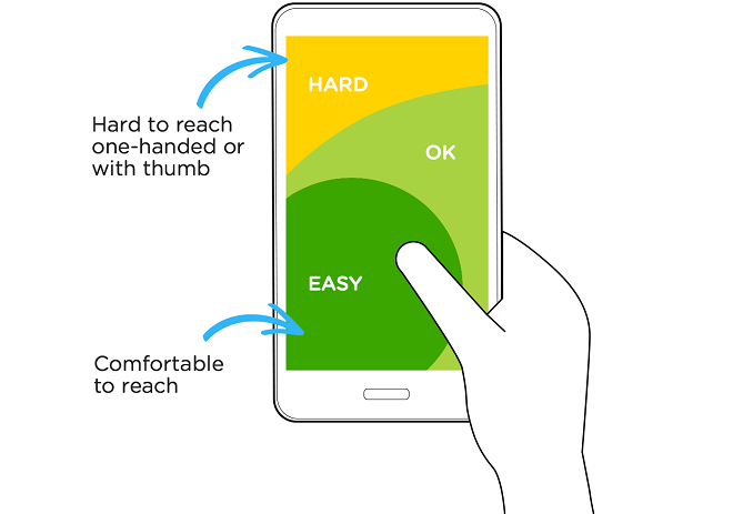
It's hard to reach

Hamburger menu is usually located on the upper left-hand side, but only 10% of the world population is left-handed (according to Wiki). And as the screens gets bigger, it's getting a lot harder to reach that part of the screen. Which, again, slows down the task completion time.

enter image description here

3
  • 5
    Its easy but my wife is an android user and ALWAYS accidentally clicks the back button for the actual system device. It exits her out of the app. I dont recommend this for android.
    – JonH
    Commented Sep 29, 2017 at 15:05
  • 1
    Note that the 'hamburger' menu often appears on swipe in from left, including bottom-left. Depends on the app, of course, and it also has discoverability issues, but it's a common pattern in Google's own apps.
    – Bob
    Commented Sep 29, 2017 at 15:27
  • 3
    That picture is not to scale. That phone would roughly be the size of your face. While holding my phone, I actually find it difficult to touch the bottom-left corner because my thumb is angled upward from the center. Commented Sep 29, 2017 at 17:01
2

There are a couple of factors why people are veering away from the hamburger menu.

Here's one of many articles about that: https://lmjabreu.com/post/why-and-how-to-avoid-hamburger-menus/

If looking at it objectively, bottom menus are likely easier to navigate as opposed to hidden menus.

Number 1 example is the Facebook iOS app (i don't have an android). All of the main sections that the user needs (feed, requests, messages, notifications) are already displayed. Easier to navigate to and from sections. The last item is the menu, which contains items that are less likely to be visited by the user.

Still, it depends on your context whether which menu is best to use.

1
  • 1
    Agree with your suggestion considering iOS, but this question is mainly for Android. So here, this option won't work.
    – Dipak
    Commented Sep 29, 2017 at 7:48
1

Considering that you have 4 main menus then it would be better to show those menus to user. Just like olegdeleon said that bottom menus are likely easier to navigate so it's more efficient and effective.

This article might be useful for you.

The Golden Rule of Bottom Navigation Design

1

Don't choose: use the best of both worlds

Top/bottom-navigation vs side-navigation

Side-navigation offers way more space to put items in while on the other hand top/bottom-navigation is very limited and at-most 4 or 5 items can fit (please be aware of smaller screens).

In our app we have quite some top-level navigation items (7+) and we use the side-navigation to display all of them and we use top/bottom-navigation to display the most prominent/used items in. This way users can access the most used top-level screens with a single click and less important screens using two clicks.

Example from the material design guidelines showing both:

Example of bottom navigation with side navigation

On iOS this pattern is quite common but instead of using side-navigation for all the items the top/bottom-navigation has a "more" option. But for Android I would defiantly use side-navigation instead of a more option that takes precious space in the top/bottom-navigation.

Top vs Bottom

As suggested by other answers bottom navigation on Android might lead to usability problems even though the area might be easier to reach by hand.

Your Answer

By clicking “Post Your Answer”, you agree to our terms of service and acknowledge you have read our privacy policy.

Not the answer you're looking for? Browse other questions tagged or ask your own question.