16

In my mobile app, I use two fonts; MaaxRounded for h1-h6 and Roboto for paragraph and description text.

My co-worker asked why I was using two fonts, and I at first didn't have an answer. After thinking it through, I answered that it's good for contrast and better hierarchy. My co-worker, however, insisted that I should use just one font.

What do you think of having two fonts on a mobile app? Is it better than one or not?

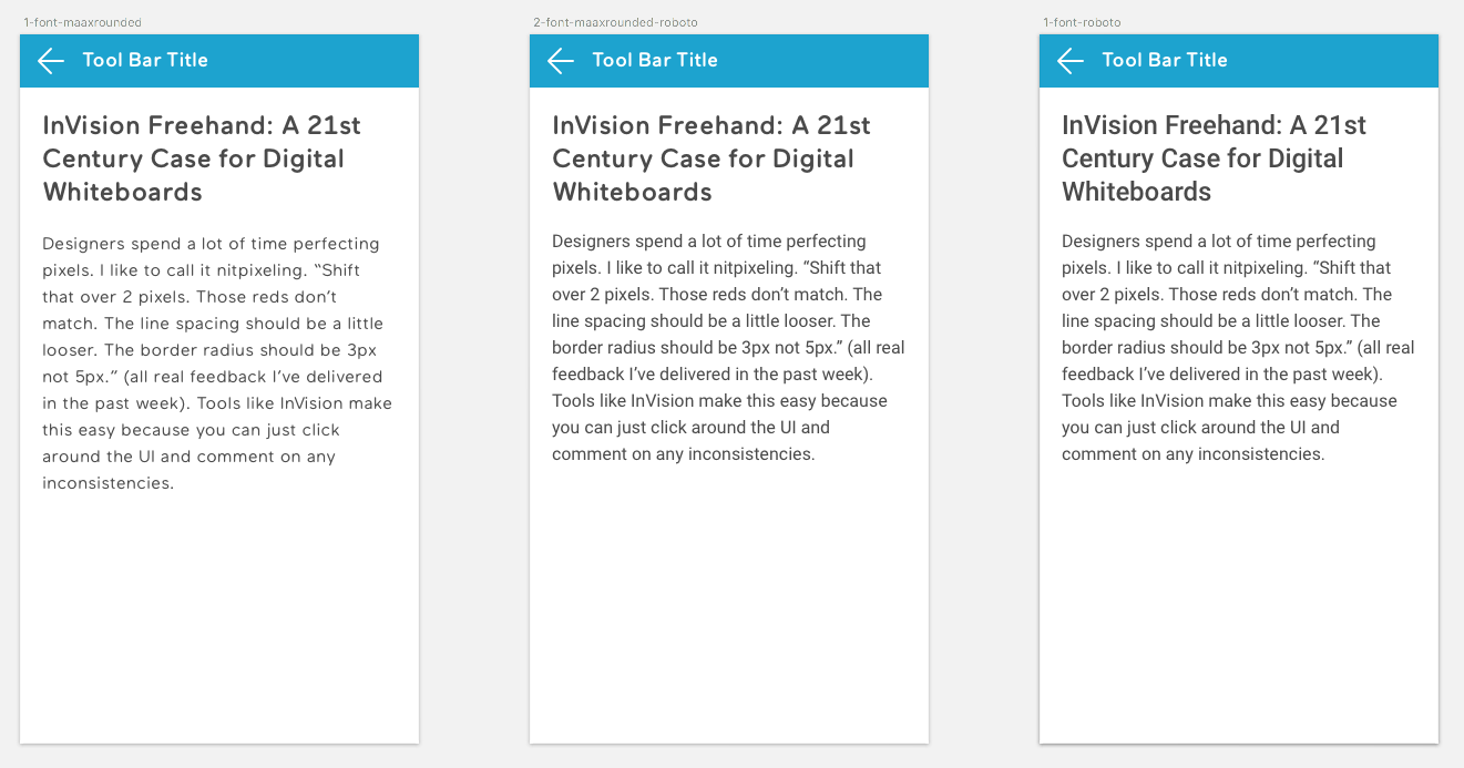
Here are some example pages that I made:

fonts

3
  • 3
    Whats the reason you are using two different fonts? Roboto Bold exists for a reason, and the contract is big enough when you combine different font size with different font style. Commented Aug 4, 2017 at 7:23
  • I use MaaxRounded because it match with our branding and theme. But i don't think it's good for paragraph and long text. So i need another font for that. Commented Aug 4, 2017 at 10:18
  • @AgeraThedo Agree that in those examples at least, the first (all MaaxRounded) is my least favourite -- probably partly due to where lines break. The second and third are pretty much neck-and-neck (judged before I saw what was used in each), with probably the third (all Roboto) slightly ahead (but not so far ahead that I'd be bothered if you used the second for "branding").
    – TripeHound
    Commented Aug 4, 2017 at 11:21

7 Answers 7

13

You should avoid using two different fonts for the following reasons:

  • You create unnecessary contrast, which creates clutter. The visual hierarchy is already established by the difference in font size and weight.

  • Reading with one font is faster than reading with two different fonts, a phenomenon called Font tuning:

Font tuning (FT) occurs when observers recognize a sequence of letters presented in the same font faster than in different fonts. ... With a number of different tasks, Sanocki (1987a, 1987b,1988, 1991) studied letter recognition in regular-font (all the letters in the same font) or mixed-font non-word strings (font alternating from one letter to the next). Letter recognition proceeded more efficiently in regular-font than in mixed-font strings, indicating that font information irrelevant to the task is nonetheless encoded by observers. We will call this phenomenon on `font tuning' (FT).

2
  • 7
    Font tunning doesn't apply to this case, that experiment was about recognition between many different fomts on a grid, the complete opposite to this question. Different fonts for headers and text are pretty common, and when properly used, way better than keeping all in the same font. Additionally, contrast is not a bad thing and headers have a difference by definition, it's an accepted design principle
    – Devin
    Commented Aug 5, 2017 at 16:09
  • @Devin thanks for the feedback but I will disagree. According to the book "Knowledge concepts and categories by Koen Lamberts and David Shanks" the results of the experiment is interpreted as "... faster to recognize letters consistent with the fonts of just previously seen or surrounding letters ...". Also, we must use contrast wisely and question the purpose of every element, in order to create simple interfaces with low cognitive load on users. Commented Aug 7, 2017 at 6:45
27

Having two fonts, one for headers and one for body text, is generally accepted. Do not use more than two fonts. Three's a crowd.

What's important for you is to create visual hierarchy. You can do this by having contrast between font size, weight and color for your header and body text. If you find that using one font for both is not creating enough contrast you can use another font for the headers to create more contrast.

In this case I think using Roboto for headers and body is fine.

7

It is definitely common with both designs using a combination of typefaces (typically 2; one for headers and one for body) , and sometimes only 1 typeface. I can't say I have found specific research pointing whether one is better than the other, I guess it depends on the style you are trying to convey (the brand image of the company might play an important role there too; sometimes there is also already existing brand guidelines / style guides in place which needs to be followed).

Here are however some links that might be useful:

7 Golden Rules of Combining Fonts for Mobile

  1. Make it readable
  2. Establish a Visual Hierarchy
  3. Consider the Audience
  4. Create Contrast
  5. Use Fonts from the Same Family or Designer
  6. Limit the Number of Fonts
  7. Don’t Forget to Test It Out

Best Practices for Combining Typefaces (Smashing Magazine):

  • Try matching a Sans-Serif title type with a Serif body type
  • Avoid similar classifications (don't use 2 slab typefaces or 2 condensed typefaces)
  • Assign distinct roles to each typeface/font
  • Contrast font weights
  • Create a variety of typographic colors
  • Don't mix moods
  • Contrast distinct with neutral (rather than with another distinctive font)
  • Avoid combinations that are too disparate (e.g. narrow & expanded)
  • Keep things simple (try just 2 typefaces)
  • Vary point sizes

There's also the more practical side (with code examples for web) from Donny Truong (I specifically link to the part with combining typefaces, but the whole book is recommended).

4

To me (not a designer by trade, but I've done some) MaaxRounded adds nothing when compared to the all-Roboto version (but the body looks very loose in MaaxRounded). With the contrast in size and weight, spotting the difference in font between the header and body is -- to quote your own example -- nitpixeling. Compare "InVision" in the title and body of the middle example. Even at the size you show (bigger than many users will see) it's subtle.

So your users are downloading MaaxRounded for no UX benefit, because it adds no differentiation to the existing difference

3

You already had answers to state it's a perfectly valid design decision which may (or may not) be appropriate for your application.

Let me pick it from a different point of view and highlight something else you should also consider for a mobile application: download time.

If you need a font for <h1>-<h6> then there are good chances you will need Normal, Normal+Italic, Bold, Bold+Italic variants. Personally I also use often the Light variant but it may not be your case. Even assuming you just need Latin language characters (not even Latin Extended) this is a 1 Mb download (more or less). For a mobile application (where Internet speed isn't always good and/or it varies across areas and countries) then it may be an issue. In this way you also force developers/designers to handle FOUT (which for 1 Mb with a low speed connection may be more than a flash).

In short: do it if the benefits are good enough but consider the drawbacks. I can't say if it's an issue or not: is it a LOB application with a stable user base? Is it a web site where most visitors arrives from Google? Is it an application used mostly by travelers (then with a roaming data connection?) To be truly mobile (and truly user) friendly you may need to sacrifice some of your freedom of expression.

1

If you want to create a distinction between headers & body text then you can try two fonts on the page or in terms of web "font-pairing". Choose what font works best. Hope this solves the problem. Let me know if you any questions.

For reference: https://www.elegantthemes.com/blog/tips-tricks/font-pairing-principles

https://webdesign.tutsplus.com/articles/a-beginners-guide-to-pairing-fonts--webdesign-5706

0

One of the main principale design rules say that you can use two fonts for the same design: each of them have to be from different families in order to create contrast. But beware, only two.

Your Answer

By clicking “Post Your Answer”, you agree to our terms of service and acknowledge you have read our privacy policy.

Not the answer you're looking for? Browse other questions tagged or ask your own question.