7

Part of a good UX for websites and web applications that support multiple languages is their fonts.

Let's imagine that English is not the default font on the web and another nation has created the web and the internet.

In that case, most websites belong to that nation and show that nation's language as the default language.

Now, in this imaginary world, as an English speaker of a minority, you go to a website that offers your language. You click the drop-down, select your country, and you see this:

enter image description here

Why, because the developer of that website has no idea that this font is not suitable for the English language on the web.

So, in spite of the relativistic nature of the beauty and suitability of fonts for different use-cases, my question is:

How do you choose/find the most suitable fonts for a locale in a website?

P.S: We are developing a multilingual website/app that needs to support Russian, Arabic, Persian, English, and Turkish. And we want to improve our UI/UX by including fonts that are better than defaults and are more readable to native speakers of those languages.

6
  • What different preferences do you see in those different locales? The time and effort you think you should put in will depend on the differences you can describe. Commented Jun 22, 2022 at 22:46
  • 1
    I don't quite understand your question. What are you trying to say with "assume that English is not the default font on the web"? English is not a font, but a language. And also, a majority of websites is not in English, but other languages. And what you mean with "another nation has created the web and the internet"? What is "the" nation that you take as the one that created it (may I assume USA)? Different parts were developed in different nations. And when you refer to USA and the WWW, you dont have to imagine this, it was developed in another nation.
    – king_nak
    Commented Jun 23, 2022 at 11:49
  • 1
    Also, I don't see what's the problem with the font in your question. How is this less suitable to display English, than e.g. German, French, Spanish, Italian, Turkish, ...? I assume it is even better suited, because the other languages have additional characters with diacritics or umlauts that are not present in English. Or has it to do that it is a cursive script? And maybe that cursive is not so well taught in the region you refer to? Or is it a purly aesthetic reason? Then it is not so obvious to me and maybe others, why you don't like it.
    – king_nak
    Commented Jun 23, 2022 at 11:49
  • Maybe you just wanted to ask how one can choose a font that is suitable for displaying text in other alphabets and scripts, other than Latin?
    – king_nak
    Commented Jun 23, 2022 at 11:49
  • In other words, you want to know how to choose/specify/select a font for each language? (i.e. css code) Or are you asking for good fonts for such languages?
    – Pablo H
    Commented Jun 23, 2022 at 14:30

5 Answers 5

11

I'd use a font family that has been designed to cover as many scripts as possible. That way there is a visual coherence between different language versions of the website (or app or any system).

One such font family is Noto, commissioned by Google and it is licensed in SIL Open Font License. From Wikipedia:

The Noto fonts cover 150 out of the 154 scripts defined in Unicode version 13.0 (released in March 2020), as well as various syllables and emoji which do not belong to a specific script.

https://fonts.google.com/noto

1
  • I'd edit this answer slightly to include "use a well-designed font family that has been carefully designed to be readable in as many scripts as possible". Commented Jun 23, 2022 at 15:53
4

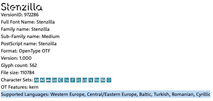
Good font providers offer enough information to be able to choose the right font according to its use: platforms (web or desktop), formats and supported languages according its glyphs.


Myfonts.com in the Tech Specs tab has information about Supported Languages:

enter image description here

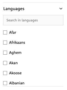
You can even do a search filtered by required languages:

enter image description here

Sample font Stenzilla

15
  • 2
    The question was about telling the difference between usable fonts and suitable fonts; the example font is usable for English, but not suitable for general-purpose English body text.
    – prosfilaes
    Commented Jun 22, 2022 at 15:52
  • The sample font is just an example with no other purpose. The answer is about information regarding support in different languages available from font providers.
    – Danielillo
    Commented Jun 22, 2022 at 15:58
  • 4
    The example of a bad font in the question is usable for English, but not suitable for general-purpose English body text.
    – prosfilaes
    Commented Jun 22, 2022 at 16:34
  • @prosfilaes Unstated—and it should be stated—is the assumption that the font will share a similar style across various character-sets, and thus will be suitable for similar purposes. This assumption may be flawed (a font may not be consistent, or consistent stylistic touches might be suitable for a purpose in English but not in another language), but the choice of example font doesn’t really have any bearing on whether it is (fatally) flawed or not. (And if this assumption is flawed, the top-rated answer here suffers from the same assumption.)
    – KRyan
    Commented Jun 23, 2022 at 15:17
  • @KRyan I don't see that assumption in the question. It's not a question about similar style; it's about suitability for similar purposes independent of that. The example font shows how a font can be usable for a language but unsuitable for most purposes. Noto will be suitable for most purposes for most languages; Stenzilla and other random fonts from Myfont.com won't, and the question was how to avoid fonts like Stenzilla even if you don't understand the script.
    – prosfilaes
    Commented Jun 23, 2022 at 16:29
1

And we want to improve our UI/UX by including fonts that are better than defaults and are more readable to native speakers of those languages.
This is fundamentally misguided. If the user is running an OS/browser in their native language, the whole point of its defaults is that they are familiar, readable, and perfectly suitable for presenting text in their native language. As someone not familiar with their language and typography, you are not going to do better and you're going to annoy them, just like the example with English text in your question. The solution isn't to try to become an expert and do better. The solution is don't do that.

The same also applies to your native language, English. Just because you are very familiar with it and have Legitimate Opinions about fonts, doesn't mean you're qualified to override the user's defaults. They may have accessibility needs (visual or cognitive) that you don't and can't understand, motivating whatever defaults they have selected, and overriding that is hostile UX. Don't do it.

4
  • Are you implying that setting the font for a website or application to something other than the system default is always hostile UX? Commented Jun 30, 2022 at 14:33
  • @flyingfisch: For body/UI text at least, yes. Commented Jun 30, 2022 at 17:05
  • You have to at least admit that that is not a mainstream opinion, given the fact that very few applications or websites use default system fonts. this is true even of websites specifically devoted to UX, like nngroup.com Commented Jul 5, 2022 at 14:08
  • it's also worth noting that many users don't know how to set their default system fonts, so for the majority of users the font they see was not a conscious decision. In a way, you're just forcing them to be stuck with the font their OS manufacturer picked instead of the one you did. Commented Jul 5, 2022 at 14:10
1

I think there's two things you need to do - hire an expert in visual design who is a native of each alphabet you're using, and do some end user testing.

Hire an expert - This can be a very brief project for someone on UpWork or another freelance site. You describe the look/feel/brand of your application, and they'll suggest fonts that would work.

End user testing - You can also use this session to make sure that language, labels, etc make sense. To test the typography style, ask a few questions like, "What are a few words to describe your overall impression of the design?"

0

I believe that you should pick a font or font family that has the glyphs that cover the languages in question, so you don't need to pick multiple fonts. (or if you do need multiple fonts, they are mutually consistent between themselves) You can use different fonts for things like Titles and Headings, but I would say try to make them similar-ish. (Like either same family, or same font style)

I would suggest NOT using Script fonts ... or fonts that you would find on a fancy wedding invitation...or fonts that look Medieval...

I'm not sure what your language is, but, look for a font that is easy to read at the default character size on your site and looks good to you and your testers.

I'm not sure what your site is for or what information is being presented, so that might influence the better font style for presentation.

You might need to/want to run it by someone fluent/native in those languages to make sure that it's not egregiously hideous for your purposes.

Your Answer

By clicking “Post Your Answer”, you agree to our terms of service and acknowledge you have read our privacy policy.

Not the answer you're looking for? Browse other questions tagged or ask your own question.