I am creating an invoicing web app. Within it, the user can search for invoices based on anything that is in the invoice.
The core result should have the invoice date, the invoice number, the buyer's name, and the sales rep name. On top of that, any additional fields that get searched should also be included. For example, if the address is searched, it should also be shown. I do this because near matches are acceptable (e.g. 759 NW Way St. and 795 NW Way St. will show up).
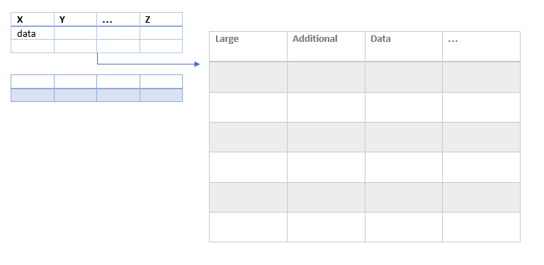
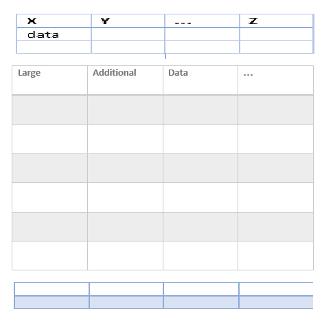
However, there are three sub-sections: vehicle information, miscellaneous fees, and payments. These should be shown below the core result. So, if I search all vehicles that have been sold, who model year was 2002-2005, I will see all vehicles that have that model year in the invoice. If multiple subsections are searched, then they should be shown distinctly.
Note that I'm thinking all of them will be hidden unless the user expands the given invoice.
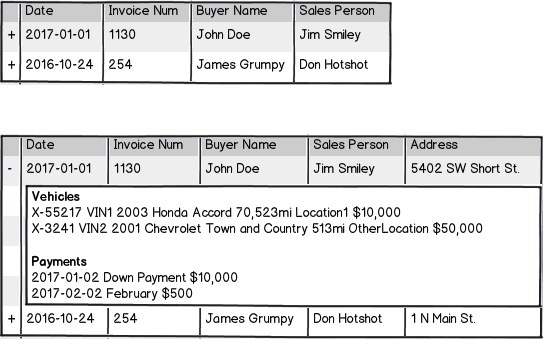
Here is what I've come up with, that I really don't like. It's too hard to read, and is just overall messy.

download bmml source – Wireframes created with Balsamiq Mockups
The issues I have with this are:
- It's hard to read the data, since it doesn't align well
- If the data is wide (such as the vehicles) and there's no additional fields, it makes the table way wider than it needs to be
- I have no clue how this would work on a smaller screen.
So how can I effectively present the data needed, in a clear, clean, data-scaleable, size-scaleable way?
Also, as an end note: If you're wondering why so much data is being presented, it's because that actually is helpful to the workflow when trying to find something. That being said, I'm open to suggestions on the entire system.


