47

In my web application, I use a wizard navigation bar like the one in the image:

example of a wizard navigation bar

While getting feedback from a fellow designer, he asked me if the progress bar is clickable. In my mind, most wizard navigation bars are clickable. Is there any good practice for making sure that users know that wizard navigation bars are clickable? Is there any research about it? Do you have any suggestions on the current design to make it understandable to the user that they can click on the wizard navigation bar?

FYI, I am also using a button navigation on the bottom of the screen, as appears in the next picture:

bottom navigation

I added some more ideas on the wizard navigation bar:

Other ideas

11
  • 104
    I didn't realise wizard navigation bars are supposed to be clickable. I've never clicked on one and the one we have on our website is not clickable.
    – slebetman
    Commented Mar 29, 2017 at 2:53
  • 18
    One simple thing that helps making me understand if something is clickable: cursor: pointer inside your CSS...
    – Mathlight
    Commented Mar 29, 2017 at 6:13
  • 4
    Buttons for navigation, bars to show current step. Commented Mar 29, 2017 at 7:48
  • 15
    @Mathlight cursor: pointer is not as useful as it used to be. Mobile users (phone, tablet) have a touch screen and no mouse. There is no cursor, and they don't scrub the page for information. Commented Mar 29, 2017 at 13:55
  • 3
    Take a look at Dipaks answer. Simply underlining the label will make it immediately clear that it is clickable. Or at least underline it if you hover over it. Otherwise how about having a separate shevron to the left and right of the bar or elsewhere on the page? Also if i as a user want to go a step back, I usually use the back and forth buttons of my browser.
    – xxtesaxx
    Commented Mar 29, 2017 at 14:03

7 Answers 7

21

Going off Simon Richter's answer and O. R. Mapper's comment, what about something that looks sort of tab-like to help indicate it's clickable, but has an arrow shape communicating the flow of the wizard steps?

Rough ugly example:directional tabs

5
  • I am going to accept this answer because it resembles more my final solution! Thank @Josiah! Commented Mar 30, 2017 at 15:20
  • 22
    I would definitely not even think about clicking on this. Would I be able to skip step 2 to go to step 3 immediately? Of course not! Commented Mar 31, 2017 at 10:05
  • 1
    @StephanBijzitter Good point, you'd probably want to gray out/disable or hide the tabs that depend on earlier steps. As for clickability, the point is to make it look similar to any other tabs that might be in the app. Obviously this is a generic mockup - and I'm not a designer. Commented Mar 31, 2017 at 12:59
  • Maybe if the steps were underlined to resemble links. Or had rounded/3d borders and a gap between them to resemble buttons. I think the "I can click this" feeling starts to go away in general on elements that are visually touching and intertwined.
    – Jason C
    Commented Apr 1, 2017 at 19:56
  • @StephanBijzitter This solution has to be tested and of course according to the design that it has to match with the current design of the app. Commented Apr 3, 2017 at 7:14
64

Note: when this answer was written, the question talked about a "progress bar". The question was later changed to mean "wizard". I am leaving this answer as is because it is still being voted up regularly; thus, it seems to kind of be a somewhat fitting answer for a "wizard"-style form as well.

Never

With all the examples in the question and the answers so far, I would never, as a user, get the idea to click on them. On the contrary; especially if it is a web application, I am usually paying a lot of attention on not clicking anything when an important page is still loading - for example on the final button of a payment operation.

So, I'd suggest putting the clickable parts well outside of the progress bar, and make them look like they always do (links, buttons, whatever you have in your application).

Outlook

If you want a somewhat nicer experience for long-running and important jobs, then you would probably avoid a "normal" progress bar completely. I.e., show the user the server-side progress, and make it 100% clear that the user is free to go away and come back later (maybe even in a new browser session). To do that, skip the progress bar metaphor, and just display something like "Progress: 77%; this has already taken 44 minutes and may take a long while, it is safe to close this window and come back later. Click here to abort the operation.". If the user does indeed close the window (i.e., the session) and comes later, your server should indeed have the results of the operation ready, of course.

9
  • what if you wanted to go back to a previous step of your shopping task? For example, if you wanted to review your shopping cart. Also, you are talking about buttons: Then, what do you think about the second example of the second image? Commented Mar 28, 2017 at 15:01
  • 36
    @DimitraMiha Make the "back" button work like it’s supposed to. Commented Mar 28, 2017 at 15:13
  • 5
    @AnoE maybe the confusion is because I confused the term progress bar & wizard navigation bar. There is no operation running. The operation will only run when you click the last button of the task. Do I make more sense now? Commented Mar 28, 2017 at 15:20
  • 7
    +1 for not clicking anything when an important page is still loading .If I have to show something important meanwhile I will probably show progress or Show details using ajax. Something like this sqlcoffee.com/images/SQLServer2008_0001_0026.PNG . But in any case, I would never want my user to click randomly when wizard or long running process is going on Commented Mar 28, 2017 at 15:21
  • 3
    @DimitraMiha, well, that's kind of pulling the rug, indeed!
    – AnoE
    Commented Mar 28, 2017 at 15:23
35

I believe you need to rely on icons in this case.

The pencil is associated with the edit action, which if I understood correctly is the reason why the step is clickable, while a check icon implies the step is completed and there is no possible edit:

The idea behind is that steps which have already been filled don't need a number anymore and they are either editable or non-editable (and completed). Steppers could either be linear or non-linear.


Source: Material design - Steppers

5
  • 3
    Just saw that actually. Do you think that it appears clickable enough? Commented Mar 28, 2017 at 11:39
  • I think it looks editable and so clickable, you could also make use of some kind of pop-over that has to be dismissed ("You can edit the step, click this box to dismiss"), but this only adds extra elements that might or not be needed. I guess you would need to test to be sure.
    – Alvaro
    Commented Mar 28, 2017 at 11:43
  • 11
    Look at the difference between editable and non-editable on the page. They are almost identical, and in each case, I for one, would not think to click on them.
    – OGHaza
    Commented Mar 28, 2017 at 22:22
  • 17
    This does not look clickable to me. On the other hand I've never clicked on any step navigation in my life. I always use the next/back buttons at the bottom of the form
    – slebetman
    Commented Mar 29, 2017 at 2:55
  • pencil icon instead of check for completed steps would hint that you could click back to edit. That's hinted at in this answer. Commented Mar 29, 2017 at 13:57
33

A lot has been discussed here already, and I think we can take an advantage of user's Mental Model by using border-bottom which will indicate that the step in wizard is clickable.

I've never used this in my work, but it would be a great option for research.

enter image description here

5
  • 8
    This makes it really clear that there is a clickable link!
    – xxtesaxx
    Commented Mar 29, 2017 at 14:01
  • 5
    I read this as a strange choice to underline, not as clickable, sorry. Might work if the color matched links elsewhere on the page. I think the the Check icon that does it. Change to pencil to hint "editability" Commented Mar 29, 2017 at 14:04
  • 2
    We have something like this where I work. The fist time you go through there is a requirement for all steps to be completed contiguously. Thereafter, you can skip between steps as you please, so we added an underline on the text. This makes it very clear that what you are looking at is a link. Commented Mar 30, 2017 at 8:11
  • @cheersphilip Great! Have you tested it with users? What's the feedback?
    – Dipak
    Commented Mar 30, 2017 at 8:27
  • 1
    @Dipak It's a new feature, so not in front of enough users to get real feedback yet, but small trials have come back positive. Our org is not too geared towards UX so examining the clarity of this feature is not a priority for them :( Commented Mar 30, 2017 at 8:40
29

Real good discussion happening here. Some thoughts and ideas below.

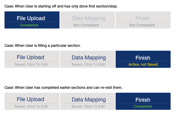
enter image description here

Consider the design attached and multiple scenarios mentioned:

1) Introducing a status message that suggests that the data is saved and also that the section can be re-visited might help.

2) It could act as a confidence measure and an information item, that could help users understand more and feel in control.

3) Status messages can be carefully worded and additionally, a popup/tooltip could be put in place to supplement more information on hover of the bars/tabs.

4) Numbering of the steps can be ignored, as that gives a hint that you cannot go back. As in 1-2-3 is ok, but the mental model does not allow to think you can easily go 3-2-1.

4
  • 11
    Sometimes a word (or three) is worth a thousand pictures.
    – 8bittree
    Commented Mar 29, 2017 at 15:17
  • 1
    Oooh, I like. To me, the navigability of this UI feels comfortable. There's no guesswork, no wondering whether the developers meant for you to be able to click a back-link and re-edit, or whether the later tab states will be lost. The status is clear and explicit. Commented Mar 30, 2017 at 14:40
  • Would it be better to have an edit icon (like a pencil) instead of a text message? Commented Mar 30, 2017 at 19:39
  • @AlvaroMontoro The issue with having only a edit icon is that, many users might still not understand that as clickable/editable - since the elements in this case are not obviously 'clickable'. See above solution by '@Alvaro' which explores that and in my opinion, can be used if supplemented with some extra text aids. Confidence aspect, on if the data is saved or not should also be considered.
    – Amit Jain
    Commented Mar 31, 2017 at 5:03
18

Deutsche Bahn are using a tabbed interface, adding tabs as the user progresses along the wizard, and with green lines indicating that the respective pages contain valid data. The user can go back by selecting an old tab.

(German) report with pictures.

5
  • Ah yes, use tabs. I just commented above that I've never clicked on wizard navigation bar before then when you mentioned tabs I realized that I do click on wizard navigation on AWS when creating a new virtual machine. It's because their wizard navigation is tab based instead of navigation-bar based.
    – slebetman
    Commented Mar 29, 2017 at 2:57
  • 5
    Not about tabs, but as a foreigner I found Deutsche Bahn interface kinda confusing in general.
    – Runnick
    Commented Mar 29, 2017 at 9:43
  • 2
    I think this suggestion is in direct conflict with a recommendation I encountered elsewhere (will add a link if I found it again), namely that if anyhow possible, no tab should influence the contents of another tab. Commented Mar 29, 2017 at 10:03
  • 1
    I think tabs are great IF the steps are all independent and can be completed in any order. Commented Mar 29, 2017 at 14:01
  • For linear tab-progress, it's OK to disable (but not hide) tabs which have not yet been reached. This style of UI makes it really super clear that you can navigate between the enabled tabs, but is really only for use where frequently moving back-and-forth within the forms you've already completed is both expected and desired. Where your ideal is a linear flow, and back-nav is for error recovery only, it's best to avoid this. Commented Mar 30, 2017 at 14:36
4

If you want to make the user aware of the fact that the progress bar is clickable, show it to them by e.g. changing the mouse cursor while hovering over a certain area of the progress bar.

Also adding a balloon context message can help. Be sure not to put too much information in the balloon as it may get unreadable and cluttered.

3
  • 1
    I plan to have cursor events. I was looking for a more visual way to show. The balloon also sounds like a good idea, but I would like to keep it as simple as possible. Commented Mar 28, 2017 at 10:32
  • 12
    Touch screen devices have no mouse cursor except in trackpad mode, which may activate when docked to an external display. Commented Mar 28, 2017 at 15:32
  • 11
    If something doesn't already stand out as clickable, a user won't hover over it to begin with.
    – GHP
    Commented Mar 28, 2017 at 20:31

Your Answer

By clicking “Post Your Answer”, you agree to our terms of service and acknowledge you have read our privacy policy.

Not the answer you're looking for? Browse other questions tagged or ask your own question.